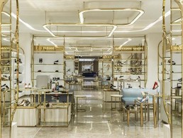
SKP Store, China
Torquil McIntosh of London-based architecture and design practice Syabrite was given the keys to the city of Xi’an for the creation of a new 250,000sqm, 20-storey, luxury landmark, SKP store in China’s former capital Xi’an.
Home to more than one thousand high-end global brands, such as Hermes, Gucci, Dior and Chanel, SKP features multi-storey event spaces, boutique cinemas, restaurants and cafes as well as an airy garden terrace designed in collaboration with structural engineers Arup. Under the ‘Rendezvous’ umbrella, visitors find a wine bar, restaurant, art gallery and several niche boutiques. In both scale and scope SKP Xi’an’s super luxe environment is as much about creating an immersive and experiential space as it as about creating something beautiful.
The project took just under three years to complete from start to finish, with its location proving a challenge to the Sybarite team. Close to both Xi’an’s ancient City Wall’s South Gate and the region’s Parliament building in China’s oldest city, the façade had to be sensitive to the surroundings and in no way ostentatious. It needed to be architecturally simple and sit back, humbly, within its environment.
To achieve this, the team took inspiration from the Forbidden City and Ming Dynasty architecture. In contrast to the exterior fortress walls; it is when you are up close to the skin of SKP Xi’an that you appreciate the intricate bas-relief honeycombed façade of brushed bronzed brass.
At the heart of every SKP project lies ‘the SKP curve’. “We always want visitors to know exactly where they are without having to explicitly remind them,” says Syabrite’s Torquil McIntosh. “We created the curve as part of the brand identity and made it a recurring motif throughout our design. From the lift buttons to the concessions, via the vents built into the pavements outside the building, we made the curve a subliminal branding cue which artfully reminds visitors that they are experiencing SKP.”
The sum of SKP’s individual parts is a truly extraordinary store, which not only offers an unrivalled 21st century shopping experience but does so despite the scale of the building, managing to successfully create an atmosphere of both luxury and inclusivity.
Lighting has been used to create zones with different atmospheres – the bar and seating areas include softer, atmospheric overhead lighting in contrast to the more directional lighting in the bookstore where the lighting picks out the book covers. Syabrite also designed large-scale pendant lights to act as zone-illuminators.
Most of the architectural lighting across SKP Xi’an is timeless, adjustable recessed downlighting where the colour temperature correlates to the category it is lighting. When it comes to bespoke lighting, it is used in feature locations to enhance the desired mood of the space. Decorative lighting is used sparingly and for the right reasons but plays a key part in Rendezvous, a fine dining restaurant within SKP Xi’an. The two Rendezvous floors are linked by a grand staircase designed to feel welcoming, incorporating intimate areas within it to read, as well as delicate planting to create an area of calm. A dramatic cluster of lights designed by Syabrite creates a sculptural installation within the centre of the staircase.
“We believe strongly that less is more with lighting – it is equally important to know where not to put the lights as it is to know where to install lighting,” McIntosh notes. In Beijing Kitchen, Syabrite enhanced the restaurant’s intimate feel with large, upholstered, teal-coloured acoustic discs which hang above each of the tables, absorbing sound and breaking up the space. Designed by the Syabrite team, bespoke lighting hangs from the disks throughout the centre of the restaurant and creates pools of diffused or directional light, depending on the time of day and the required atmosphere.
Each of the seven screens at the SKP Cinema – two double-height halls, two VIP halls, a kid’s hall, a theatre hall and a Love hall – has a signature geometrical stacking effect across the ceiling and walls similar to that of an armadillo shell. This design highlight connects the ceiling and the walls, with the curvaceous offset also allowing a gap for air-conditioning and subtly diffused lighting. Aside from the multi-hued Kid’s hall, each screen has its own single colour identity, such as red for the Love hall, with seats matching the walls. Syabrite looked to have the lowest light levels possible – just enough light to highlight seating and steps.
The large light in front of the Louis Vuitton store is very heavy, despite its lightweight, ethereal appearance. Structural calculations were required to ensure the ceiling above would support the weight. “Every space had to be drawn, modelled, lit and technically – that is structurally and mechanically – managed,” says McIntosh. “But with changing site conditions, the designs also had to be explained, translated and adjusted almost daily. As architects, it was our role to co-ordinate everything so that the right information reached the right person at the right time, in order to deliver the project successfully – both on time and on budget.”
Lighting, combined with the use of tactile materials throughout the 250,000sqm store, has created a luxurious and sensuous environment. The large-scale chandeliers add drama in public spaces, while carefully designed overhead lighting creates the right atmosphere depending on the time of day.
“SKP Xi’an is so much more than just a department store,” McIntosh says. “Despite the potentially overwhelming scale, it manages to be very intimate – which, in turn, makes it very easy to shop. Ultimately, the store offers something hugely experiential for its customers – and I think that makes it very powerful.”


