1700 Broadway Atrium Campus, USA
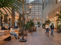
Interior design studio MAWD teamed up with Warbach lighting design to produce a stunning exterior-influenced scheme for the Denver-based Atrium Campus. Using lighting was key to making the vast space feel inviting.
Downtown Denver’s first high-rise, 1700 Broadway, was designed by I.M. Pei in 1954. Then, an adjoining Atrium by architect Philip Johnson was added much later in 1983. This iconic building has undergone a contemporary revival by UK and US-based Mawd design studio, with the new space now a nucleus meeting spot for tech firms and leading creatives in Colorado’s capital, providing a flexible and responsive workspace for today’s workers. Beacon Capital Partners, an American real estate investment firm which acquired 1700 Broadway in 2019, appointed Mawd to bring the expansive 27,000sqft glass atrium down to scale, providing a more comfortable, flexible workspace.
Unique to the Atrium’s entryway, visitors can find a front-of-house bike room, complete with lockers, makers tables, and tool storage space. The thoughtfully designed workshop not only supports the city’s biking trends but encourages individuals to enjoy time spent on campus.
Expanding 9000sqft, the communal amenity space features inviting fireplaces perfect for Colorado’s mountainous climate, as well as a wellness space with gym and yoga/sound bath studio, all to enhance the active lifestyles of Denverites. Lighting pieces from Roll & Hill and Artemide add further comforting layers to the communal areas.
darc spoke with Elliot March, Co-Founder of Mawd and Project Lead, to find out more about the firm’s approach to designing various spaces within the iconic building, as well as with Nathan Warner, Principal of the two-person run, US-based lighting design practice Warbach who were appointed to complete both exterior and interior lighting elements.
“Initially, Mawd was brought on to develop and design the project’s amenity space. However, quickly after we presented the initial renderings, Beacon Capital asked if we could become more involved with the project’s overall scope – appointing us as the design lead for I.M. Pei’s lobby. As time went on, we were added to more and more projects, such as the campus’ Bike Room. We are still involved and are now working on F&B adjacent to the Atrium space,” explains March.
Similarly to Mawd, Warbach was approached by Beacon Capital initially for an exterior commission, which later developed into extended interior assignments. “We were approached by the developer and asked to create an extensive exterior light sculpture that would tie the three buildings together, and make them feel like one, unified campus,” says Warner. “After our initial talks with Beacon, they asked if we would expand the scope of our involvement and take on some interior projects as well. That’s how we were first introduced to Mawd.”
March continues: “We drilled into the Mid-Century details that were prevalent, authentic and timeless. We focused on wellness and learning amenities, which we know through research are a major driver for businesses looking to attract and retain the best talent.
“Atrium Campus stands out in terms of sheer scale. The lobby required a large-scale intervention, which provided rare opportunities for innovation in terms of both design and interior architecture.
“Furthermore, while our studio specialises in working within heritage settings, it was a great opportunity to be involved in a Mid-Century project built not by one, but two architectural masters.
“While we work with a number of lighting fabricators worldwide, Warbach was an exceptional fit for the Denver project, not only in terms of regional geography, but in terms of what the Atrium Campus audience would be looking for. Warbach’s focus on craftsmanship was a great match for Denver’s creative and tech workers.”
Lighting, both decorative and architectural, was imperative for achieving the desired atmosphere in the grand, glass-surrounded spaces. As March explains further, the decorative elements aided this concept predominantly: “Compared to the project’s architectural lighting, which was geared towards pure functionality, the decorative lighting helped to fill the space, bringing the lobby and streetscape back down to human scale.
“The street lamps, for example, stand at around 10ft, but provide different levels of lighting just above eye-level.”
Warner adds: “For the street lamps, the size of each lamp post was absolutely massive. There were only two of us installing them, which was difficult to manage due to the sheer weight and scale of the fixtures.
“Throughout the project, scale was our primary consideration. Due to the overwhelming size of the Atrium, we had to get the scale of each lighting fixture right. If the lighting sculptures were too big, they would be overwhelming for visitors. Conversely, if the lighting fixtures were too small, they would be overlooked.
“For Philip Johnson’s glass atrium, we worked to ensure that the street lamps were alternating throughout the walkway to provide the tenant with variation as they moved through the ‘street.’
“For the pendant [custom made by Warbach, situated above the front desk], the scale also remained key, ensuring that the installation height and dimensions were correct. For this pendant, we had to work around the ceiling’s existing conditions to properly fix the chandelier. The weight of the pendant meant adding additional support.
“Working within such a large space, we wanted to ensure that the lighting fixtures were able to draw attention, and anchor visitors,” continues Warner.
“We felt that we were successfully able to accomplish this with the chandelier, which helps to show off the magnificence of the building. Although it was a challenge to install, the one large pendant was able to establish a greater presence compared to if we installed several smaller pendants.
“In terms of the street lamps, we feel that the scale of the lamps were able to perfectly mimic the feeling of being outside. In this case, the lamps brought warmth at a familiar height within an expansive atrium.”
March adds, with reference to the pendant: “A cost-effective approach would have been to opt for something along the lines of three smaller pendants. However, we were determined to stay true to our initial design plan. In the end, it was more than worth it. The grand effect of the chandelier creates an initial ‘wow’ moment upon entry. Additionally, the added bonus of the pendant doubling as a wayfinding mechanism is invaluable to the Lobby experience. While we didn’t necessarily need that large of a pendant to light the desk, the scale of the fixture helps to guide visitors as they enter the building.”
As designers that specialise in hospitality and residential environments, Mawd was continually looking to create spaces where “both tenants and employees are naturally encouraged to interact”. “Lighting plays a major part in this interaction,” says March. “Lighting makes spaces warm and welcoming, and in the case of the Atrium Campus street lamps, provide a natural anchor for people to sit down and congregate around.
“Compared to most architects and designers who work within a lighting range of 3000K, our team continually pushes for 2700K, which is closer to the incandescent lighting in your home. Working within this spectrum that we use frequently in our speciality fields of design, we are able to create an atmosphere that is welcoming, comfortable, and familiar. [Warbach’s team also ensured Edison light sources were used throughout to maintain consistency].
“While there was ample lighting in the tower to start, we saw decorative lighting as the jewellery of the space, as an opportunity to add warmth, and to create an inviting atmosphere,” continues March.
The street lamps within the glass atrium help reinforce directionality, guiding guests and visitors through the streetscape towards the Spanish Steps.
“Lastly, decorative lighting successfully helped to define each individual area, such as keeping the look and feel of the lobby distinct from the look and feel of the atrium’s streetscape. The light not only defines the space, but brings ambiance and atmosphere, which supports interaction.”
Throughout the process, Mawd’s approach evolved in two primary ways. March expands further: “Firstly, as the brief evolved to incorporate the lobby, it became an exercise in modern workplace design and architectural intervention. Not only was the lobby designed as a public space, but the area’s scale allowed us to transform the welcome experience and the ground floor’s directional flow. This was primarily achieved through the addition of Spanish Steps and transformation of the streetscape.
“Secondly, the addition of Philip Johnson’s glass atrium and the lobby space help to shift the design focus to preservation. The historic significance of both Johnson and Pei’s work impacted our design process in the sense that we prioritised keeping the Mid-Century design details alive throughout the renovation. One such example includes the lobby’s flooring, which we maintained, in addition to adding in furniture and fixtures inspired by this period.
“One challenge we encountered during the design build-out involved the placement of the street lamps throughout Philip Johnson’s streetscape. Fabricated by Warbach, we designed these in the spirit of Johnson’s original fixtures. In order to add the new street lamps within the Atrium, we had to dig into the ground to extend power to the fixtures.
“In the end, the unexpected digging was well worth it. We were able to add convenience power to the base of each lamp – a contemporary upgrade that allows the building’s tenants and guests to sit, relax, and recharge their laptops or tablets.”
March also notes that the use of strong digital renderings at the beginning of a project can aid in the process going as smoothly as possible. “Our studio prides itself on our photo-realistic renderings, which remain an integral part of our process. Our team’s ability to deliver designs that stay true to our initial briefs is something our clients appreciate.
“This also holds true for the lighting designers we work with. Getting the renderings right for Warbach, for example, provided their team with a strong visual to work off.”
Overall, the project has been a great experience and success for all parties involved. Warner reflects on the pride he felt upon completing the project in a favoured city of his: “We specialise in large-scale projects, so this was well within our area of expertise. However, working on the Atrium Campus project was notable as I have admired the work of I.M. Pei for decades, and I have created many past works that were inspired by his architecture. It was an honour for my work to be installed within his building. Also, I have always loved Denver, and have wanted to create work for this city.
“We’re craftsmen, and between me and my business partner, we fabricate and finish everything. There is a lot of love that goes into these projects. We are happy with how the project turned out, and the fact the entire project went smoothly, especially in terms of fabrication. We felt that the scale was spot on, and that all of the fixtures were oriented in the correct direction.
“In terms of working with the initial plan, renderings are so good these days, you know exactly what the final result is going to look like.
“Denver is a working city, and we thought that its residents would appreciate something that was made with our working hands.”
March reflects on the relationship between Mawd and Warbach and the value he gives to lighting fabricators on projects in general: “Our experience working with Warbach was exceptional. We regularly work with lighting fabricators due to the technical aspect of lighting, and the designer’s vast knowledge of millwork and LED technology.
“Both our team and the client have been thrilled by the project, and we look forward to continuing to work with Beacon. We appreciate our client’s faith in us, and support for the design details we believed to be important.”


