1880, Singapore
Overlooking Robertson Quay in Singapore, the 22,000sqft members club 1880 takes its name from the decade the quay was established. Founder Marc Nicholson and CEO Luke Jones envisioned a design that would spark imagination and encourage unplanned conversations and engaged Timothy Oulton Studio to do just that.
“When I spoke with Marc and Luke and learned about their ideas for upending the traditional old style members club, and creating a place where life and work all come together in a totally modern way, it just seemed right up our alley,” Timothy Oulton tells darc. “They wanted to create somewhere that would encourage unlikely connections and unplanned conversations. Part of the brief was to create a home away from home for both the diverse membership from Singapore as well as their international members, so incorporating both Asian and Western elements into the design was very important and flexibility was key. 1880 has a really varied program so they didn’t want the design to limit the type of activities and events they could hold, and that was a challenge.”
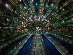
The studio responded to the brief with a multi-sensorial design, seeking to activate and energise the senses at every turn. Members enter through a kaleidoscope tunnel, a portal that separates the outside world from the club. Ascending the escalator, members arrive at the Rose Quartz reception desk, a 1.5 tonne rock crystal, mined from Madagascar. This 25 million year old mystical love stone emits energy under pressure – the piezoelectric effect.
One of Timothy Oulton Studio’s biggest projects to date, 1880 is also the first co-working space the studio has designed. “The workspace is different from a breakout space, which is what we’ve been known for, but now we’re learning both disciplines,” says Oulton. “The space is called Bardo, a Tibetan word that means ‘intermediate state’, just below heaven limbo an idea of blending work in. That’s what 1880 does – it blurs that line between work and leisure because there’s no such thing as a traditional work life balance anymore, its just life. My favourite features of the club are the reception desk and the kaleidoscopic tunnel entrance, it’s covered in mirrored triangles that play with the light. We wanted to create an experience that felt as though you were being transported into the world of 1880.”
One of the club’s highlights, where work and leisure blur together is The Double, a casual café in the daytime, suitable for relaxing or holding a business meeting, which dramatically transforms into an intimate, seductive bar at night. As the sun goes down, a hidden, fully stocked bar shelf is lowered from above, elegant lighting appears from the ceiling and the leather banquettes rotate to face the bar, cocooned by a sweeping silk curtain adorned with a golden dragon.
Reclaimed mahogany flooring has been used in The Studio, to allow for the array of casual and formal activities held here, black velvet drapery can be pulled back to reveal an entire wall of antique mirror panels when a more glamorous atmosphere is called for. Inbuilt cupboards made from reclaimed English timber house the technical equipment for the in-house cinema and
the wine cellar forms the backdrop to Leonie’s Restaurant, where burnt timber arches stand at just under three metres high. Multiple brass rods connect the arches, supporting 700 wine bottles, each one individually lit.
In the lobby, the Cabinet of Curiosities is filled with curios from Oulton’s personal antiques collection, while in the members lounge 360 antique English teapots are contrasted against a wall of reclaimed bricks etched with Chinese motifs. 1880 is built around the concept of colliding ideas, a place to forge unlikely connections. Old things need revisiting and rethinking, to be made relevant today.
The club’s curated membership of movers and shakers is a melting pot of personalities, including both locals and ex-pats, and Asian and Western influences have been incorporated throughout the club, along with feminine touches for a lighter atmosphere.
Versatility was a key element of the brief for Oulton, from private dining to board meetings, yoga, salon discussions and private events, the extensive programming in the club means that the rooms are in constant demand and serve multiple functions. “The brief definitely developed over time, the initial discussions we had with Founder, Marc Nicholson, were very collaborative as we began to map out how the space would be used, Oulton says. “The events programming followed later and with this the demands on each space increased. Every space needed to become more adaptable and flexible than originally discussed. We wanted to ensure that when you are in the space the design lends itself to how the room is being used at that time and elevates the overall experience.”
It was vital to the design that the different spaces in the club connect and the lighting is one of the main ways that this was achieved. The private dining room is styled quite differently from The Double, but the walls between the two spaces can open up if needed, connecting them for larger events. The feature lighting is the same in both areas helping tie them together when the space is opened up.
The lighting in Leonie’s brings a subtle elegance to daytime dining but in the evening the nine Night Rod pendants are much more of a dramatic, romantic feature of the space. Similarly, The Double which serves as a casual café in the day transforms at night to a theatrical but intimate cocktail bar: the banquettes turn, the silk curtain is drawn and the bar shelf and feature lighting descend from the ceiling. “We wanted the space to be almost unrecognisable after the transformation, and the lighting plays a really big part in that,” Oulton continues.
The feature lighting in the club was all made in-house. Night Rod, Core, Stellar, and Gradient are from the Timothy Oulton collection, Khan is from Halo Established, and the Flame bar lamp and Carrousel pendant were custom made by Timothy Oulton Studio. The Gradient pendant was chosen because of its impressive scale, which links with the feature columns in the Members Lounge and Leonie’s restaurant. Flame was handblown in the studio’s in-house glass workshop, the soft organic shape contrasts beautifully with the harder metallic lines of the bar while Carrousel draws its inspiration from traditional Chinese lanterns. Khan was used in the club lobby, its circular form and different sizes allowed the designers to play with positioning the lights along the entire length of the lobby as a way of connecting the different areas in the club and also to act as a subtle marker for some of the secret hidden doors.
“As with any project there is always some degree of modification as the concept develops and evolves but one thing that remained constant throughout was the dedication to using reclaimed materials,” Oulton says. “They’re authentic and they bring character to the space, which works together with other design elements to create a truly unique environment.
“With the lighting, we wanted to create an atmosphere that is comfortable but at the same time makes each individual feel special, it is the details and considered elements of the design that come together to do this and lighting is an important part of that.” 1880 is an environment designed to energise the senses and provoke conversation; every detail has been designed to spark the imagination. For Oulton, luxury is not about things, its about experiences, meaning and connection. “I wouldn’t change anything about this project, that’s not how we look at it,” he says. “The space was designed to bring people together, there will always be some elements that people might respond differently to but that’s part of what makes it interesting, it starts a conversation or a discussion and in doing so provokes interaction.”


