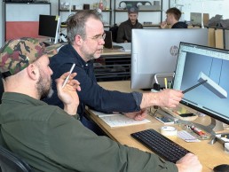
Samuel Lambert
One of Canada’s most energised hubs for collaborative design, Lambert & Fils’ founder, Samuel Lambert sat down with Editor, Helen Ankers to discuss his ongoing passion for materials, form and function.
The studio may be based in North America, but Lambert & Fils has created installations around the world – taking over displays at the Conran Shop during Paris Design Week, collaborating on Hermès holiday windows in Switzerland, and devising a grand floral installation with HAHA Studio during Stockholm Design Week. It has also designed lighting for the likes of Hôtel Bachaumont in Paris, Paramount House in Sydney and the Kinfolk gallery in Copenhagen, among many others.
Preserving the bond between design and making, all lighting is conceived, designed and hand-assembled in the Lambert & Fils atelier in downtown Montreal. Ahead of the studio’s latest product launches set for Milan Design Week – founder Samuel Lambert sat down with darc to discuss the shapes of life and unlocking hidden magic in a room.
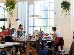
Having grown up in the Eastern Townships of Quebec, Canada, where his mother was a painter and father a ceramic artist, Lambert recalls how he was often left to his own devices… how there was always a lot of “stuff” around the house and in his parents’ studios – he soon became fascinated with the way things worked, how they were designed and was, according to his mother, re-assembling bicycle parts and toasters before he could read. “As a teenager I started working with my father’s kiln,” he says. “So that pulse of ideas, creating and making is a big part of who I am – it’s been with me for a long time.”
While the studio is now well established within the design industry, lighting isn’t an area that has always played a part in Lambert’s career, “for more than 20 years I worked in film and contemporary art,” he says. “Then, when I was almost 40 and my wife and I were expecting our first child together, there was a shift. I felt an urge to return to the basics, create something that I could dedicate myself to – I had this recurring feeling of wanting to make my son proud.
“It was a turning point for me. I’d always dreamed of having my own design studio, where I could conceptualise and create pieces; set down roots in a creative community like my father had done in the 70s. I quit my job and opened up shop in a small storefront on Beaubien St in Montreal. It was a full-circle moment for me… amidst all these reflections on legacy I named the shop Lambert & Fils (Lambert & Sons).”
Form is a huge component of Lambert & Fils’ work, particularly as the team begins to debut more contemporary lighting collections in more contemporary materials. The studio looks for ways to breathe new life into classic, archetypal shapes – creating dialogues between opposing materials, playing with scale and dimension.
“Materials have always been an anchor of my creative process,” continues Lambert. “In the original Beaubien location I split the shop into two sections – mid-century modern furnishings and in-house lighting that I started designing as I came across beautiful vintage materials such as coloured glass, milk glass and polished brass. I did a lot of custom work but it started to feel too complicated and I wanted to streamline the ideas into cohesive collections.”
This is where the Lambert & Fils Waldorf Collection was born. Combining an open hemispherical shade with a cylindrical socket cover, this composite shade is deployed in suspension and wall-mounted configurations with natural brass and powder-coated rods. As time has gone on the studio’s focus has shifted solely to lighting and many of its collections since have featured that nod to the past, invoking a vintage, romantic feeling into contemporary designs.
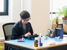
“We are inspired by the collective memory of the past and the future possibilities of lighting design,” says Lambert. “Through installations and exhibitions, we explore where our artistic and design practices can meet.
“Lambert & Fils is not about spectacle or fireworks. Our designs are composed of simple, honest gestures that feel meaningful and timeless to us. Behind all our own work is a reflection on form and materials; aesthetically, that shines through the design itself. I think our lighting makes you think about the many shapes of life – it aims to tap into a collective memory of architectures and objects.
“Even though we design our own collections, we also define ourselves as a collaborative lighting studio. We work with designers internationally to transform ideas and prototypes into collections. We challenge where art and design intersect through provocative lighting installations and exhibitions. On our own team, a design blossoms over time between different designers and editors. The creative visions are collective and constantly under investigation.”
One of Lambert & Fils’ latest collections, heading to Milan Design Week this year, is a wonderfully playful collection – Hutchison is a study of soft curves and hard lines, presenting a rivalry of vertical and horizontal forces, a play of scale and repetition.
“We summoned the archetypal shapes of Middle Eastern archways and Roman terracotta roofs,” explains Lambert. “Experimenting with how we could breathe these iconic forms into a contemporary pendant light.
“Alongside our new Sainte collection, Hutchison also continues our ongoing conversation with modular lighting. Alone, it self-defines as a very frank and decorative lamp, but in multiples, it invokes those classic architectures of columns, arches and pillars. This is what I mean when I say that as a studio, we’re interested in stirring a collective memory of shapes and forms.
“The Hutchison collection is a result of simple and honest gestures – it’s a piece that – at least for me – resonates in the mind long after leaving it.”
Each Hutchison pendant is composed of an aluminium base with a matte, textured finish that pivots attention to its contours and lines. Visually prominent suspension wires made from waxed cotton contrast the dense horizontal base – an interplay of mass and lightness.
“Aluminum was chosen for its flexibility, which was necessary to create the curves in the base,” says Lambert. “Initially, we looked into molding the forms and even considered concrete, but we found it was tricky to get the exact curves we were envisioning. Achieving the right angle was so critical and aluminium gave us the freedom to perfect the shape. For this fixture, we used our custom LED board that we designed in-house. We wanted the light to have multiple moods – being able to go from dim to warm and supply various forms of ambient light.
“We chose the matte textured paint on the aluminium because the curves can be highly reflective and transform the object under different shadows of light. We wanted to limit this and turn the focus to the form itself and the matte finish helped us achieve this effect.”
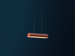
Lambert’s fascination with the iconic shapes explored in Hutchison came from an “overdose of seeing the archway shape being exploited in so many interior scenographies.” While it is a timeless form, he tells darc how he felt many iterations of it were being used superficially, “as sort of a trend component, not engaging with the history and collective memory of the shape itself,” he says. “That is what sparked Hutchison. I wanted to find something new in this form – a style exercise in how to aply the architecture of an archway into a lamp.”
For Lambert, most types of design involve the interaction of function and form and it couldn’t be more true for lighting design, which has so many considerations beyond the way it actually looks.
“There are so many components to take into account when creating fixtures – light quality and control, installation and wiring, the interaction of different materials and their light source,” he says. “The benefit of producing our designs in-house is being able to keep an eye on these considerations. We think about the people who will interact with the light over time and also the many types of spaces.
“Technology is also a big component of lighting design, something that always keeps designers on their toes. For instance, in the beginning, lighting design was appealing to me because it was easy to create spectacular effects with incandescents. When LED technolocy came around, it became more complex, but also more exciting – we now build our own custom LED boards to bolster the functionality of our designs.
“Ultimately, lighting should impose a scaling factor and function for all kinds of spaces, creating dimension and texture with any kind of ceiling height,” Lambert concludes. “Lighting should be dynamic and create a different ambience depending on the time of day. Lighting is a room’s link with intimacy, warmth, glow… it defines a space in how it creates forms through shadows and shine – it is the design component that can unlock the magic hidden within a room.”
