Glam Seamless, USA
Glam Seamless recieves a colourful, abstract make-over, which features pendants from Masquespacio, by New York-based designer Sergio Mannino
In 2019, interior architect Sergio Mannino worked on completing a new permanent space on West Broadway, New York, for brand Glam Seamless.
Having worked together previously on a pop-up space, the two reunited to create an artistic, chic beauty space in New York, with decorative lighting from Masquespacio that complements the pastel, abstract styling of the space.
“We had already worked with Glam Seamless in the past. We designed their first pop-up space on Broome street, which turned out to be so successful that the company decided to open a new permanent space on West Broadway; a better location in terms of foot traffic, only a few blocks away from the first one,” explains Mannino. “From start to finish it took about 3-4 months.”
Working under the constraints of a small budget to renovate the space, Mannino decided to keep a lot of the features intact, mostly playing with wall paint and furniture to create abstract shapes and textures throughout.
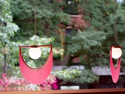
“The first space was characterised by a series of string curtains that defined the area and created different zones, separated from each other, without building actual partitions,” explains Mannino. “When we saw the lights by Masquespacio we knew right away that they were the perfect fixtures for the new space, as they had almost the same fringe curtain that customers had been accustomed to.”
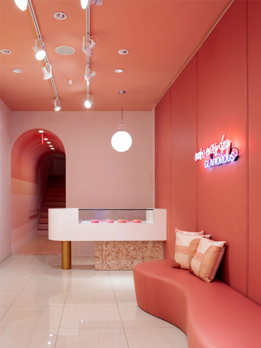
Deciding to leave a lot of the existing lighting untouched as it remained in keeping with the overall aesthetic, Mannino ensured to adjust the colour temperatures of the fixtures to create a comfortable balance. “The previous tenant was the Billionaire Boys Club, a well-known retailer that had built the space with a lot of attention to lighting. We only made sure the colour temperature of the fixtures was correct and we moved a few fixtures to the right places,” he says.
“There are two [Wink Houtique] chandeliers by Masquespacio at the entrance plus a custom-made pendant on the cash register (designed by my studio). In addition to that, we designed two neon lights in bold colours, one at the entrance and one inside the space. They serve as both lighting and feature pieces. We even see people taking pictures in front of it.
“The front space is a tall, double height entrance and placement of the lights was not an easy task. If you placed them too low, they are blocked from the street view, and if you placed them too high you couldn’t see them when you were inside the space. There is also a concrete fascia on top of the storefront that blocks most the view into the interior. In the end, we placed each item for a different point of view: across the street for high visibility and attraction, side approach from the sidewalk, and the view from the second floor when you are inside the space.”
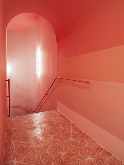
The aim was also to make the space as bright as possible to attract foot flow from outside. By doing this, the design scheme was mostly white in order to reflect as much light as possible around the space. “We placed extreme care in illuminating the two walls at the entrance where the gradient paint is featured. These two walls are an important part of the design and needed to be very well lit. Even by changing the position of the existing fixtures, without adding any new ones, we were able to accomplish our goals,” explains Mannino.
Taking a decision to not use a lighting designer on this project was possible due to the support of a pre-existing working relationship with Bill Pierro of Lido Lighting who is regularly consulted when Mannino and his team embark on new projects. “Lighting is a crucial element of any space and you need to pay attention to it,” concludes Mannino.
