Axis Communications, Sweden
Axis Communications is a Swedish security company that has been referred to as a success story in Swedish entrepreneurship. As market leaders in network video and video surveillance, the company has rapidly grown in staffing numbers since its inception in 1984, which has in turn put demands on larger premises in Lund where more than 2,500 employees are based.
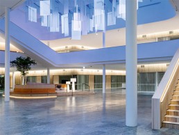
Fojab Arkitketer designed a unique new head office for the company, which was completed at the end of 2020. The 42,000sqm, 10-storey campus works as a meeting place and hub for all employees, with a roof terrace, sky lounge, around 150 meeting rooms, and six terraces. The entrance hall acts as the ‘living room’ for the company, providing a large daylight-filled space for welcoming clients, coffee meetings and as an exhibition space. The achievement also earned the building Sweden’s Most Beautiful Office award in 2020.
Talking about the lighting design journey for this illustrious entrance lobby is Fanny Englund, lead lighting designer on the project from Light Bureau. “At the end of 2015 Åsa Krantz, interior designer at Landén & Krantz, contacted me and wanted help with lighting design for the Axis project. I had worked with Åsa before on other smaller projects, and Åsa had been working with Axis for a long time with several different projects, developing their way of working and adapting their working environment.
“The project started with a pre-study and a workshop together with Axis, the architect, the interior designer (Åsa), and the electrical consultant,” Englund tells darc. “Together we decided on key words and set the brief for the lighting design with a focus on the most important areas in the house: the entrance/lobby with its atrium and gathering space, the external meeting rooms, the restaurant, the sky lounge and the terraces. Axis take pride in caring for its employees and creates a good working environment for them. Since they now built a house for themselves, they wanted it to be tailor-made for their needs.
“General key points for the design and for Axis as a company were a good and sustainable working environment. Sustainable not only for the environment but also for the social elements. Also, the building should be a place that boosts creativity, innovation and feels like a home away from home,” she says.
The brief given to the team for the lobby was to brand the space as Axis-specific, but subtly. Also, to provide an exciting, surprising, and impressive wow experience to draw people inside, meet in the central hub and move further into the building. The client also wanted to accentuate the surrounding wall surfaces to create a feeling of spaciousness and have a Scandinavian aesthetic that blended warmth and coolness together. It was important that it gave the first impression of being the beating heart of the business that pulsed with light, space, air, and energy, whilst exuding quality.
“After we set the briefs for the different areas, we delivered the light scheme and the design of a combined light installation and sunscreen for the atrium in the beginning of 2016, it was then handed over to the contractor.
“During 2016 – 2020 we were involved in commenting on the work of the contractor (who wanted to change a lot of things in the design), making the detailed design of the atrium installation, choosing the decorative lighting together with the interior designer and acting as a general support to Axis in the process.
“We had great contact with the client and the architects involved so there were never any problems making adjustments to fit our lighting design into the architecture. The biggest challenge was the contractor who tried very hard to make everything as simple and cheap as possible. We supported Axis with arguments and material many times during the way, and we made visits on site etc to ensure the design intentions were being realised,” explains Englund.
“The biggest challenge, design-wise, was the scale of some of the spaces. The lobby spans over two floors and a large atrium, with several stairs and has open views from the big restaurant and other surrounding areas,” she continues. “We handled this by lighting up all the walls around the lobby to frame the space and make it easy to orientate. Since there is a lot of meeting rooms with glass walls around the lobby, we designed integrated light for the curtains to be able to also light these vertical areas. We generally worked with hidden or very discrete fixtures so that the number of fixtures needed in a space this size wouldn’t be in focus. The space also had to be “filled” with something that, at the same time, didn’t take away the airy feeling. As a result, we designed the light installation in the atrium with a combination of opal and clear slim acrylic plates. Floor lamps also helped to create more human scale meeting places so that people would stop and inhabit the space, and not just pass through.”
The dramatic light installation visitors and regulars are greeted with in the atrium is very on-brand for Axis. It consists of a combination of opal and clear acrylic plates from Acrylite LED in various sizes, hanging in a zig-zag pattern. The clear panels are electrified and can illuminate in differing colours, whilst the opal panels reflect the natural daylight during the day, and the coloured light of the electrified panels in the evening. Reflections from the panels dance colour across the nearby walls and fill the room when the sun sets. “Because the movement of light is irregular and unpredictable with scenarios that do not loop, it feels almost alive,” reflects Englund. “The plexiglass installation can be compared to pixels, and when the colour moves from glass to glass, it’s a bit like information that moves in a digital cloud formation – a lot of similarities to the work of Axis,” she adds.
“For the architectural light we worked a lot with a combination of warm and cold light temperatures to create both an airy and at the same time cosy experience. The colder light (4000K) was used as the general light in the big lobby to enhance the daylight from the atrium and big windows. The walls and open staircases were covered in wooden panels so here we choose a warm light (2700K) to enhance the warmth in the material and to create a contrast to the daylight. When you reach the inner part of the lobby, where the internal workspaces are that have a more intimate scale, the light temperature shifts to a more neutral 3000K.
“We also made sure all the fixtures used had very good colour rendering and minimal glare to create a good working environment for the employees.”
The overall result and well-tuned balance between cold and warm light was achieved with a mix of decorative floor lamps, pendants, table lamps and wall lamps, which all contributed to the aim of bringing light and warmth down to human level. “The result of the contrast of cold and warm light worked even better when I saw the final outcome, from what I had envisioned,” says Englund. “It really gives a special feeling when you stand in the lobby. All the lighting of the vertical surfaces like wooden panels, curtains and walls also gives a great impression and describes the space very well.
“The decorative lighting adds the intimacy needed in places where you want people to meet and be social. The softness of the decorative fixtures used creates a friendly and inviting atmosphere that works very well with the general concept.
“All the decorative fixtures were chosen to fit the general concept for each space. In the meeting rooms they are enhancing intimacy and creativity, such as the Zette’z from Ingo Maurer and Dear Ingo from Moooi. In smaller meeting rooms and spaces decorative pendants also give functional light to meeting tables to create a more intimate atmosphere.
“In the sky lounge, the sparkling Raimond from Moooi creates a sense of luxury business and can be seen from very far at night through the big windows. The pendants are big but still airy, so as not to block the magnificent view.
“In the lobby the big floor lamps Big Shadow from Cappelini populate the large space and help bring down to human-scale to create inviting meeting places.
“The decorative fixtures are important to create the cosy and inviting feeling that Axis wanted and is supported by the architectural lighting to enhance the space and the interior design to make the whole building inviting and functional for work requirements.”
This project proved to be a unique one for the team to work on, as the client built its headquarters around the concept of it being a large house for its employees. This allowed them to design the space exactly as they wanted it. “In Axis, the architecture and lighting design was tailormade for them according to their wishes. This made the design process very fun and effective with a very close collaboration with the client and the interior designer,” says Englund.
“The most stand out feature is of course the light installation in the atrium. To get the opportunity to work with daylight and electric light combined in an artistic way was very fun. To suggest solutions like this is not unique but it’s not usual that the brief and design stays true through the whole process, unlike other commercial projects with budget constraints, for example.”
Upon reflection of the completed project, Englund claims to continuously be a student to her career. “You always learn something from every project. In this circumstance, I would probably have put more focus early on in the project on the control system to make it easier for the users to change their lighting in offices and meeting rooms. The control system chosen by the entrepreneur might fill our function requirement, but it doesn’t have a user-friendly interface. This just creates annoyance instead of the flexibility we were planning for.”


