Wyers Bar & Restaurant, The Netherlands
Wyers Bar and Restaurant is an art and ambience filled hotel close to Amsterdam’s Central Station. After studying the historical context of the restaurant’s location, Studio Modijefsky created an identity and interior for the new contemporary restaurant and coffee corner, that takes inspiration from the building’s former use as a Dutch fabric store called Firma Wyers, with the fabric industry a strong starting point for the concept of the new restaurant.
Analysing the space and its location, a new layout was developed for the restaurant where the orientation of the building and outside traffic played an important role in the design. Located on the busy intersection of a pedestrian street and the main road leading tourists from Central Station into the city, the design was created to filter the surroundings and establish a softer environment away from the hustle and bustle. A subtle transition in materials, from hard to soft creates a relaxing atmosphere in the interior of the restaurant.
Bright ochre colours stand out against the greys and greens while creating an accent in the entrance, which is clearly visible from the street, showcasing the restaurant logo and a mysterious portrait of a young girl shot by local Dutch photographer Maarten Schroder. A weathered wall in clay coloured brown welcomes guests into a warm and cosy dining area while olive green walls and banquettes give a nod to the site’s former history with the backs and seats resembling fabric rolls stacked in a store.
The building’s history works to further inspire and play a role in the design of the restaurant, as the design team uncovered a graveyard of tubing and insulation in the ceiling. Esther Stam of Studio Modijefsky explained: “The ceiling height was proving an issue for us and we wanted to open it up. This actually ended up working in our favour, we had no idea what had been hidden away until then and by this point we were already quite far into our drawings.
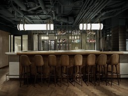
This discovery inspired the industrial design of the restaurant’s open ceiling and pipework, where custom made lighting was built into a tube that hang from inside it in an impressive and surprisingly cohesive feature. The lighting tube runs throughout the space reminiscent of a thread weaving through a piece of fabric; growing from the sculptural wooden banquettes, these spatial lines make playful curves transforming into a light tube before disappearing again into one of the walls between the windows.
“Every banquette has its own light thread that appears and disappears, highlighting the seating area,” says Stam. The lights are made from steel and lightly powder coated so that the texture still shows through, while the tubing and the globes are made from Perspex. “The bar is an abstract version of a weaving machine and we felt the lights should also feel like a thread winding through the interior.”
Decorative tubes hanging from the ceiling, lit by spotlights, shine onto the show kitchen front, illuminating the food being served. The lamps are curved in the lower part as half circles to form a roll that wraps around the show kitchen. Metal tubing also decorates the bar’s back wall forming the construction of the glass shelves holding the bottles displayed. The bar itself is a solid volume covered in end grain wood and off-white honed marble. The restaurant is finished with a dark wooden floor laid in a weaving pattern, which continues down to a lower level where the bathrooms are situated. Here, dark blue tiles complement green walls and custom made light boxes hanging from the ceiling shine onto green marble sinks. Special details give this space its own identity, such as the toilet rolls placed in the back wall, hanging like rolls of fabric.
“We wanted the space to be comfortable and accessible,” says Stam. “The brief was to create a space with a high level of service for a mixed crowd; the restaurant had to have a local feel in an area that is actually more occupied by tourists. There is a lot of foot traffic on the street but we had to think about making the restaurant stand out. The building itself doesn’t have the same charm as a lot of older buildings in Amsterdam, so we didn’t have that working for us, the historical architecture just wasn’t there unfortunately.”
Outside, to draw attention to the façade, Studio Modijefsky designed several lamps that highlight the entrance of the restaurant, a light box with a life size pin, an icon that marks the logo of the restaurant pinpoints the entrance to the restaurant from the hotel, then there’s Miss Louisa the little coffee shop on the corner, named after the founder of the fabric store J.P Wyer’s youngest daughter. Miss Louisa is a fun addition to the more serious restaurant space. A strong graphic appearance and a variation of black and white tiles combined with a custom steel light box on the brick façade attracts the crowds passing by.
Both designs are a welcome addition to the Kimpton De Witt, a chic and stylish hotel where the city’s history lives on and its pulsing energy thrives.
“All of the challenges the project threw at us worked in our favour, in a way,” Stem says. “The restaurant has a local flavour in a part of the city that doesn’t feel very local, but that’s what makes it different, the coffee shop’s small space makes it standout, they’re hidden gems and those things that you have to discover usually give you the most pleasure.”


