Arnhem Museum, Netherlands
Studio Modijefsky has created a new interior scheme for the Arnhem Museum in the Netherlands. darc speaks with senior designer Natalia Nikolopoulou to find out more about the studios approach.
Museum Arnhem, in The Netherlands, is home to modern, contemporary, and applied art and design, with a special focus on female artists. The public spaces were recently renovated by Studio Modijefsky, which included the entrance, café, and shop on the ground floor, plus an event space and activity room on the first floor.
The museum’s iconic dome is at the centre of it all, and Studio Modijefsky worked hard to ensure a new design language united these areas spread across the cavernous space. The design language was inspired by the building’s past and present; its origins as a gentleman’s club and the “Magic Realism” of the museum’s current collection. “While seemingly worlds apart, both these guises have escapism at their heart, from the men who used to evade everyday life to the artists creating fantastical takes on reality,” says the studio. “The new spaces designed by [us] take visitors on the same journey by playing with perspective and offering pathways into other dimensions.”
The museum’s core value: “from the heart, looking further, from now on and with quality”, is reflected in the new interiors of the building and its collections, which spread into new wings of the museum.
Senior designer on the project Natalia Nikolopoulou sat down with darc to elaborate on the museum’s new aesthetic that was completed in May 2022.
“Museum Arnhem approached Studio Modijefsky in the summer of 2020, and the initial brief was to create a design for the public spaces of the museum; main entrance, café, shop, and activity room. [They wanted] a design that represents the identity and values of Museum Arnhem, respects its surroundings, and the architecture of the building. A destination for art, culture, and nature lovers in a completely renovated building.”
One of the major challenges that the team faced when starting out on the design process was factoring in all the ideas, suggestions, and thoughts from different stakeholders. “[This] was challenging as they all had various and interesting points of view,” says Nikolopoulou. “The ability of Studio Modijefsky to combine and unite all these ideas was the turning point of this design: we overcame the challenge by translating the client’s own desires into a design that clearly speaks Modijefsky’s language.”
Using a selection of bespoke fixtures designed by Studio Modijefsky and created by Signwise, Fiction Factory, as well as some architectural pieces from Modular, a stunning aesthetic was created throughout the museum.
In the entrance, the “Magic Realism” atmosphere begins with a bespoke lightbox hanging above the reception desk, mirroring the desk’s shape. “ It’s a floating version of this piece of furniture hanging above. It’s made like a kite, with sticks that span from corner to corner, and uses the fabric that is also used for kites,” describes Nikolopoulou.
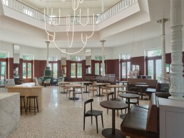
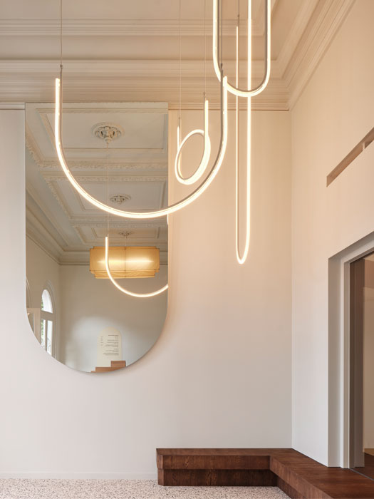
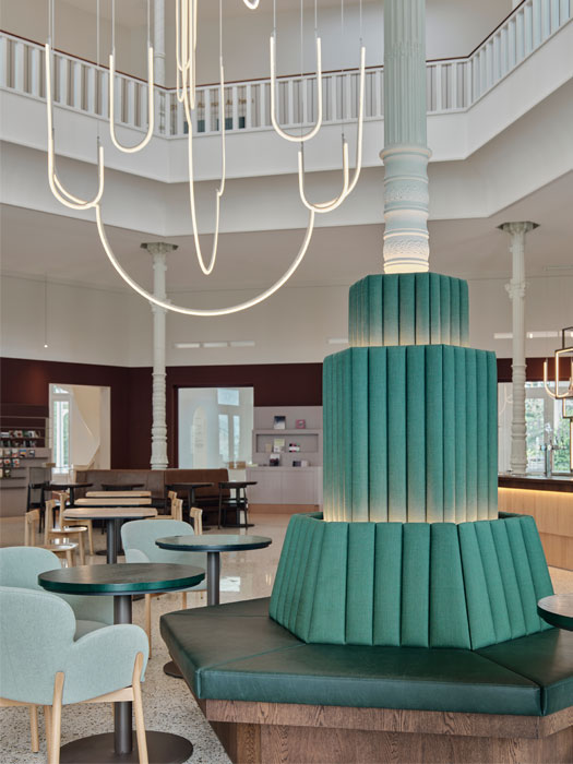
A small (by comparison) chandelier hangs in solitude hinting at its larger version that is yet to be seen on the other side of the entrance. Moving through into the dome area, visitors can enjoy an open-plan zoned space that houses the café and museum shop. Each area is distinguished by a unique identity and set of materials that are linked to different themes of the museum’s collection. Eyes are drawn to a large custom-made chandelier that makes full use of the dome’s impressive height and unites the space. Formed of illuminated curves in different shades of white that hang together in a cluster of varying heights, the chandelier’s shapes mirror the outline cupola above it and the windows above.
Nikolopoulou adds: “The chandelier is inspired by the architecture of the building. Taking the outline of the building’s dome and the outline of the windows situated in the lantern all the way to the top of the dome – we created two basic shapes, that we flipped upside down and used to compose a spatial arrangement with.
“The chandelier elements are divided into groups; each group slowly glows at its own pace.
We wanted illuminating tubes that give light in every direction so we used a system of custom LED tubes, a product we discovered through the executing party. It works really well and provides the same neon tube effect that we were aiming for. The LED tubes are a bit bigger than standard neon tubes, which works well with the proportion of the dome.
We programmed the three-tiered clusters of light to slowly pulse throughout the day.
“A smaller version of the grand chandelier hangs in the entrance of the museum, which can be seen from the outside looking in. And, a second even smaller one appears when standing in the entrance area looking through a window into the dome area, right on the ceiling close to the entrance space. This one leads the visitor to the dome where the big chandelier greets you the moment you enter the space.”
In order to support this grand chandelier, a special suspension system was installed to ensure the piece hangs comfortably and safely in the centre of the dome. A high seating area, characterised by a lilac backdrop behind the bar, has mirrors to reflect all the colours and structures used in the seating area. As they are positioned higher than the dark wooden plinth, they invite visitors to look up at the reflection of the chandelier. The activity and event space on the first floor also benefit from the large chandelier that transcends this floor, enlightening it throughout at different heights and points.
Speaking of how the decorative lighting elements worked alongside the architecture, Nikolopoulou says: “The existing building served as a blank canvas upon which the design was drawn. Its architectural features are enhanced by the custom furniture that wraps around the monumental columns, delineating the perimeter of the café at the very centre of the area. A lower darker layer creates a contrast with the brightness coming through the big windows, leading the eye towards the dome where the custom chandelier lightens up the entire building.”
Reflecting on the project, Nikolopoulou concludes: “With the collection moving into the new wings of the museum, the interior of this monumental building became a work of art itself, expressing Museum Arnhem’s core values, inviting the visitors to escape reality in their new surroundings.
“A museum inspires you in a different way than a bar or a restaurant. To unite the areas spread across this cavernous expanse, we created a new design language inspired by aspects of the building’s past and present.
“If [we could have changed] anything, we would add back an initial element of the design, which was let go during the process – a large yellow mirror behind the entrance desk. This large mirror was supposed to be placed parallel to a silver mirror, creating a series of smaller and smaller reflections that appear to recede to infinity. This would have transformed the main entrance into a piece of art itself, inviting the visitor into an infinite mirror play. I hope that this feature will be eventually realised.”
Images: Maarten Willemstein
