

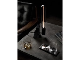
EOQ Collection
EOQ is a lighting company rooted in the spirit of industrial adventure, it delivers classic design principles using a new and constantly evolving vocabulary. Brand Director Matt Pepper took time out of his busy schedule to talk us through their processes and why working with aluminium is a surprisingly flexible and sustainable solution.
How and why did EOQ begin working with Aliminum?
Michael Young and I founded EOQ to create a platform for selling his celebrated Chair, 4a - an aluminum chair developed for a small restaurant project that had received a lot of attention due to the way it married form and function so elegantly. Developing this chair and the Bramah lighting range took us on a journey together along with an aluminum factory we both had close ties to, which happened to specialise in highly engineered components for the electronics industry. We all understood the material but every process and development for these products was new territory for everyone involved. This context has driven an innovative approach from the start.
Why is aluminum important to EOQ as a brand?
It is not only the world’s most abundant metal, it is non-toxic, rust proof and infinitely recyclable. It is also one third of the weight of steel and once alloyed it is stronger. We work with recycled raw material which, when designing products offers us a large range of production processes and finishes.
Could you talk us through the design and manufacturing process of your first ever product?
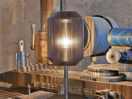
For our first pendant light Bramah we took inspiration from a heat sink. We spent some time studying the optimum extrusion dimensions and calculating our best guess initially at how thin and how many fins we could practically manufacture to create the lightest and most refined design. We have worked exclusively with Michael Young Design Studio for the first few collections who have been invaluable in defining the products in the context of the factory and its expertise and capability.
Michael knew he wanted to try and remove the core of the material to open up the structure and create the transparency needed to allow the light to diffuse through the fin, but that this wasn’t something that had been done before, so the process was challenging. Having discovered it was possible to kill out the core material to open up the fins and allow that transparency, we soon discovered that such fine aluminium fins did not respond well to the vibrations created by spinning at speed on a lathe. Many long weeks were spent refining the process to include packing the spaces between the fins with gypsum to reduce vibrations and wastage in the milling process. All of our lighting is predominantly made of aluminium, Bramah, Joseph and Dub.
How well does aluminium interact with glass?
It’s not so much that aluminium interacts differently with glass compared to other metals, it’s the surface treatment / finish that we can apply that works so well with glass. All of our products are anodised to a very high standard; this finish allows us to deliver any colour and a reflection that creates a synergy with the properties of glass.
How do the different treatments and finishes of this material affect how it interacts with light?
When the anodised finish interacts with light it causes a soft reflection that disperses across all the surfaces and delivers the light throughout the whole product.
What’s next for EOQ and aluminium?
We are midway through developing a new range of lighting with a very talented British designer using a simpler extrusion and I’m quite excited about the application of our anodising on a larger surface.
Sabine Marcelis
“I love neon” proclaims Dutch industrial designer Sabine Marcelis from her Rotterdam-based workshop and studio. An uncommon favourite amongst lighting designers, neon is not your typical go-to light source. Even so, Marcelis has managed to make neon sexy, if not totally chic.
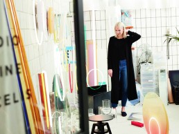
We’re sitting together in a small office on the ground floor of SuGu, a creative workspace and warehouse situated on the port city’s western shores, while the rest of the team is out for lunch. Dressed in minimalist navy blue threads, Marcelis is all energy behind a clutter-free desk. A series of bookcases containing inspirational literature, artifacts, and many, many samples lines the walls, supplying a colourful backdrop to the industrial surroundings. A Voie table lamp resting precariously upon a pile of books casts a soft halo behind her.
“I definitely wasn’t someone who knew what I wanted to be from an early age,” she confesses. “I’m very intuitive, and have always enjoyed creating things. When I was young, I used to sew bags and try to sell them at the markets where my parents sold flowers. I never had a clear sense of what I wanted to be, I was just doing things that I liked at the time.”
Born and raised in Krimpen aan den IJssle, a suburb of Rotterdam, Marcelis is Dutch by nature but a Kiwi at heart. At age nine she and her family left their native Holland and emigrated to Wellington, New Zealand. It was there that, as a teen, she discovered her passion for sport, and first learned to channel her creativity into the physical world. “When I was sixteen I got really into snowboarding, and so that took over my life for a few years. I completed my last year of secondary school at an Outdoor Pursuits college, where you go rock climbing, skiing, and things like that. It was a really great experience, a very different kind of learning,” she says.
After stints working as a snowboard instructor in New Zealand and on Canada’s Whistler Mountain, Marcelis decided it was time to carve a new path for the future. “I realised I couldn’t earn a living snowboarding, so I was like, OK, I’ve got to learn something and get a degree. My sister studied industrial design and I really liked what she was doing, so I decided to give it a go. I couldn’t imagine doing anything else now,” she adds.
Marcelis enrolled in a local design program, and was instantly hooked. “I was quite lucky” she says, alluding to her impromptu decision to pursue design. Two years into her studies she decided to take things a step further and applied to courses abroad. In search of a “more poetic way of working,” Marcelis enrolled at Design Academy Eindhoven and made her return back to the Netherlands at 21.
“I definitely feel like I got a good education in New Zealand, but it is was a very traditional way of teaching industrial design. DAE offered a more realistic approach, one that’s closer to the real world. As a student, you’re left on your own to find materials and machinery. It taught me how to be resourceful and how to work creatively with others,” she says.
The Academy turned out to be just the right match for Marcelis, who thrived in the program’s hands-on and explorative approach. “I have a very driven personality. I want it my way and I’m not afraid to fight for it,” she says, reflecting back on her final graduation project, House Wine, a nifty DIY winemaking kit that turns fermenting wine into a work of art. The project, which would be extensively published and earn Marcelis her first gallery commission, was not exactly what her professor had in mind.
“He saw it as a sort of bread maker, something for your kitchen table, and I was like ‘NO, that’s not it at all! It’s like an aquarium in your living room!” she says, laughing. “We really couldn’t understand each other. It taught me that it’s OK not to agree with everyone, and that you need to fight for your views and bring the right arguments to the table.”
Marcelis’ uncompromising determination and vision has played out into her professional career. “I feel like I work quite selfishly because everything I do is out of a personal interest or fascination. If something doesn’t interest me, I won’t pursue it. I want to explore and challenge myself with the work I do. I think that’s always been a very important aspect of my work.”
Marcelis opened up shop in 2011, working first as a freelance designer before devoting herself full-time to her personal research and work. “I haven’t had to actively pursue work myself, I’ve just been doing my thing in the background, and in the last few years people have started noticing and taking an interest in me and my work. Now it’s more about saying no to things and being selective of who I choose to work with.”
For a young designer, still at the bud of her career, Marcelis is extremely disciplined. “I don’t want to repeat myself,” she says. “I don’t want to keep making the same things over and over again. Of course, there’s a red thread that runs across my work, but if there’s the possibility to do something custom or specific to the project, then that’s definitely my preference,” she adds.
While Marcelis’s body of work is varied, ranging from custom interiors to ticking clocks, the shining theme that unites them all is, as she explains, “this fascination with light, both natural and artificial, and how, when combined with other materials, light becomes a tool for seeing something other than you’d normally see. It’s all about creating a moment of wonder. Resins and glass are the perfect materials for that,” she adds.
Marcelis, who works almost exclusively with glass and resin, started experimenting with the materials during her studies, and remembers being immediately impressed by their versatility. She soon started adding colour to the mix and found that the effects, especially when combined with light, were nothing short of mesmerising.
“My fascination with glass and resin started simultaneously. I constantly have projects going on. Everything is a continuous evolution, you do one project and you find specific opportunities within that production - a way of producing or working with a material - and then that can be pushed again within a different scale for a different result. Basically, the projects just keep building on top of each other,” she explains.
Marcelis’ love of neon started in 2014, when she was invited to show in a joint exhibition with Dutch designer Luc Van den Broeck in a gallery in Copenhagen. It was there that Marcelis first presented Voie, a series of neon table lamps cast in solid resin cubes.
“At this point no one knew who I was, so the gallery really took a wild leap of faith on me. I was already working with resin, and somehow knew I wanted to work with neon. I asked myself ‘what is the unique quality of neon?’” A question to which she immediately provides an answer: “The light itself is the material, it’s really a physical thing. You could just have a single neon light on it’s own and it becomes the object, something you can’t achieve with LEDs, for example,” she says.
“For Voie, I wanted to see what would happen if you added another material to neon. I did a lot of experiments where I would mix different pigments with the resin. First it was about seeing what happens to the light when it goes into this other material, so creating this clear difference between light on it’s own and light in combination with another a material. Then at some point it evolved into the light being completely encased in resin,” she explains.
Voie quickly turned to Dawn, a collection of atmospheric floor and wall-mounted lights where the neon light never leaves the object. In the case of the Dawn lights “the difference in the resin, what happens within the object, is what manipulates the light,” she says. It’s all about manipulating light. A lot of my projects touch on this,” she adds.
For Filter, a series of lights commissioned by Hi-Macs, Marcelis worked in reverse, using light to transform the encompassing material. “I wanted to show something that you wouldn’t otherwise be able to see,” she says. “When the light is on it brings the textures in the Hi-Macs material to the forefront.”
Marcelis has recently started experimenting with interiors, working alongside renowned Dutch architectural practice OMA on projects in Paris and Berlin. Designed by OMA, the projects dazzle with mesmerizing materials and lights by Marcelis. The Repossi store, which opened its doors last year, flaunts a shining display of aluminium, laminated glass and mirrored panels, all crafted by our lady of the hour. For the entryway of OMA's redesign of the KaDeWe shopping centre in Berlin, Marcelis used strips of lights in resin to create an ethereal sense of exaggerated depth.
This September saw the opening of her biggest interior project yet with the new Salle Privée flagship in Milan. Again, playing with resin and light, Marcelis drew from existing frescoes to give shape to a series of semi-transparent displays that radiate with colour, and a brilliance all of their own.
“I like working in different contexts,” she says. “I don’t want to feel confined to one thing.” When it comes to interiors “it’s about appreciating how you move through a space, of creating experiences. I don’t make anything mass produced,” she continues. “Like my objects, which are numbered or limited edition, the spaces I design are one-offs. I don’t want to make something you can buy thousands of.”
Marcelis has seen success relatively early on in her career, and is careful to point out that she has plenty still to explore. “I’m very cautious of not wanting to become this one-hit-wonder, and am constantly experimenting and trying out new material combinations. Next year there will be a whole other body of work that will be released, that doesn’t necessarily follow the same thread.”
She hints at metal being the material of choice in 2018. “I can’t say what it is, but it will definitely incorporate light,” she assures me.
For the diehard snowboarder-turned-designer, inspiration is as much in the eye of the beholder as it is in the physical world. “A lot of my projects are about mimicking things in nature, but in a very artificial and abstract kind of way. It’s about using your eyes and your mind, and not relying on Pinterest and those sorts of things for inspiration, because, inevitably, you’ll end up with the same designs as everyone else, and you definitely don’t want that.”
The Native Hotel, US
The Native is a boutique hostel, café and event space designed for the epicurean traveller and locals alike. It is nestled in an existing two-storey late 1800’s stone warehouse and a mid-century brick warehouse right in the middle of the upcoming transit-oriented development adjacent to downtown Austin, Texas in the US.
Un.box studio utilised of rich palette and textured materials, a theme aptly referred to throughout the design process as ‘dark and stormy’. The result is a truly unique communal experience that offers affordable rates with impeccable style at the nexus of development in Austin.
Owners of Native, Michael Dickson, Antonio Madrid and Will Steakley approached principal designer at Un.box, Jared Haas when they first obtained the lease to the property. “The owners did not have a fleshed out concept, they initially thought it would be a boutique hotel and were circling through many different programmatic concepts,” says Haas. “Regardless, we were all set on creating a community and a culture. The owners started to realise that the market for high end boutique hotels is over saturated the affordability crisis in Austin doesn't just affect the locals, it affects tourists too, so starting a hostel was the best solution.”
Un.box Studio spent about six months fleshing out the different concepts within the existing space, locking down a final concept proved a challenge, “we truly believe in a think twice, act once policy when it comes to design but in this case it was think 10 times, act once, but the extra effort shows.”
A lack of historic buildings in the area made the property a sought after space and the designers worked hard to preserve its historical charm. Certain areas were left untouched or exposed, historic etchings and stencilling are left on show and the building's original stone, brickwork, wood and steel structure can be found throughout the building.
“Most projects in Austin are newly constructed, relative to other cities in the US," says Haas. "Austin does not have a strong building history. There are very few older buildings standing or buildings that were built well. It was important that we not only preserved as much of the existing elements as possible but to celebrate its beauty.”
The rooms are an eclectic mix of old and new, tied together with the eventual dark and stormy concept. The lounge area features leather seating, fabric sofas, patterned rugs and hanging plants while the oversized 1960’s inspired Capiz shell globes by Restoration Hardware lend a softness to the space, facilitating the feeling of home.
The café and bar area opts for deep blue banquettes illuminated by Barn Light Electric Wesco Gooseneck Lights, modified with gold leaf to give them a warm amber glow. The dorm room’s feature bespoke steel bunk beds equipped with privacy curtains and nautical inspired CB2 globe pendant lights. With the main part of the building being a former warehouse, there is very little natural light in the space so the natural light that was available had to be utilised carefully and a dark and stormy theme was adopted in the darker areas of the space.
“We placed the café in the one space where natural light was most abundant and added skylights in the main communal space outside of the bunk rooms. All other spaces were intentionally left dark with very dim lighting to help create a soft and warm mood,” Haas says.
The lighting had to turn from day to night seamlessly, something designer Joel Mozersky considered carefully. “Originally there were a lot of custom fixtures designed, due to budget and other constraints some of those were edited. We did end up designing the sconces with Warbach Lighting and Design and modifying others, though I would have loved to be able to commission more custom lighting but ultimately it turned out great.”
Although the venue is open, the concept is still considered an experiment and is constantly shifting. The owners recently acquired the adjacent vacant space and have turned it in to an open event space, which host’s musicians and DJ sets weekly and is also available for the general public to rent.
“There are a few ideas that we floated with the owners that we agreed to put off into later phases,” explains Haas. “In particular, we wanted to create an outdoor garden/event/ café space with a pool. We typically design our projects to tie our buildings interiors with the exteriors and I would love to open up the back of the hostel to tie it in to a communal garden area per our initial intention. Fingers crossed that it could happen in the future.”
Hotel Es Vive, Ibiza
Upon stepping inside Ibiza’s Hotel Es Vive, guests are met with tropical palms, brilliant white walls, an inviting pool and the chilled out beats of a poolside DJ. From the inception of Hotel Es Vive in 2000, when owner Jason Bull and interior designer Sean Cochrane of Cochrane Design put their heads together to create an Ibiza destination with a difference, an Art Deco haven for health-conscious hedonists was born.
The award-winning hotel takes inspiration from the 1940s, mixing bold lines and sweeping curves of the time to capture the essence of a bygone era. Full of elegance and fashion, the unique rooms and suites at Hotel Es Vive have been lovingly designed to perfection, with every room and suite offset by a luxurious marble bathroom, stylish furnishings and equipped with all the facilities a guest could wish for from a luxury hotel.
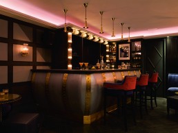
The Experience Bar - one of three established bar/restaurant areas at the hotel - was recently redesigned by Cochrane and reopened on 30 April this year. With no fixed brief to work within – apart from to create the most amazing late-night lounge on the island – Cochrane’s existing knowledge of the building dictated the design, as he explains to darc: “The hotel’s culture is very much entwined into all of our schemes. In terms of the lighting, we complimented the interior design of the Experience Bar by using multiple layers of light to help bring each space and area alive over the varying moods during the day and night. All of the lighting designs are timeless and have a warm ambient glow to them.
“There are five different lighting heights in The Experience Bar, which allows more flattering lighting in the evening while illuminating the tables sufficiently so that they are functional.
The hotel is one of the few remaining listed buildings in Ibiza and Cochrane and his team had to work around a number of constraints and structural limitations when working on the Experience Bar, with that in mind, lighting placement was even more of a consideration. “We used many different levels of lighting to achieve this,” says Cochrane. “And the reflected qualities of the new curved metal wall sections complemented this, helping to direct small amounts of light into darker areas of the bar.
“Because the building is listed we needed to develop a room inside a room because of the structural limitations. To overcome this, we split the area into two VIP booths and lit them both separately. The booths are needed to convey privacy and a sense of VIP separation; by adding low lit opulent lighting that is different to the rest of the bar, we were able to create secluded areas that have affluent ambiences.
“We combined the Art Deco heritage with nautical twists and turns of a 1930’s cruise ship to create a completely new concept for Ibiza. Whilst we wanted to create a punchy and modern design, we also brought a feeling of Deco grandeur into the lighting through the use of ribbed glass, brass finishes and subtle geometric patterning.
“The timeless concept for the lighting and constant warmth from all light sources blends the decorative and architectural elements seamlessly and I am very happy and proud of how the project turned out. We designed everything within the project and Es Vive is a personal favourite of mine. I wasn’t asked to just create bar, but to create something special and so that is what I did. Lighting is everything in a bar, so here, we had to pay even more attention to it.”
Liberty Commons, Canada
A generation ago, Toronto’s Liberty Village was barely post-industrial, its landscape still dominated by abandoned munitions factories and railway yards. Since the 1990’s, an astonishing transformation has seen new towers rise between these old red-brick buildings - now converted in to trendy lofts - as younger generations have flooded to Liberty Village to live, to work at a growing number of tech and design firms, or to simply enjoy the vibrant atmosphere of a neighbourhood on the rise.
Restaurateurs Oliver & Bonacini along with Albertan craft brewer Big Rock recently collaborated to create Liberty Commons at Big Rock Brewery, located at 60 Atlantic Avenue, a key node in Liberty Village. Local firm DesignAgency was tasked with converting the 7,400sqft interior of the exemplary former warehouse into Big Rock’s first hospitality location in Ontario. DesignAgency created interiors that celebrate the connection between beer and food and appeal to the district’s style-conscious residents. Part vintage speakeasy, part modern tasting cellar, Liberty Commons has an atmosphere that’s polished, yet casual.
Inspired by the surrounding setting of Liberty Village, Allen Chan, Founding Partner of DesignAgency wanted to showcase the neighbourhood’s industrial past as well as it’s design driven future. “We wanted to create a hospitality space that would appeal to Liberty Village neighbourhood’s youthful and creative spirit,” Chan tells darc. “We also wanted to create a setting to highlight the brewing process and a design that spoke to the process of beer production and how that inspires the menu.”
To give the interiors a distinctive character throughout, DesignAgency blended sophisticated finishes and paired them with reclaimed and industrial objects. The space features reclaimed surfaces, including masonry and wood slat elevator screens, while large original wooden beams contrast with sleek geometric tiles, leather banquettes and polished wood and marble tabletops.
An array of unusual lighting elements illuminate the restaurant space, including an impressive custom Yoki Milke copper pipe and valve light fixture above the bar. VISO globo suspension lights provide guests with a warm welcome in the entrance, whilst the Milke Bau multi-arm chandelier wows on the stairwell. Restoration Hardware’s Factory filament smoke glass funnel pendants run through the centre of the dining area, illuminating the tables below, whilst Milke Bau Glass Cylinder pendants highlight the booths and tables at the side of the room. Barn Light Electric’s School House copper LED cord hung lights adorn the restaurant’s window, in keeping with the industrial heritage of the space.
“Liberty Village is going through a huge transformation and part of that transformation is about preservation and how we can beautifully merge the old with the new,” Chan explains. “We wanted to pay homage to the history of the building by bringing to the forefront as much of the building’s character as possible, we also custom designed the ‘I don’t give a sip’ neon art piece in the downstairs waiting area, which glows above some vintage lecture hall seating that we found. The juxtaposition is quirky, flashy and a bit irreverent all at once.”
Fire related code constraints required some creativity to work around - unable to puncture the dry wall ceiling, DesignAgency created a hanging system of decorative lights that snake around the space and drop down where needed most. “We were tasked with giving new life to a dark, leftover basement so we had no choice but to work with the low ceiling height in this project. We would have potentially gone darker with the paint on the ceiling, but it would have felt too oppressive.”
Surprisingly DesignAgency did not work with a lighting designer; instead they brought in an electrical engineer to deal with the calculation requirements for code. “In a lot of cases, we design all the lighting and have it fabricated to our specifications,” says Chan.
The result is a space that’s part vintage speakeasy, part modern tasting cellar and pub with a polished yet casual and warm atmosphere; thanks in part to a clever, layered lighting scheme. “Lighting is crucial to any successful project – ambience is everything. Without proper lighting you might as well give up. It creates the mood and the atmosphere; good lighting can make people look great at the worst of times.”
Capri by Fraser, Germany
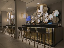
In the heart of Berlin, Germany, Capri by Fraser brings its unique design-led style to this cultural and diverse city. Located on Museum Island, this brand new hotel residence is only a short walk to the famous museums in Berlin's historic centre and guests can choose from 143 stylish serviced apartments, ranging from studios to one-bedroom units.
Designed around the ‘always on’ needs of today’s travellers, Capri by Fraser Berlin features carefully curated art pieces that make each property unique and offers floor-to-ceiling windows with stunning city views. Interior designers JOI-Design were appointed by Frasers Hospitality to design Capri by Fraser’s first German property in Frankfurt, which completed in August 2015. Its interiors were true to Capri by Frasers’ brand of fun, playful apartment hotels for plugged-in, globetrotting professionals that also have a strong sense of place.
When Frasers Hospitality acquired the site on Spree Island, they brought JOI-Design on board once again to develop interiors that were as vibrant and exciting as the previous Frankfurt project and which, as before, celebrated the hotel's location. This time however, the location was extraordinary – atop an archeological site that showed structural traces of how the area has been used in centuries past.
Excavation works carried out between 2007-2009 revealed the island to be the birthplace of Berlin and as such, the designers were keen to showcase this heritage within the contemporary spaces. This fresh and modern long-stay apartment hotel encourages guests to learn about the site’s past in a fun and engaging manner.
The lobby for example, affords guests a unique opportunity to interact with the site’s remarkable legacy. An eclectic array of vibrant furniture allows for flexible configuration atop a tempered glass floor, immersing guests in history as they peer into the archeological dig below. Overhead, a shimmering gold wall-to-wall installation features hexagonal mosaics and perforations that frame a black and white etching of the Spree River’s island and its ancient structures. Layered patterns recur throughout the hotel’s interiors, including the lobby seating groups where rugs are decorated with hexagon blocks and stencilled art employs superimposed circles to inject creative energy. Timber shelves strung onto colourful ropes suggest the notion of being suspended between time and space. Lighting within the hotel was of exceptional importance to the interior design and according to JOI-Design, offering different light moods in the public areas was particularly crucial as they allowed the spaces to be completely transformed from day to night.
“We chose decorative lighting that would emphasise our concept's playful spirit and echo other elements within the design,” says Peter Joehnk, Co-Managing Director, JOI-Design. “Moolin floor lamps and pendants surround seating areas in the lobby and illuminate the bar. Their bamboo ribbon shades cast lined shadows across the walls, a repetition of the patterns created by multi-coloured strings hung from the doorways as an allusion to the graphic depiction of timelines. Hotellicht pendant lights suspended in a zigzag pattern also suggest the charting of time.
“Bespoke Hotellicht table lamps and pendants made from stacks of colourful globes emulate the lacquered spheres strung into the floor-to-ceiling shelving units. These shapes can also be seen in the quirky, contemporary artwork streamlining these elements within the design scheme.”
Working in close collaboration with lighting designer Raoul Hesse of Lichtvision, the teams talked at length about technical planning, site-specific information and installation to develop seamless mood lighting for all public areas.
“JOI-Design’s idea was to use decorative lighting fixtures designed in layers – an outer filigree layer or opaque material and an inner transluscent layer that hides the light source,” says Hesse. “For the different rooms with their different functions, other luminaire types were proposed – this was due to the fresh and young atmosphere that was the design intent. The decorative lighting elements work as part of the furniture - it integrates into the young and vivid feeling, using fixtures that are en vogue, such as cage luminaires.”
Guestrooms at the Capri by Fraser Berlin have been designed to feel modern and bright yet comfortably relaxed. Elegant oak detailing and floors enhance their cosiness, while stylish yet durable modern furnishings in muted orange and pink tones bring understated warmth and a sense of wellbeing for longer-stay residents. Once again, the heritage is an important reference point with laser-cut wall panels that reveal in orange and pink a map of ancient Petriplatz. The historical reference is also depicted in the abstract rug pattern.
Lichtvision was responsible for both architectural and decorative lighting elements throughout the hotel and as such the relationship between the two is based on a common concept, as Hesse explains: “Architectural lighting stands back in recessed ceilings and is as discreet as possible – while decorative elements do as they are supposed to – decorate the space.”
Good lighting is crucial for interior design to be successful, according to Joehnk. No matter the quality of materials used or the finesse of the concept, without the correct type and level of illumination, guests will not be able to fully appreciate them.
In terms of challenges, according to Hesse, the client set higher luminance levels than you would normally find on a project like this and as such, Hesse and his team proposed luminaires with the latest technology including LED. This of course had an influence on the budget: “Although the budget was defined in ‘pre-LED times’ the daily design process was based on LED-techniques,” Hesse says. “On one hand Fraser appreciated this but on the other, were not willing to change the budget as this was a main focus of the project. In the end we had to make the decision to specify discharge lamps.”
“It was a unique and humbling experience to work on such an important historic site,” concludes Joehnk. “We wanted to preserve and showcase the excavations, bringing Berlin’s origins into the design. However, we also needed to create a concept that reflected the values of the brand, which is young, fun and playful. This was a challenge, but one we truly relished.”
Bellavista del Jardin, Spain
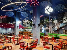
Located in the Eixample district of Barcelona, Bellavista del Jardin del Norte is the brainchild of the Iglesias and Messi brothers who, from the very beginning of the project, wanted to create a ‘town’ we would all like to live in.
Working hand-in-hand with interior designers El Equipo Creativo, lighting designers BMLD reinterpreted the two key elements of the town the owners' envisioned nature and the lights that adorn the patron saint festivities of Spain.
Formally an office building with a fantastic garden at the rear, which was unavailable to the public at the time, the ‘town’ of Bellavista includes a garden, cinema, town square, church, local pub, barber shop, newsstand, corner store and flower shop.
BMLD’s strategy throughout was based on a two-part design: visible decorative lighting that provides the required ambience in each part of the restaurant, accompanied by almost invisible architectural illumination that allows suitable levels of light in each space. For each scenario BMLD came up with different, innovative lighting solutions, for example the Plaza a six-metre high space which ends the tour of the ‘town’ under a sky full of fireworks. Brigit Walter, head of creative direction at BMLD, designed a special set of different disc-shaped structures, hanging luminaires and shadow producing ceiling lights at different heights to evoke an exciting climax, an explosion of light and shadow.
"The overall design and development of the project took three months, whilst the construction took around nine months to complete," says Walter. "From an operational point of view the space is used 24/7 all year round, mornings for breakfast and brunch and later on for lunch and dinner which is served throughout the entire lower floor. The upper floor houses the VIP areas, restrooms and conference rooms, so coming up with an all day concept that divides the venue into smaller spaces with different atmospheres was a challenge.”
Due to the peculiar brief, custom tailored solutions were required as Walter explains: “Once the conceptual design was approved mock-ups were conducted and during the process, special attention was given to the custom elements, their proportions and balance within the space, detail and integration.”
Bellavista guests are greeted by thousands of luminous flowers hanging from the ceiling at different heights, a system the BMLD team designed. Strips of lamps are fastened by tension wires and clamps that adjust the position of the lights to create a natural spontaneity. Across the space to the greenhouse, vegetation takes the spotlight and hangs freely from the ceilings, lit to showcase its beautiful green hues and bring the outdoors in. Scores of yellow flowers hang from the ceiling in the flower shop accompanied by garlands of light while a rail luminaire illuminates the flowers from below, causing shadows that produce a three dimensional effect.
“The original brief didn't change much over time,” Natali Canas del Pozo, architect at El Equipo Creativo tells darc. “The restaurant design translates the idea of daily life and the festive spirit of villages and towns in Spain and all around the world. Bellavista del Jardin del Norte means ‘beautiful view of the garden in the north’, referencing the large garden at the back, a surprising oasis in the centre of Barcelona. The final result of the design creates a sensation of a familiar setting for many Spanish people: going back home for the yearly village feast and enjoying homemade food, each corner is as surprising as it is familiar.”
The innovative design evokes a connection to nature, the sensation of the open air, the festive spirit of the lights in the city, summer nights and fireworks.
“We tried not to be too literal when evoking a town, we wanted to introduce into the venue something of a spirit and atmosphere," continues Cansas del Pozo. "We are more interested in abstract references and reinterpretations; lighting became a key element in achieving this goal. The idea was to create a lighting installation that accompanies the concept of a walk through a town and the grand finale in the final open space is the explosion of fireworks. The light varies in intensity and colour and gives the option of creating a separate ambiance for lunch and dinner.” says Canas del Pozo.
“The decorative lighting is a key element in this project,” continues Walter, “it’s a visual cue to identify the feeling in the town and the town square’s fireworks. To incorporate nature into the project, custom flower elements were designed to greet you from the entrance and follow you all the way to the town’s plaza. These flowers hide recessed mounted track systems that incorporate the functional lighting for tables, as well as small uplights that highlight the flowers; both the track and uplights were designed for this project due to size limitations. Throughout the space, you find additional cues such as decorative lamp posts, signage within kiosks and bare E27 lamps placed strategically. Once at the plaza, the town’s fireworks are recreated through custom designed fixtures that provide sparkle and soft changes within colour.” The result is an authentic and endearing location, where good comfort food can be enjoyed on a bright summer evening, no matter the season.
Moooi opens a new showroom in Stockholm
(Sweden) - On October 20th, 2017, Moooi opened the doors to its brand new showroom in Stockholm. With no less than three levels, 150sqm of space on the picturesque banks of the Riddarfjärden.
After taking the design world by storm in London, Amsterdam, New York and Tokyo, Moooi has travelled northward and arrived in Stockholm. From its prime location in the heart of the Scandinavian design capital, the new showroom will serve as a useful, inspirational tool for architects and designers in Scandinavia, an important market for Moooi.
In 2006, Moooi’s history of creative collaboration with Sweden started with an outstanding partnership with Front. It has since collaborated with Jonas Forsman and recently presented a new novelty with Luca Nichetto. The new showroom in Stockholm could very well open the doors to other exciting and extraordinary collaboration opportunities in the future. With this move, Moooi hopes to bring its celebration of ‘A Life Extraordinary’ to Scandinavia.
Buster + Punch launches Stone Table Light
(UK) - Buster + Punch have a launched a new table light ready for autumn. The Stoned table light is the ultimate home accessory, creating warm, crisp, light without the hassle of actual candles. Stoned uses innovative LED technology, with a signature resin light pipe, set in a hand blown, glass shell.
The table light is available in polished white marble and honed black granite.
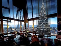
Lee Broom unveils 'The Tree of Glass' with global design brand Nude
(UK) - This festive season, leading UK designer Lee Broom with global design brand Nude unveil ‘The Tree of Glass’ for contemporary British restaurant aqua shard, located on the 31st floor of The Shard. Designed by Lee Broom and manufactured by Nude, together they have created an illuminated sculptural take on a traditional Christmas tree inspired by the striking architecture of The Shard and its iconic silhouette on the London skyline.
The partnership sees aqua shard’s highly anticipated annual Christmas tree take a design-focused direction for 2017. 'The Tree of Glass’ is a unique and contemporary Christmas tree comprised of 245 hand blown glass LED pendant lights floating in formation. The pendant shade design is inspired by The Shard and all 245 come together to create a single Shard shaped tree of light and glass, which playfully lights aqua shard’s iconic triplestory atrium, and views of the London skyline.
Committed to working with only the best craftspeople to develop his designs, this is the first collaboration between leading UK product designer Lee Broom, and contemporary glassware brand Nude who have meticulously handcrafted the shade for each pendant light. The cascading installation marks the perfect end to a celebratory tenth anniversary year for Broom who, earlier this year, unveiled a retrospective commemorating his decade of design during Milan’s annual design week. Previous collaborations of the tree at aqua shard include fashion designers Vivienne Westwood, Matthew Williamson and Sir David Attenborough with Timothy Hatton Architects.
The tree this year will raise funds for the British Red Cross, Lee Broom’s charity of choice, and two of its fundraising programmes, the UK Solidarity Fund and London Fire Relief Fund.
Each of the 245 pendant lights will be available to purchase from the Lee Broom website from 15th November 2017, with all proceeds being donated to the British Red Cross. Each pendant light will come with a 2w dimmable LED and ceiling rose for simple installation and will be delivered after the tree is de-installed in January 2018.
In addition, aqua shard will develop a special dessert and cocktail, to be sold throughout November and December, with 50% of the sales going to the British Red Cross. The restaurant will also add an optional £1 to every bill throughout the Christmas period, which will be donated directly to the charity.
'The Tree of Glass' will be unveiled on 14th November 2017 and will light up aqua shard’s atrium into the New Year.
Decorex announces new Brand Director
(UK) - Britain’s prestigious luxury design fair will now be led by Brand Director Anna Knight, alongside her current position as Brand Director for Brand Licensing Europe within UBM EMEA. Working alongside her is Brand Manager Sam Fisher who has been closely involved in Decorex’s success for the last 10 years.
Simone du Bois is moving on to take up a new role at Design Centre, Chelsea Harbour. Simone has worked for UBM EMEA, the premier market leader for B2B events, since 2011 and, together with her team including Sam Fisher, Andy Bishop and Will Wootton, has been responsible for significantly raising the profile of this international event.
With strong relationships across the industry, Sam Fisher has been involved in developing strategy, managing the fair’s design collaborations and content, including Future Heritage designers, building an impressive reputation for Decorex as the leading destination for the industry, both at home and abroad.
Creative Director Andy Bishop has had a major impact on the show with the development and introduction of exclusive feature areas such as the celebrated entrance carousel that has seen a number of leading designers involved. He has delivered design spaces at events for more than 20 years and joined UBM in 2005, producing key features, entrances and hospitality spaces since 2012.
After starting his career in publishing Key Account Manager Will Wootton has worked on five editions of Decorex, maintaining a strong relationship with exhibitors and ensuring they fit with the overall brand values of the show.
Decorex International will continue to collaborate closely with Simone in her new tenure at the Design Centre Chelsea Harbour. Decorex 2018 will be held once again in the prestigious grounds of Syon Park and an exciting line-up is already being planned for the event on 16-19 September 2018.
“Decorex International will continue to be at the forefront of the design industry, supporting both innovation and tradition, as London confirms its status as the centre of global design,” says new Brand Director Anna Knight.
Claire German, Managing Director, Design Centre, Chelsea Harbour comments:
“I am delighted that Simone du Bois is joining the team at Design Centre, Chelsea Harbour. She has already proved to be hugely successful, highly effective and popular within the interior design world. From November she will bring a wealth of invaluable experience to the exciting future exhibition plans that are about to unfold at the ever-evolving Design Centre, Chelsea Harbour.”
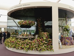
Giopato & Coombes win best new product at Decorex Design Awards
(UK) - The Gioielli collection received the "Best Product Award" at Decorex International. The series of appliques, inspired by the painstaking work of the goldsmith combined with cutting-edge LED technology, were awarded for being the most "emotive and innovative products" shown at the fair.
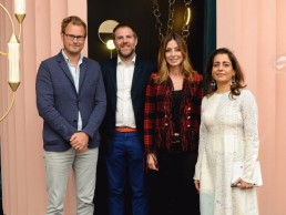
The Decorex Design Awards were judged by celebrated Interior Designers Staffan Tollgård, Fernanda Marque and Shalini Misra (pictured with Christopher Coombes).