

Caviar House & Prunier, UK
When Caviar House & Prunier won the bid for the most important retail space at the epicentre of London Heathrow Airport’s new terminal, T2 ‘The Queen’s Terminal’, it also undertook the requirement to deliver a central sculptural feature to be integrated within the restaurant. Upon the recommendation from the retail directors at BAA (British Airport Authority), it commissioned Cinimod Studio to conceive, develop and produce an iconic sculptural intervention to mark its presence within the terminal, and to provide an impressive and memorable addition to the overall terminal.
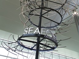
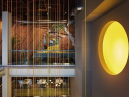
Emergence captures the re-imagined movement of a school of fish moving underwater, a playful reference to the core business of Caviar House. It is a sculptural expression of the light patterns and shimmers that are created as a school of fish moves in harmony within water.
The structure comprises bespoke LED arcs spiralling thirteen metres up to the ceiling, made from engineered carbon fibre composites as found in the newest airplanes. The resultant form manifests a kinetic moment frozen in time and then re-animated through cutting edge interactive digital lighting. The sculpture is an iconic and memorable scene that sets the brand up for incredible exposure to the millions of travellers flocking through the terminal on a daily basis.
Each arc of light, controllable in movement, mimics the shimmer seen against each fish when they move in unison. Held together through beautiful mechanical fixings, each sits in the space above the bar, as a weightless mesmerising glow. This fragmented shimmer of scattered light translated as a fish vortex achieves a light movement that mimics that of the lateral line system that fish have, where each arc or ‘fish’ picks up the movement of its neighbour and mirrors the action in perfect synchrony.
This disparity between the perspectives of an outside observer of the shoal and that of a member of it leads into an interesting area known as Emergence. Cinimod extracted these natural principles by arranging each component, carefully creating absolute synchronisation within the overall form, where light sequences played through each arc really brings it to life.
Emergence has been extremely well received by the public, and has delivered on the design intent to provide a unique lighting installation that captivates the public. So much so that it has been shortlisted for a darc award.
It is interesting to see how Cinimod Studio has delivered a complex and ambitious installation that is firmly rooted within the commercial sensitivity of the client. Emergence serves as another example of how Cinimod Studio utilises innovative lighting technologies to underpin ambitious and memorable lighting interventions. In common with the studio’s other works, the lighting takes centre stage, it is the playful manipulation of light that the public engages with and has impact from. Prior experience has demonstrated a link between Cinimod’s lighting features and attracting business to its customers, with Emergence it has developed one of the most ambitious and commercially rewarding iconic lighting features for this superb brand.
Kinetica, UK
The Third Space health club & medical centre in Soho, London was originally designed by architect Mark Goldstein of Goldstein Ween Architects. Offering a more creative take on the traditional health club, it includes a climbing wall, altitude training area, boxing and power lifting facilities as well as a sports medical facility. The space was also filled with fine works of art and sculpture adding to the luxurious nature of the club.
The skylight in the centre of the original interior was essential to the design, allowing natural light to flood through the well to all areas, down to a glass floor above the swimming pool. However, due to the Crown Estate taking over part of its space, the skylight was removed. Within this void, the need for a feature arose, which wouldn’t just fill the space with glare-free light but would also become a talking point, adding value to the club through association.
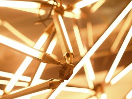
With the knowledge of Goldstein’s honest approach to materials and the celebration of engineered structural elements, Kinetica was born - a bespoke light sculpture by Hugo Light Design (HLD).
HLD had an existing relationship with Ollie Vigors and Joel Cadbury, the directors of Longshot Ltd. - previous owners of The Third Space - as it had provided lighting design services to them in the past. From this, they recommended HLD to the new director of The Third Space, Eric Dunmore, to provide a lighting design for the new reception.
The brief was to create something that filled the space without dominating it and without blocking the views through to different levels. It would also attempt to replace the lost natural light, creating a bright and enjoyable space with enough light to safely train in and create a comfortable environment, energising the club’s visitors.
The sculpture had to be designed in a modular fashion to ensure it could be assembled quickly and simply, considering the limited hours that the club is closed. Therefore Kinetica was put together in situ with Set Works quickly and easily, from component parts manufactured by B Hepworth and Co. Given the club’s long opening hours, about 90% of the light sources used in the club are low energy, with a system installed to run these at 90% of full output, reducing the energy consumption and increasing the life of the light sources.
Above the sculpture, an 8m x 5m space made the installation process difficult and therefore required scaffolding and careful planning. Additionally, two of three bulkheads above the sculpture had limited recess within them and due to the building and steel being very old, there were very few opportunities within limited runs to mount control gear to ensure the sculpture would work correctly. Therefore a detailed plan of the wiring and suspension points was put together, including weights and positions. Suspension points had to be carefully calculated by a structural engineer considering the old existing steels.
In order to further make up for the loss of natural light, a mirror finish was installed on the ceiling prior to installation to create the illusion of a limitless void above. Using a Pharos control system to animate the sculpture, Kinetica engages health club visitors to appreciate the architecture of its surroundings through dynamic lighting.
Along with Kinetica, the reception and medical centre lighting was designed by HLD to ensure that the general lighting in the space was integrated within the structure, concealed and celebrating the architectural design. This was accentuated by more decorative industrial luminaires, which were chosen to compliment the scheme and to create a more intimate atmosphere where necessary. These included: Historic Lighting’s Verdgris pendant in the reception, Bocci’s illuminated glass pendant in the medical reception and Verner Panton’s Flowerpot pendant in the reception meet and greet area.
Yauatcha Restaurant, UK
Only its second venue to open in the UK, Yauatcha, a contemporary dim sum teahouse from the Hakassan Group, is situated within a unique semi-circular restaurant overlooking Broadgate Circle in the City of London.
In collaboration with Hakassan, Paul Nulty Lighting Design (PNLD) worked alongside architectural firm Gensler and interior design company GBRH to create a dramatic lighting design concept that is consistent with the brand’s identity and also adapted to the unique space and physical needs of the new restaurant and retail unit.
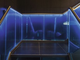
Set over two floors, PNLD has designed a lighting scheme that complements the darkness of the interior design. The lighting entices customers upstairs by incorporating the brand’s signature blue colour within an illuminated glass balustrade and integrated staircase lighting from MJ Lighting that leads from the ground floor entrance to the first floor restaurant.
To draw visitor’s attention upwards, sparkling fibre optic lighting from Linealight is used to create a starry theatrical ceiling while cladded geometric lattice panels are illuminated with in-ground recessed uplights from LightGraphix, bringing texture and depth to the space.
Upon entry, guests are greeted by three large white bespoke silk pendants from Metro that hang above the concierge desk, forming a focal point and an illuminating glow.
Moving up the staircase, the reception on the first floor features the same soft blue back lighting from MJ Lighting within key brand elements such as the fish tank and the first of many orange columns that are downlit by Soraa lamps to punctuate the space and provide rhythm. LED Light Sheet from Applelec has also been used to showcase a large pastry display, which runs alongside the reception area.
The lighting levels in the restaurant are designed to be low, with contrast ratios high to create a dramatic environment throughout the space.
Simplicity is key to the design throughout, with architectural details housing discrete lighting such as integrated luminaires within joinery. Using this technique, PNLD was able to pick up and highlight brand elements within the interior, such as small brass crosses from Metro integrated within the brick walls, which house LED candles from Electric Candle Company, creating a warm illuminating ambience for an intimate dining experience.
Further decorative elements include clusters of bespoke bone white china pendants from Ceramics by Design, hanging throughout the restaurant to provide intimacy and define the sleek style of the space.
The two bar areas continue to use the brand’s signature cove lighting above, whilst providing additional drama through the use of a rear illuminated corian bar-top again using LED Light Sheet from Applelec.
Claire Hamill, intermediate lighting designer at PNLD, said: “Throughout this project it was important for us to focus on key characteristic lighting design elements that make the brand recognisable whilst creating an atmosphere that is inviting and dramatic.”
Two large terraces run alongside either end of the restaurant, with soft uplighting from Mike Stoane Lighting used on neutral stone columns to define the space. In addition, low level lighting used under planters around the edges form a halo of light, framing views of the city and adding a softness to the outside space.
The new Yauatcha Patisserie on the ground floor, selling tea and desserts, continues with the brand’s distinct blue backlighting and features soft downlights from Lucent to bring focus on the products for sale but still keeps the same ambience and charm as the restaurant upstairs.
PNLD has provided a lighting scheme that is both detailed and modest, whilst creating a mood suited to restaurant Yauatcha’s dining experience.
Heals, UK
With a history spanning more than 200 years, Heal’s remains the go-to store for contemporary design and discovering emerging talent from around the world. From the simple and decorative to unexpected designs and innovative lighting brands including Bocci, Brokis and Seletti, Heal’s hosts an extensive spectrum of designs from the classic to the contemporary.
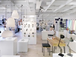
As part of its ongoing retail strategy to provide the best in-store and online experience possible, Heal’s has opened a new concept showroom in The Queens Building on London’s Westbourne Grove. The fully-digital store features a range of multimedia displays that pay homage to the cinematic heritage of The Queens Building, formerly an Art Deco cinema. Heal’s has embraced the latest technology to offer a unique retail experience, placing it at the forefront of British design.
Will Hobhouse, Chair of Heal’s, commented on the vitality of the new store and digital platform: “We are two years into a programme of change to ensure Heal’s remains at the forefront of British design, putting the customer at the centre of all we do. Shopping habits have changed beyond recognition in the past ten years and we needed to respond to the new consumer digital age and how customers research and shop. Service, whether online or in-store, is paramount.”
A stone’s throw away from Kensington Gardens and prime avenues for high-end fashion and designer boutiques, the new Heal’s concept showroom is situated beneath sixteen individually designed residential apartments, on the ground floor of The Queens Building. The new showroom houses the most comprehensive lighting collection in London, catering for all specialist lighting needs, shrouding West London with Heal’s innovative style and service.
The Queen’s store was designed and project managed through a collaborative effort; British designer and former finalist of the ‘Heal’s Discovers’ competition Matthew Elton brought together his furniture manufacturing company Tendeter and Heal’s to form the Heal’s Tendeter partnership. Elton commented on the union and collaborative project: “The Queens Building is a local landmark with its cinematic heritage; the team and I are proud of what we’ve created, and feel privileged to be part of the Heal’s programme of change.”
Tendeter specialises in bespoke joinery and interiors, having also designed and installed the spa, kitchen and home furnishing departments at Heal’s Tottenham Court Road store. Heal’s Tendeter then spans across furniture and interiors from retail to residential. As a London-based workshop, it allows clients to be fully involved from the initial concept stages of design through to manufacturing. “Working with Hobhouse and being part of the Heal’s programme of change is a fantastic opportunity for both Heal’s and myself,” said Elton.
Elton first got involved with Heal’s after meeting designer John Jenkins for whom he created his limited edition Clue Table design. Following this, Elton was instrumental in launching Heal’s Ambrose project with the A Frame collection in 2014. Commenting on this as his pivotal design project, he said: “That is when my name became associated with Heal’s and furniture design. I’m very proud of the collection.”
The Queens store is Elton’s largest project to date, from design concept, plans to build. “It was a quick turnaround that needed to run like clockwork. Hobhouse trusted me to get the job done. It helps having a great client and a strong team. It gives you the confidence in your ideas to see them through,” said Elton on the design process.
Since partnering, the Heal’s/Elton collaboration has given the team the ability to design and implement larger projects, thereby expanding the Heal’s Collection range with Elton’s experience and skills as a designer, craftsman, manufacturer and business owner. “Growing up in London, I always knew of Heal’s and what it stands for,” he said. “Now, in my new role heading up the Heal’s Contract Furniture/Kitchen and Shop-fitting division, I have a hand in keeping that tradition going.” The extended team creates what Elton describes as an infectious dynamism: “You can’t help trying to do more than one thing. Personally, I like working this way. It keeps you on your toes.”
As the one-stop shop for interior designers and specifiers, the Heal’s showroom also offers a Heal’s Styling Service with an interior expert team on hand to discuss projects using Heal’s extensive collection of exclusive and designer furniture, stand-out fabrics and made-to-measure services. In addition to being the prime destination for specialist lighting, the showroom includes an all-encompassing library of designer fabrics for customers to browse through in-store.
Heal’s new concept showroom is a multipurpose platform for designers and consumers to immerse themselves in the most exciting and current trends in interior design. With Elton’s expertise and Heal’s range and reach, it is truly a hub, and a stunning one at that, drawing in West London strollers with its polished style and charm.
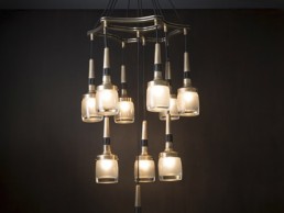
Flagon
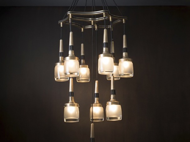
In Bert Frank's new lighting additions and collections, Flagon Chandelier is a sumptuous hand finished brass with black highlights and thick whisky glass shades. Made to make a statement in any room, the piece features ten-drop shades, ensuring it will dramatically illuminate any dinning table, hallway or stairwell, and is available in custom sizes and colours.
Flemings Mayfair, UK
Having worked in various architectural practices after graduating in Interior Design at university, Bronwen Tully and Tony Filmer set up interior design practice Tully Filmer in 1993 and have since worked on numerous restaurants, hotels and private houses in London and abroad. Following a project in partnership with Stanton Williams Architects on a modern London house and completing the restoration and interior design of Masseria Petraolo, a fourteen bedroom, fortified farm house in Southern Italy, the practice was approached by Henrik Muehle - the newly appointed General Manager of the Flemings Mayfair hotel in London, which first opened in 1851 - to help with its interior redesign.
Muehle, who was charged with upgrading the Flemings to a five star hotel, saw to it that part of this upgrade included a extensive remodelling and refurbishment of the hotel bedrooms and restaurant. The initial brief was to improve the quality of the fixtures and fittings with a coherent, sophisticated design suitable for the Georgian hotel.
Working within the brief, Tully Filmer’s initial design concept used classical modern design with strong signature colours, together with plush upholstered furniture and a suite of bespoke joinery furniture. With this in mind, the practice selected British lighting manufacturer Martin Huxford Studio to supply its Bibendum chandeliers and wall lights, to feature in all rooms and suites of the famous boutique hotel.
Hanging throughout the bedrooms and suites as a centrepiece, the Bibendum’s mixture of classical and modernist references, featuring hand-brushed horizontal gold rings that encircle multiple charcoal grey shades, suited the hotel’s classic interior. Alongside the chandeliers, the Bibendum wall sconce was also used to bring extra warmth.
The starting point for the project was selecting three strong colours. From this, the practice looked at fabric which had a modern interpretation of 1930’s elegance and from that, the furniture was designed and fittings chosen. The importance of the lighting wasn’t underestimated, especially in the hotel’s bedrooms and bathrooms where guests need to feel comfortable and at home.
Bronwen Tully explained: “It was important for us to have a mixture of LED and incandescent lamps to create comfortable lighting levels suitable for the bedroom and bathroom, most of which were on dimmers so that a variety of moods could be created to suit the time of day and guests using the room. A mixture of light sources has always been important in our schemes: task – in the form of bedside reading lights, desk lights, backlit mirrors and illuminated magnifying mirrors; occasional – in the form of standard lamps and bedside table lights; ambient - in the form of dimmable down lighters and decorative in the form of the chandelier.”
Visually, the decorative lighting brings the scheme together and gives a more luxurious, homely feel to the personal space of the rooms. It was very important to the designers to get the right balance of different fixtures to enhance the design while practically providing the correct type of lighting. This included using Porta Romana wall bedside lights, Chelsom built-in bed reading lights, Gubi desk lights and Bestlight floorlights in the hotel’s bedrooms. Additionally, a Porta Romana chandelier was used in the lobby of one of the hotel’s suites.
The resulting interior is very much in tune with Tully Filmer’s signature style: very much classic with a touch of modern, sumptuous fabrics, attention to detail and beautiful pieces of furniture. With the Martin Huxford chandeliers such a focal point in the hotel, Tully explained their reasoning for working with the manufacturer: “The Bibendum chandelier reflected our slight 1930’s style but in a modern way suiting our design perfectly. The generous mass of the fitting is shallow and wide, working well with our high ceilings and simple ceiling mouldings. The gold of the chandelier added a hint of glamour to our interior of textural greys and palette of signature colours – indigo, mustard and teal. It’s mass is akin to a UFO hovering just below the ceiling, making one aware of the generous high ceilings.”
When asked if the practice could go back and do the project again and would it do anything differently? Tully answered: “Design wise probably not – we would have liked to have used real shagreen on the desk but it would have been impractical for a hotel.”
Podolyan, Ukraine
Ukranian fashion designer Vladymyr Podolyan’s monobrand store in the heart of Kiev owes its aesthetics to a collaboration with Ukranian design studio Fild’s vision for a 36sqm prerevolution building with high ceilings and a large arch window. With a branded view on feminine fashion developed by Podolyan leader and designer Vladymyr Podolyan, their distinctive style emanates a glowing mystery of care and sensuality in women's clothing, a theme that needed to be replicated in the interior design of the monobrand store.
Fild bases its designs on minimalist lines and subtle colours, demonstated in the interior and lighting design of Podolyan's store. A set of upholstered seats and a concrete table top are situated in the middle to accentuate the centrepiece of the room, while 36 Edison bulbs float in the air above the furniture unit, lending a complementary glow to the angular and clean design.
The clothes on the racks are illuminated by twelve SO6 lamps from Fild's first object design collection, Sustainable Origins. The collection features minimalist forms created in virtue of assembling raw materials of wood and metal, holding accurate and conceivable design at its heart.
The façade and show window of the store are decorated with brand logo featuring inner illumination that blends with a flood of natural daylight from the arch window. Fild designer Dan Vakhrameyev commented: “The idea was to make the interior of the store a part of the window display itself.” Drawing customers in with a lightly sophisticated clarity, the store presents a sharp image in both fashion and interior design.
Pic: Roman Pashovskiy
Wahaca Restaurant, UK
London based lighting designers Kate Wilkins and Sam Neuman have joined forces after years of collaboration to create a portfolio of varied projects using both well-established and cutting-edge lighting techniques.
Under the name Kate & Sam, much of their work is about lighting as a way to effectively bring out the materiality and detail in both architectural interiors and exteriors. They explore the narrative role of lighting in space, and the physical and psychological feel-good factor that is achievable through tactical lighting. Their interests follow lighting as an essential part of a business’ identity, with their work for Wahaca restaurant group exploring the notion of brand in the same way.
Most recently, Kate & Sam completed the lighting scheme for Wahaca Cardiff. This marks the first venue in Wales for the restaurant chain, situated on The Hayes in a corner plot of a new site, featuring large double height glazed frontage windows with three different eating levels built into the space.
Kate & Sam’s approach maintains the relaxed street lighting style they have built up over the last twelve Wahaca restaurants; very much a response to the more informal street food offered by the Wahaca chain. Kate & Sam opted for a sunny feel evoking natural light in their design, as they see it as important in generating positive emotions indoors. “In the Wahaca restaurants we like to use warm colours that relax the diners,” the designers commented. “We mix 2,700K with warmer tones for a more theatrical feel and hint at the sub conscious feeling of sunshine.”
At the Cardiff restaurant the large void in the middle of the room was made use of with a lighting installation using +Nacho Carbonell soft rubber pendants from manufacturer Booo - each supplied with a 2,700K, 650lm LED with mains dimming down to 10%. To tone in with the colour palette and react to the warmer tone light waves, the pendants were fitted with custom yellow and orange flexes. The Booo pendants help bring the room down to a more friendly scale for dining while keeping the impressive size.
The +Nacho Carbonell fixtures’ warm central glow is set against a two-metre diametre wall mounted indirect colour changing disc that is programmed throughout the day and evening in subtle sources: a cold cathode tube and DMX controlled LED colour changing Fresnel key spotlight. The colours are chosen for their uplifting and relaxing qualities, aiming to be felt but not seen. As well as an external focus of the window, “the installation of the pendants, cable and circle are designed to be viewed from all the different levels, designed to be more intense and immersive the higher you are,” said the designers. Elsewhere in the restaurant, H2o pendants from Italian manufacturer in-es.artdesign bring additional warmth to the dining space.
The use of LED lamps in projects is becoming more and more common, but by using a product that is still evolving, issues are inevitable from time to time, as the designers explained: “The LEDs we specified developed a stage too far during this project. We tested the lamps with dimmers, had written assurances, used a reputable manufacturer, but when it came to the programming stage, we had the dreaded flicker!”
The lamp manufacturer had changed its internal electronics after Kate & Sam had tested it with a specific dimmer, meaning all the lamps had to be swapped out. “As a result we’ve increased our LED lamp specifying check list to include colour temperature, CRI, and dimming is tested with the same dimmer and is the same confirmed batch that has been tested! Until binding standards are set and adhered to by the different lamp manufacturers, this is an issue that will continue.”
Despite any challenges there might have been concerning LED developments during the project, Wahaca restaurant founder and former Master Chef champion Thomasina Miers described the venue as, “possibly the most beautiful of our sites.” The venue can’t help but ooze the identity of Kate & Sam as creatives and lovers of light, with an unavoidable natural glow that helps brings the outside in.
Tattu - UK
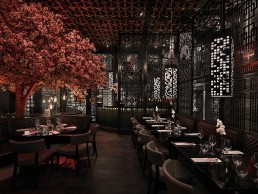
Tattu is a contemporary Chinese restaurant and a thriving addition to the fashionable Spinningfields area of Manchester. Inspired by the strong conceptual restaurants found on America’s West Coast - and the vision of Tattu Managing Director Adam Jones, in partnership with his brother Drew - the interior takes customers on a visual journey drawing decorative influence from different styles of body art.
UK-based Tyson Lighting was chosen to light the distinctive venue, having designed and manufactured all products featured in the restaurant, with Product Design Engineer Henry Opara overseeing supply and fabrication of the bespoke and technical lighting. Opara, an up-and-coming talent in the lighting industry, has overseen a number of innovative and exciting light projects in the UK with particular focus in the North West, including Sakana Restaurant, Manchester and The Art School Restaurant, Liverpool.
Opara explained the fitting of the installation for which Tyson was on site with its specialist knowledge of the conceptual products: “Because many of the items were unique, the contractors required assistance with some of the more complex fittings. For example, with the anchors being so bespoke right down to the way the rope had to be tied, I was personally responsible for creating the knots, which could only be done on site, to give them the authentic look required. This needed an element of artistic license to dress them and achieve the original styles envisioned by the client and architect.”
Tyson’s Managing Director, Andrew Gibson, commented further on the complexity of the project in all its determined designs from the Jones brothers: “The clients, Adam and Drew, both had ambitious plans for the look and feel of Tattu. Initial discussions included talk of suspended anchors, woven rope lighting and bespoke chandeliers featuring glass skulls encased in cast iron spheres. We were responsible for bringing some very radical pieces of lighting to life so from a design point of view we set about prototyping the fittings which could potentially give us the most headaches.”
The brief was that the interior needed to have a low level of ambient light but be cleverly lit to highlight key aspects and design pieces within the building and capture the essence of Tattu. The main colour scheme blends rich earthy tones with sumptuous blacks and golds, so Tyson was instructed to use lighting that would provide a tapestry of light against these surfaces.
For general use areas, narrow beam spotlights were used to retain the dark appearance of the venue, whilst providing adequate light. Gibson explained: “We fitted many of the products with halogen lamps to provide a flame-like appearance. However, with the building falling under new energy consumption compliance regulations, the use of LEDs was compulsory. To match the light to the halogens, we used specialist Soraa lamps which use colour-changing filters to alter the colour temperature of each lamp as required.”
The majority of the lighting products used on the scheme are completely original concepts, with Tyson utilising Solidworks software and 3D printing technology to build the prototypes. With the added benefit of being able to produce lighting schematics, Tyson was able to generate the wiring drawings and assist with establishing the dimming zones which played a major factor in achieving the client’s and architect’s vision for the project.
The rope ceiling, a special feature in itself, required lighting that highlighted its presence but didn’t create too much ambient light to impact on other features such as the illumination of the blossom tree that stands as the centre piece on the restaurant’s first floor along with the skyscraper pendants. Tyson used high-level track mounted spotlights facing upward to flood light onto the ceiling. Spotlights are positioned on the same track to wash down the walls and highlight the textures of the wall panels.
As you would expect, with so many customised elements, the project didn’t come without its challenges, as Gibson explained: “During initial talks regarding design concepts, one of the ideas was to have a winch fitted to the mezzanine bridge. Unfortunately the ideal mounting positions of the anchors and location of the bridge became somewhat of a stumbling block. As a compromise and, in fact, a wiser use of space, the anchors have been mounted on rise and fall units behind the rope ceiling which still allows them to be moved up and down on demand.”
Jones commented further on Tyson’s involvement in the project: “Tyson Lighting was the first choice for the restaurant due to the firm’s previous history of high-profile projects in the region. Tyson’s ability to take design concepts, no matter how radical, and turn them into eye-catching pieces, coupled with the company’s experience, has enabled the creation of stunning lighting fixtures for Tattu.”
As a complete lighting scheme, the external view into the building was designed to provide a visual feast for passers-by.
The combination of the skyscraper pendants against the backdrop of the coloured blossom tree create a sense of drama and intrigue, while the two suspended anchors add to the theatre of the interior and help balance the overall lighting scheme within. Tyson’s distinctive character is seen in every aspect of this restaurant’s surreptitious profile, standing as a point of pride for bold creativity and signature design in the North West.
Pics: Tyson Lighting
Mulberry, France
Renowned British architects, Universal Design Studio, have designed the interior of Mulberry’s newly opened store on the prestigious Rue Saint Honoré in Paris. The interior emphasises the personality of Mulberry with a sophisticated display of original British craftsmanship and architectural skill.
Designed to present three distinct sections each specialising in different luxury products, a multi-tonal herringbone stone floor links the areas showcasing men and women’s leather accessories, ready-to-wear, accessories, shoes and jewellery. The store’s interior has been designed to create a calm atmosphere through the use of pale oaks, marble, luxurious leathers and limestone floors.
To complement this, a dynamic lighting system has been putin place which changes the ambient mood over the course of the day and evening through the clever use of up-lighters which respond to the light outside.
Specialist British designers were commissioned by Universal Design Studio to bring a distinctive aesthetic to the interior. London-based textile artist Genevieve Bennett has created a bespoke leatherwork tile design that is used for wall panels, and award-winning English designer, Lee Broom designed a feature chandelier.
Personalisation is currently key to luxury and Universal Design Studio created an area for Mulberry’s new Paris store to offer a bespoke monogramming service for leather goods. A circular stone and glass personalisation bar at the heart of the store is a focus for customers to see examples of personalisation as well as French and British icons, which are exclusively available at the Paris store.
At the rear of the store the Ready-to-Wear room offers customers a more luxurious ‘Dressing Room’ environment to browse apparel and shoes. The sage green carpet, soft fluted walls, upholstered furniture and chandeliers create an atmospheric contrast to the open, external feel of the accessories areas.
Hannah Carter Owers, Director of Universal Design Studio, commented: “We are delighted to collaborate with Mulberry at this pivotal point in the brand’s progression. It is a wonderful opportunity to debut the new store concept at scale in ‘the capital of fashion’, bringing the best of British design, artistry and craft to Rue Saint Honoré - a truly iconic luxury destination.”
The new store joins Mulberry’s portfolio of international stores including New Bond Street in London, Madison Avenue in New York and Harbour City in Hong Kong. Mulberry has also recently opened stores in Hamburg, Frankfurt, Las Vegas and Dallas, and has 122 stores worldwide. This store is an important step in Mulberry’s global expansion as it continues the innovative store concept developed with British architects, Universal Design Studio. Responding to the brand’s core values of English heritage and sensibility, Universal’s concept is inspired by Mulberry’s roots in the Somerset landscape where the company has been manufacturing premium luxury leather goods for over 40 years.
Margherita, France
Former pub St Germain in Paris, France, is the latest project from French interior designer Laura Gonzalez. As a young designer with a passion for design and cooking, she has grown into her own through Margherita restaurant standing as her ideal project with a blend of her personal passions and professional goals.
With the words ‘In Pizza We Trust’ publicised on the building’s façade, Margherita announces the cosmopolitan spirit of this contemporary brassiere. Gonzalez, in collaboration with restaurant owner Thierry Bourdoncle, converted the 900sqm space spanning across three floors, into a multifacetted restaurant. Gonzalez commented on the layout of the space: “The big challenge was that the location is enormous and quite complex to organise. Four floors and numerous smaller rooms - we needed to make the customer curious about discovering the whole restaurant. That’s why we made two bars and two pizza ovens to create different activities.”
The ground floor opens into a large bar with dining tables along the walls, where Allied Maker Convex and Orb sconces made of black antique brass shed a warm light on casual diners. The lighting scheme and interior design throughout is based on Gonzalez’s signature amber colours, producing yellow and golden lights. On a lower level, another dining area featuring Allied Maker half-moon pendants serves as a casual space to share food in a relaxed atmosphere.
The first floor then houses a second cocktail bar and pizza counter illuminated by Original BTC wall sconces, which are dimmable to carry guests through to evening cocktails. The sconces pose against Margherita’s nineteenth century Belgian brick walls, reflecting Gonzalez’s love of mixing period, modernity, classic and vintage in their eclectic and authentic combination. Custom-made pendants designed by Gonzalez’s practice Pravda Arkitect and manufactured by Crea Lum’in feature on this floor and throughout the rest of the restaurant.
Keeping with Gonzalez’s desire to maintain a casual tone to her projects, another flight of steps leads to the Kid’s Kingdom. Gonzalez commented on the need for this space: “What was most important was giving the restaurant a family feel, which is why I created the Kid’s Kingdom so that even the little ones would have a space they could share with their families.” Designed as a living area with two lounges, one features industrial coffee tables and club armchairs while the other seats guests on velvet sofas with solid wood coffee tables, giving young parents who enjoy brunch and dinner with friends a sophisticated alternative. Gonzalez described the space as “a cool area in which everyone can feel comfortable.” Inspired by industrial designs, the choice of wall coverings – panelling, bricks and roman plaster - accentuate the room’s easy atmosphere and homely decoration. “I wanted to create a timeless restaurant. We simply respected the identity of the place,” Gonzalez said of the once intimidating area that has now been restored to its natural state.
With a hunger for all things new, Margherita exemplifies Gonzalez’s ethos that “every project is a new story”. Her curiosity and ability to find inspiration in everything from fashion shows to food is demonstrated in her focus on the smaller details of a larger project, and her understanding of the importance and delicate nature of lighting. The designer maintains that trends in decorative lighting are very much aimed at the importance of crafts and the smaller parts of a larger whole. The interior is draped in Gonzalez’s signature style with a combination of antique and bespoke furniture enhanced by the gentle lighting that creates a relaxing atmosphere to be enjoyed in style. As in the making of a home, the beauty of Margherita lies in the personal detail and warmth created by light, so it stands as a place of comfort while serving as a paragon of cool.
www.facebook.com/pages/Laura-Gonzalez-Pravda-Arkitect
Pics: Francis Amiand
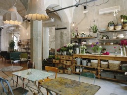
La Menagere, Italy
Once a hub for Florentine ladies of the late nineteenth century to find all that they needed to lay their elegant tables, a unique space is born again in La Ménagère, Florence, through Karman’s new lighting scheme.
The concept-restaurant is a collection of tastes, flowers, fragrances, design items and live music sprawled across the 1,500sqm space in several sections. The unconventional layout brings together elements where Karman has illuminated the architecture and interior design across the different areas into which the large space is split. Each environment differs in style yet all are united by a modern take on retro furnishings and fixtures including suspended, table, wall and floor lamps.
Entering through the concept-shop from the main entrance, Karman paid homage to La Ménagère’s roots with particular attention to lighting the shop that sells tableware, kitchen tools and a selection of home items. Guests are met with Mek Meccano-shaped hanging lamps by Karman designer Bizzarri Design, serving as an elegant and warm detail in the entrance of such a large space. Across from the shop, a flower corner flaunts rare plants and fresh bouquets through the seasons, glowing with Karman designer Matteo Ugolini's Lucilla suspension lamp with its bare iron structure and Life pendant covered in denim with a vintage finish.
Moving through the open space, guests then reach the large hall across from the main entrance. With a clean, airy light, this open area features Karman's Kimono lanterns in white fiberglass and Settenani pendants in rough concrete, also designed by Ugolini. The Dharma suspension lamp, designed for Karman by Italian Edmondo Testaguzza, is also incorporated to complement the lanterns and pendants. In conjunction with purple and pink suspended foliage, the space maintains a fresh and homely atmosphere, reflected in the Lucilla suspension lamp, which uses space within its own bare structure to illuminate and add detail without clutter.
Beyond the large hall is the concept-restaurant's kitchen. Ugolini's white ceramic Gangster suspension lamps feature here, as well as his Via Rizzo7 pendants in matte ceramic - reminiscent of old, round street lamps - lighting up the cooking space. To the left of the main entrance is La Ménagère's gallery featuring an eighteen-metre long table lit by Ugolini's white ceramic Déjà-vu Nu suspension lamps. The venue also features a private room with another of Ugolini's creations, the Au Revoir white glass chandelier, suspended above a table used for meetings or private dinners.
The coffee bar to the right of the entrance houses a coffee counter lit up by the oriental shapes of Ali&Baba, where Cristian Guitti, an international barman, offers his experimental skills in infusion, smoking and smoothie making techniques. The café tables are illuminated by the industrial yet delicate Nando pendant from Karman designers Luca de Bona and Dario de Meo, a metal joint grasping a micro-holed tube.
With an eclectic mix of contemporary design evoking traditional themes of the Italian home and cuisine, Karman's scheme delicately illuminates a challenging space with a sensitive goal. Its history embedded in aesthetics, this concept restaurant stands as testament to the abiding blend of modern and rustic design, and the significance of the minute detail no matter what the space.
Pics: Sofie Delauw