Bulbo reinvented by Flos
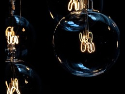
(Italy) - Bulbo was first designed by Achille and Pier Giacomo Castiglioni for an installation at the XI Triennale in Milan in 1957. A large industrial lamp deprived of its screw cap and with a shortened neck to take the shape of a bubble, with a filament inside as the distinguishing feature.
When designing means breaking down or deconstructing, and shapes are forged through observation of what already exists – these are some of the commandments put in place by the Castiglioni brothers.
In the case of Bulbo the rule of simplification is very clear. This lamp is a synthesis of redesign and ready-made: a large industrial bulb without its screw cap and with a shortened neck to take the shape of a bubble. The classic filament inside becomes its distinguishing feature, both decorative and illuminating. The light source itself highlights the technical design that characterises this lamp, and also makes it work.
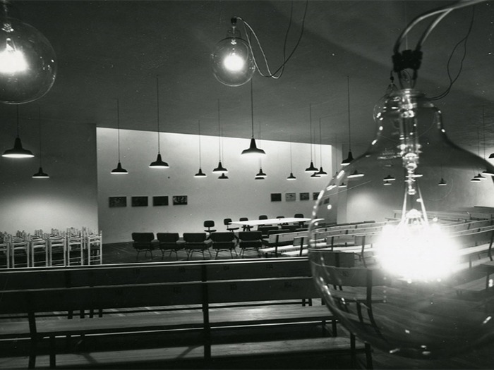
At the XI Triennale in Milan in 1957, when one lamp was connected to others in a series, the light output drastically reduced and the internal filament turned a reddish hue, giving off a low-intensity, warm ambient light.
The 2019 edition by Flos reproduces its filament in tungsten with an LED source, preserving the same colour and intensity of the light as in the original.
-
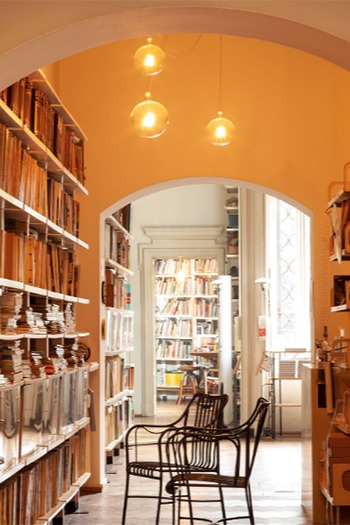
After dismantling the Triennale exhibition in 1957, four Bulbo lamps were installed at Achille’s home and two were set in the Studio at Piazza Castello 27 in Milan, now home to the Castiglioni Foundation, where they are still showcased. -
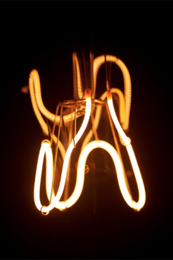
The original filament in tungsten is now exactly reproduced with an LED source, maintaining the warm temperature of light. -
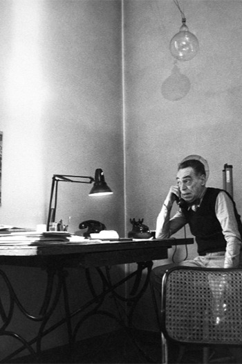
Achille Castiglioni in his Studio in Piazza Castello 27, Milan. Hanging on top is one of the original Bulbo lamps.
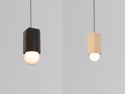
Bimar & Cano - Cerno
As the year comes to an end and the weather is cooling down, Cerno is warming things up with two new accent pendants, Bimar and Cano.
Built of one-inch thick solid hardwood, the Bimar showcases the beauty of the natural wood grain. Eight faceted sides compose a design that works well in a modern or transitional space. The combination of natural wood and glowing sphere lamp warms up any environment.
Designing with LEDs often lends itself to hiding, or using a low profile light source. The Cano pendant does the opposite; the lamp is an integral part of the design. The solid hardwood faceted body can be enhanced further when paired with a spherical glowing lamp.
Kuulto - Secto Design
designed by Seppo Koho
How did your collaboration with Secto Design happen?
I met the founder of Secto Design, Tuula Jusélius, when I was still a student at the University of Art and Design in Helsinki. The university organised a match-making event for young designers and companies. After meeting and discussing with Tuula at the event I couldn’t sit still: I was full of ideas and just drew and drew all the following evening. In the morning I called her and presented my ideas. She was convinced and the deal was sealed! The first assignment I got from Secto was a furniture collection. When the clients wanted to have lights that would suit the furniture line, Tuula gave me another assignment and I designed the first Secto pendant. That was how the Secto Design lighting collection was born.

What is the concept behind Kuulto?
Before the Kuulto lamp there were various pendant, table, wall and floor lamps in the Secto Design collection. The customers kept asking if we could also make a ceiling lamp, one that would suit halls and lobbies, so there was clearly a gap in the market.
How long have you been working on the product for?
Two years in total - the Kuulto lamp took a year to get from idea to prototype, which was introduced in 2016. After the prototype phase, it was very challenging to find the best technical process for the series production. The Kuulto lamp's bent joints are very challenging, as every angle in every joint is different. It demands precision and dexterity. The Kuulto ceiling lamp is made of form-pressed birch slats, white painted steel casing and acrylic glass. Despite the other materials necessary for the technical parts, the Finnish birch remains the protagonist. Joining the slats together demands dozens of stages, specialist methods and tools developed and built in the Secto Design factory. However, the secret is in the expertise of the carpenters and their attention to detail.
Could you describe the design process?
My process starts with pencil and paper. Then, I make more detailed 1:1 drawings on the computer, and finally a prototype in my own protoshop. Handcrafting is very important for me. It is fascinating to feel the material and create something new with your own hands
What makes Kuulto different to other lighting products available?
The Kuulto ceiling lamp stands out for three reasons: first, its round design looks different at every angle. Secondly, birch was not commonly used for ceiling lamps before Kuulto. Thirdly, the Kuulto lamp is versatile: it can be used on the wall and the ceiling. The light source is dimmable, and a bright Kuulto gives a totally different atmosphere than a dimmed one. I aim to make lamps that give a harmonious light, without the blinding light that you get from a light source. I regard the lamps like cosy houses on a dark evening, viewed from the outside-in. And it makes me happy that my lamps have become timeless classics that are passed from one generation to another.
How would you describe Kuulto in three words?
Purity of line.
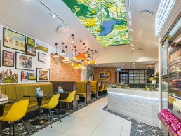
Yeo Valley Cafe, UK
Phoenix Wharf and Yeo Valley have joined forces to bring a little piece of Somerset to West London, with its first outlet comprising of a two-story café, shop and workspace.
As a brand, Yeo Valley is keen to stress the quality of its products and ethical approach to its farms, where its Friesian herd are digitally monitored and provided with organic feed and their own mattresses to sleep on. The business has developed over two generations, starting with the acquisition of Blagdon farm in 1961 to becoming Britain’s leading organic dairy brand, gaining a new farm, beef cattle and sheep along the way.
The desire was to bring some of this rustic ethos of Somerset to London, and to create an engaging, inviting showcase for Yeo Valley in order to establish an increased presence in the capital.
Working together with Phoenix Whard, it was important that the concept maintained and expressed the brand’s nature-inspired ethos and friendly, fun and unpretentious feel.
In order to honour the origins of Yeo Valley and establish a sense of synchronicity between places, scattered throughout are visual links to the Blagdon HQ, another Phoenix Wharf project. These include a mural by Natasha Clutterbuck, a long-time Yeo Valley collaborator.
“One of the main challenges was the shape and footprint of the site,” explains Emma Gullick, Associate Creative Director at Phoenix Wharf. “The long, narrow shape of the building means lighting was frequently used to create an illusion of depth and size. The rear of the store, for example, appears to have vintage style Crittal windows with illuminated panels, to give the impression of space beyond.
A slatted and angled roof feature pays homage to the brand’s agricultural roots, and places emphasis on a bright, stained glass window embedded into the ceiling. Being long and narrow, we wanted to capture the feeling of the open space present in Blagdon HQ and make sure the design didn’t feel too enclosed.”
The other challenge was to make sure the project did not fall into the clichéd territory of an ‘organic artisanal look’. Gullick and the team tackled this through treating each individual space as a mini project, using pattern and colour in abundance to create a visual flow between them. This feeds into a binary balance that is expressed throughout the project, where warm and cold LED lighting are used to separate cosy and clinical spaces.
One half of the cafe is intended to represent the cool light of a dairy farm, using marble and white LED strip lighting alongside retail chillers and yoghurt pots. Gullick adds: “This feels clean and also adds a directorial cue, leading visitors along the counter.”
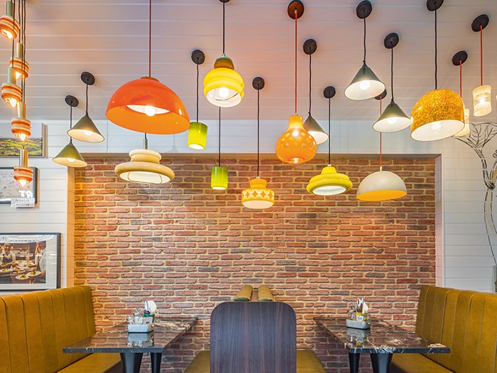
Meanwhile, the booth space on the opposite side is all warm lighting, with coloured glass shades and pendant fittings that create a ‘more is more’ decorative feature, as well as a distinction in space and tone. Furthermore, this lighting clutch of pendant lamps embodies the brand’s sustainability drive. “It was inspired by a pendant originally created for the Blagdon HQ, and contains eighteen different upcycled light fittings sourced via eBay and vintage fairs,” says Gullick.
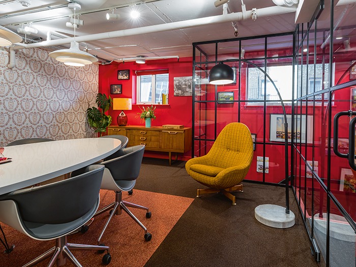
They inspire a retro and colourful atmosphere in the space, whilst the re-use of old fittings fits into the company values and progressive attitudes towards the environment. Upstairs, the meeting rooms and office space have very low ceilings and exposed pipework running in a maze across most of the surface. “
The desire to create an open, bright and comfortable working space meant careful design considerations to ensure nothing made the space feel smaller,” continues Gullick. “By adding three new windows and using full height glazed walls for the meeting rooms we were able to achieve a feeling of bright openness.”
Further vintage light fittings are used upstairs - combined with Anglepoise task lamps and a 1960's Arc floor lamp. “We specifically used wall-level and floor lights to accommodate for the low-level ceiling,” says Gullick. “Much like the booth lighting feature, these vintage fittings are reminiscent of the domestic feel within Blagdon HQ, creating further overlap and connection between the two outposts.”
In terms of the balance between decorative and architectural lighting, the latter remains very much functional and subtle. Spotlights and high-level tracklights are designed for additional illumination but do not detract from any decorative lighting feature. Meanwhile, bespoke neon lettering and an illuminated diner sign downstairs were designed by Phoenix Wharf and manufactured by Bristol-based Artworks-Solutions. The intention is to attract attention from the outside, delivering playful messages and potential current offers, whilst also doubling as a bright feature at mid-level from the interior.
In addition, the stained glass effect ceiling panel makes for the other key decorative lighting feature. This is a five-by-two-metre mounted ceiling lightbox with a fabric printed graphic that alludes to Blagdon, also bespoke designed by Phoenix Wharf. This hand-drawn design has also been worked into the ground floor toilet, which has been designed to look like its own underground station, complete with arched corners, authentic tiling throughout and two illuminated, bespoke ‘Blagdon Station’ tube signs. This is considered the standout feature of the space and acts as a playful link between Yeo Valley’s London and Somerset sites.
Ultimately, the project was not about creating something entirely new but an evolution of a well-known space, the marriage of a familiar household name in a new and urban location. Gullick summarises aptly: “Upon entry, the customer is met with a feast of colour, pattern and character.” Phoenix Wharf has created a warm and playful brand experience, one that underlines Yeo Valley’s countryside origins and that emphasises its dedication to the fun, the friendly and the unpretentious.
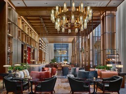
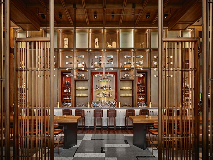
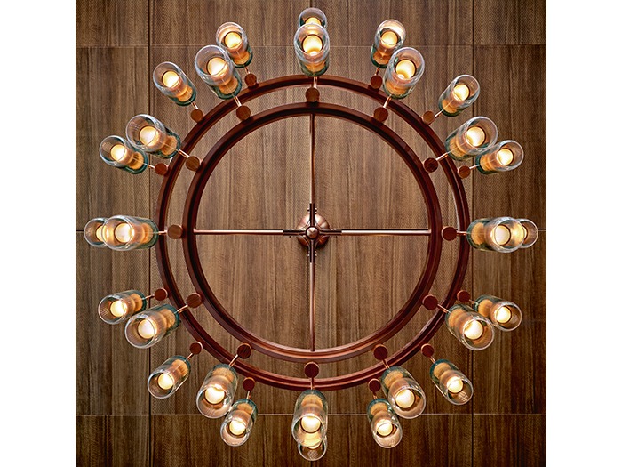
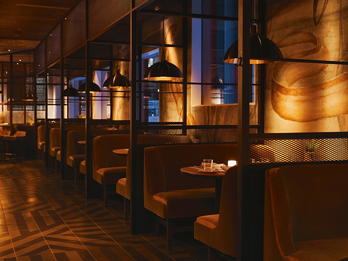
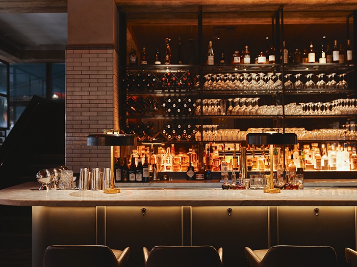
Union Bar, China
The Opposite House hotel in Beijing has recently completed its first phase of refurbishment with the new Union bar, designed by AvroKO.
The Union bar is the first completed edition of the Opposite House hotel's refurbishment. An elegant bar that exudes comfort and the free spirit of an artisan’s studio, it has been created by New York-based design firm AvroKO, with the interior design takeing inspiration from 1920s modernist sensibilities.
Located in the Taikoo Li Sanlitun - a vibrant open-plan shopping, entertainment and dining destination - The Opposite House is part of the Swire Hotels Group and is one of four houses in The House Collective - a group of hotels each with a unique identity inspired by its location, which began with The Opposite House, designed by renowned Japanese architect Kengo Kuma in 2008.
AvroKO’s Bangkok-based studio was responsible for the interiors that pull inspiration from Lucie Rie’s 20th Century modernist pottery studio: 'a beautiful, yet versatile, space that was suited to living, working and socialising.'
“We have a long working relationship with Swire, having created all of the restaurant and bar venues at its Temple House Hotel in Chengdu,” explains William Harris, Founding Partner at AvroKO. “Based on the success of that, they approached us to help re-invent the ground floor food and beverage for The Opposite House. Union is the first phase, with a hip, pop-culture, casual Chinese concept called Superfly, which is coming next.
“The brief was to create a magnetic and chic all-day lounge experience that was equally as desirable during the day as it was late into the evening. One goal in particular was for the space to feel like a swanky living room in Sanlitun, where locals, as much as guests, would feel welcome and catered to.”
Taking a total of fifteen months to complete, the design executed a balance of ceremony and warmth to create a personal and authentic experience. Offering a variety of food and drink flavours that celebrate traditions of the Silk Road, the bar creates a sense of belonging and discovery.
“For us, decorative lighting is a critical part of all our designs globally," elaborates Harris. "We sculpt with light. The fixtures themselves become pieces of art, drawing the guest’s eye and body through various spaces in meaningful ways.
“Lighting is also incredibly important when venues need to function during different parts of the day and look equally amazing regardless of the time. Strong lighting becomes a signature and helps to define a brand. It also needs to make people look good, and when they look good they feel good, and when they feel good, their experience, as well as the business’ bottom line, does all the better. Lighting really is one of the most influential aspects of interior design.”
The team at AvroKO worked in collaboration with lighting designers, Firefly Point Of View (FPOV), to create the all-important lighting scheme for the Union, as they believe lighting designers “focus on and complement our design schemes, bringing an added layer of detail, technical prowess and local support on our global projects.”
Studio Director of FPOV, Owen Xuan, explains to darc how his team came on board: “The client had engaged with us, in a report that highlighted lighting as a very important design element that needed to be upgraded to transform the space for the current trend of end customers.”
All of the decorative lighting fixtures provided for Union were bespoke creations by AvroKO and manufactured by Hong Kong-based Ricardo Lighting. “In service to the concept, all lighting pieces give a nod to mid-century design and international style,” continues Harris. “Signature chandeliers and dramatic pendants over the bar utilise a gradient teal cast glass. The colour is unique and memorable, while still being warm and inviting. The chandeliers anchor both ends of the fairly symmetrical space, while the soaring, planar installation of pendants really helps to define and highlight the prominent bar experience.”
Custom-made salmon-hued blown glass table lamps create an element of intimacy on the bar floor, as well as helping with the illumination of the monolithic travertine bar. Several other custom-made table lamps are peppered throughout, evoking a comfortable residential feel. The architectural lighting worked to gently highlight the textured surfaces and columns, bringing some drama and contrast to the space.
“The façade/backbar wall also becomes its own light feature, with integrated LED lighting sandwiched between perforated brass screens to define the geometric structure. The resulting glow is both ethereal and tailored, becoming more dominant as the sun slowly sets,” says Harris.
“The decorative and architectural lighting work together seamlessly. For such a voluminous space, it was important to have large scale memorable decorative pieces. The lighting as a whole brings a sense of order and strength. It is sculptural and idiosyncratic, channelling the spirit of the concept and the rest of the design. The lighting acts as anchors of experience and draws guests through the space helping identify key moments of focus.
"It creates very simple and effective detailing, but it was incredibly hard to try to co-ordinate the fixture locations clearly on the wall. We finally made a mock-up to define the lighting effect."
Xuan elaborated: "At the very beginning of the project, when we were reviewing the designer’s concept sketches, we immediately knew where the architectural lighting could help to create identity. We took the opportunity to integrate light to the perforated panel, sandwiched in between to form the feature wall that is in the hotel reception."
The grand space with large windows demanded a design that filled the room and created a strong presence to help shape the surroundings and create rhythm.
“The lighting takes on one of the very important roles to transform the space from day to night – from a lobby lounge to a lobby bar, seamlessly working with the lighting control system on the pre-set lighting scenes,” expands Xuan. “Accenting the features of the spaces as well as balancing the ambience lighting level is key to the interior design as a whole. Creating the right atmosphere throughout different times of the day is challenging but is the hidden soul to any successful F+B space.
“We focused all of the adjustable fixtures and commissioned the control system with the AvroKO team and the hotel’s General Manager for a few nights in order to get the right atmospheres that are both appreciated inside and out. The design is timeless; it has not overtaken the interior design, but blends nicely, and the success of the project truly comes down to team spirit!”
www.avroko.com | www.f-pov.com
Rove Hotel, UAE
H2R Design has injected the Rover experience into the interior design at the new Rove Hotel, Dubai Parks and Resorts.
The three-star Rove Hotel, situated within Dubai Parks and Resorts theme parks, features an interior design from H2R Design that is a physical representation of the hotel brand’s slogan ‘explore without borders’. The free-flowing space injects playful features, bold colours and lighting accents to provide the guestts with the ultimate experience.
“Our client approached us with an initial brief to create a space for thrill-seeking ‘rovers’ to stay and enjoy, while being in the heart of the action of Dubai Parks and Resorts,” explained Hasan Roomi, Co-Founder of H2R Design.
“We took the existing Rove brand attitude and developed it into our interpretation of the Rove experience. The hotel is adjacent to the theme parks and is conceptually tied to this area. The overall aim was to develop the urban attitude of current Rove properties, but ensure it is relevant to the location and demographic.
“With the contemporary generation of travellers in mind, we developed ways to keep them connected and engaged. Our aim was to harmoniously bring together four contrasting elements including the bold amusement park themes, UAE’s culturally inspired surroundings, the need for connectivity and the essentials of hotel-stay tranquillity.
“We achieved this by creating a natural flow from room to room and throughout the public spaces of the property with playful touches that would re-define the Rove experience. Ultimately, creating a physical representation of the brand tag - explore without borders.”
Balancing the influence of theme parks was carefully evened with sophisticated design elements and smart lighting, avoiding rooms that were too thematic. Nevertheless, the Rove personality is evident throughout: 'artsy, cool and fun, interlacing a world of wonder and thrills.'
Husain Roomi, joint Co-Founder of H2R Design, tells darc about the pleasure of working on this project: “This was actually a dream project, with very few challenges faced in the delivery. Consultants, contractors and the client worked together harmoniously to create a shared vision. Making it a joy to design and bring to life.
“Since the early stages, our collaborations with the client enabled us to lock in the concept. Therefore, it did not change much over time – we followed through with the concept until the end.”
Decorative lighting played a key role in the design aesthetic and functionality and had to be adapted to all generations of guests, while working work side by side with architectural fixtures. H2R Design worked closely with LET lighting consultants on the project to produce a coherent scheme throughout the hotel. All the fixtures are dimmable to adapt to the changing natural light outside.
“We always work with lighting consultants – given that it’s such an important aspect of interior design,” explains Husan. “Having a specialist onboard helps us deliver our desired aesthetic appeal, mood, ambiance and vision to the best of our abilities. We created a balance between the two. Using natural lighting as much as possible (using full height façade glazing for sustainability) and optimised the use of architectural lighting – introducing it only in places where we needed to accentuate and soften the space.”
The lighting elements used throughout the hotel varied, as Husain explains: “Marhaba (hello in Arabic) is the first thing you see when entering the hotel, using surface-mounted fixtures on the ceiling. We wanted the lighting to convey a message, bringing in a quirky touch and an introductory voice to the brand.
“There were also small lights between the wooden frame fins in the lobby. These were used to accentuate the lenticular artwork that was commissioned by local artist Tarsila Schubert. The suitcase locker room also had a quirky light feature, representative of a maze – linking back to the Rove brand slogan of exploring without borders.
“In the general seating area we included giant floor lamps, which accentuated the large seating groups as well as bringing a colour accent into the space. Suspended west elm lights in the lobby and seating areas give the space a sophisticated touch with their brass finish.
“Considering sustainability throughout the project, we used rattan lighting in the all-day dining area. This also helped with separating the different zoning areas of seating, highlighting the high seat tables.”
In the guestrooms, bedside lamps add a further pop of colour and playful element to the overall aesthetic scheme. “Our final impression was a positive one as it was delivered effectively and in line with our initial plans,” reflects Husan.
“The project is unique in its location – being in the midst of a theme park. But, what made it such a standout experience was working on a shared creative and consistent vision with the client, contractor and consultants. As playful as the design is, it maintains a sophistication, which can be seen throughout the property. Accents and details are bright and cheery, yet flow into more relaxing spaces to ensure a comfortable experience. This ensures the openness of space while maintaining a strong workflow and connectivity throughout to elevate the guest experience within a theme park driven context.”
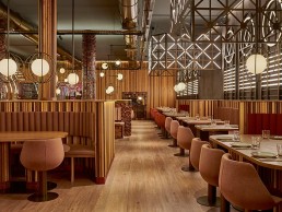
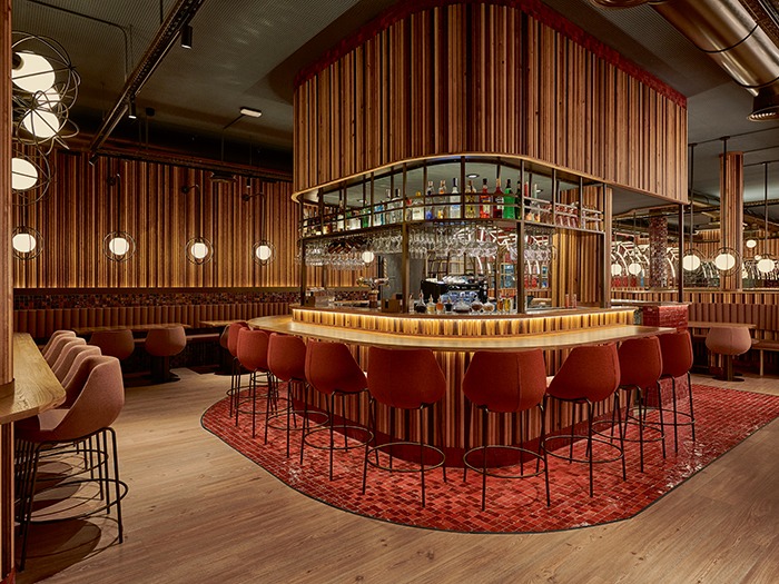
Piur Restaurant, Spain
Bespoke lighting elements designed by Masquespacio complement a rich, warm interior design for the new Piur restaurant in Valencia, Spain.
Spanish creative consultancy Masquespacio has paid tribute to the heritage of Valencia with the opening of Piur, a new pizza restaurant that reflects the city’s famous Art Nouveau architecture.
Taking inspiration from the chain’s Valencian roots, Masquespacio wanted to create a space that echoed its brand values of honesty and freshness, while providing a welcoming atmosphere that could work for any type of customer experience; both for individuals, as well as families or bigger groups of friends.
“The client was looking for an interior design studio that could create a space with an aesthetic that was different to the well-known in their category,” said Christophe Penasse, Marketing Director at Masquespacio.
Alongside the request for a stand-out location for visitors, the clients were keen for the restaurant to be connected to its location through its design.
“For the owners, it was important to connect the design with the local area, just as their pizzas are made with local ingredients,” continued Penasse.
“The biggest challenge was to find a connection point with something local, thinking about a concept that could evolve into something new for every space. We thought in this case that we would make a tribute to Valencia’s Central Market, which is one of the city’s most relevant Art Nouveau buildings.”
Emblematic ornaments from Central Market’s façade are therefore represented through a wide variety of bespoke decorative lights that create personalised corners, giving visitors the opportunity for new experiences every time they visit the restaurant, whether a romantic dinner for two or a relaxed lunch with the whole family.
“Each of the lighting fixtures represent a different element of the market. This way the play of lights tries to create a visual spectacle for Piur’s customers,” Penasse continued.
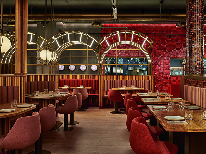
Alongside abstract, neon-effect sculptural lighting elements, each table is illuminated with a softly glowing orb pendant, while illuminated latticework structures and glowing archways provide intriguing focal points around the 500sqm restaurant. Masquespacio designed all of the different decorative lighting elements throughout the restaurant, and these were then produced by Ilumisa.
The interior designers also requested three separate programs for the lighting system so that it can be changed depending on the time of day. “When the night is coming closer, the lights are dimmed slightly to convert the restaurant into a bar atmosphere to enjoy cocktails and other drinks,” said Penasse.
The decorative lighting elements, which provide the main source of illumination in all front-of-house areas, are complemented by an interior design dominated by warm, earthy materials. Terracotta tiles and dark wood give the restaurant a cosy, intimate feel, while the gentle illumination from the bulk of the lighting fixtures adds to the overall ambience of the space, that Masquespacio hoped would provide visitors a “different stage” each time they visit, letting them “live in a unique moment that disconnects them from their daily routine, with a bit of comfort that reminds them of their own home”.
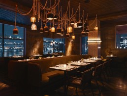
The Fulton, USA
Yabu Pushelberg delivers The Fulton - a seafood driven restaurant steeped in the history of maritime commerce with a Jacques Coustaudian dash of adventure.
Pier 17, the site of the original Fulton fish market in New York, has stood at the East River waterfront for more than 300 years. Its big brother now resides above Fulton Street in the financial district, second in size only to Tokyo Tsukiji fish market, and turns over a billion US dollars a year in annual profit.
In its place, Yabu Pushelberg has teamed up with Michelin-starred chef Jean-George Vongerichten to dream up an homage to the heyday of the fish market. The result is The Fulton, a seafood driven restaurant steeped in the history of maritime commerce and a Jacques Coustaudian dash of adventure. The Fulton comprises of two-levels, featuring a public and private dining room, bar, outdoor terrace, cocktail and oyster bar.
It was a friendly project, Glenn Pushelberg tells darc, a partnership between friends and professionals with phoenix-like origins.
“It all really started from our relationship with our New York neighbour, Jean-George Vongerichten,” explains Pushelberg. He had called them up to help design a space in a ‘really handsome’ Richard Meier building, but the project never moved past the planning stages. ‘Although the project didn’t move forward, we were still so intrigued by the building that we ended buying a unit in the tower above and making it our home in New York!”
“It’s a bit funny how it all came about,” adds George Yabu, “If it wasn't for that failed restaurant project, we wouldn’t be neighbours with Jean-Georges now and designing his new seafood restaurant at the Seaport. Everything happens for a reason.”
The designers knew from the offset it would be a special project - Vongerichten’s first venture into a seafood-focussed restaurant, it also holds a special place in the making of his own personal history. As a young chef, he used to scour the market stalls to select the freshest catch of the day. “His memories, the ingredients and the 300-year-old history of Pier 17 formulated how we wanted to design the restaurant,” says Pushelburg.
“We took into consideration how Pier 17 was used over the generations - as a space to bring fresh food and people together,” further adds Yabu. “Generations later, The Fulton was designed to transport guests back to this time and to this feeling.”
The result is a modern warehouse exterior, inspired by the fish market, that shifts into an underwater theme within. The walls are covered with dream-like murals by the architect and artist collective En Viu, who have conjured up oceanic scenes that go against the usual cliches of fish-nets and sea monsters.
“We needed to elevate this idea and create a design language that is worthy of Jean-Georges, the location and the sea-to-table ingredient ethos,” explains Pushelburg.
In order to do this, the design team placed particular emphasis on decorative lighting. The aim was to make everything feel warm, welcoming and intimate, and decorative lighting was the fundamental element required to establish this. Envisioning a sea of ceramic buoys, Yabu Pushelberg suspended pendant lighting from the ceiling by sailing ropes at varying heights. The idea was to create a visual rhythm that resembled the ebb and flow of buoys in the harbour.
One expansive art piece, it branches out across both levels to create a warm, intimate glow. Placed at the centre of the room, guests can look up and admire the detail, or simply get lost in the glow illuminating the face of the person sitting opposite them. Other small features include illuminated columns that double up as coat hooks, whilst simultaneously accentuating the glow of the hanging pendants. Considerable time was spent deliberating on how to give decorative lighting a moment in the spotlight, to make sure it looked like an art piece rather than just another fixture.
“The ceramic pendants were designed in our studio in conjunction with the ceramicist Alissa Coe,” says Yabu. “We also worked with Allied Maker on other custom lighting pieces in the restaurant; the project would not be the same if it wasn’t for the emphasis we placed on the lighting.”
The goal, according to Yabu, was to create a moody, intoxicating romantic glow that touches every single space of The Fulton. A cohesion so well suited for the menu and interiors, that it shapes the complete experience. “You can’t taste light,” he says, “but that’s what we were aiming to do.” The purpose of each space was considered carefully, and the designers used dimmers and backlighting to accomplish this sense of cohesion between the different areas.
There was also a keen focus on the reciprocal relationship between decorative lighting and architectural lighting.
Pushelberg explains: ‘“Although it may look like the decorative lighting is doing the heavy lifting, it’s typically an allusion and the architectural lighting is doing the work. The marriage of decorative and architectural is crucial to accomplishing a cohesive overall effect.”
Furthermore, this marriage is encouraged between the studio's lighting and design teams, which ultimately allowed for smooth sailing throughout the design and building process. Yabu describes their work ethic: “Our lighting team works hands-on with the studio’s interior, architecture, and landscape designers to make sure that we are conscious of each touchpoint of a guest’s experience and vice versa.”
This cooperation allowed for each team to challenge the other, encouraging self-awareness and open-mindedness that puts the guest’s experience as central.
“Overall, everything came together beautifully,.” summarises Yabu. “With the lighting team doing a fantastic job of honing in on their vision and seeing it through. The plan, was that there would be no bad seat in the house. Whether a guest can recognise that or not, they can most certainly feel it. That’s the beauty of good lighting.”
Yabu's personal favourite seat overlooks the Brooklyn Bridge, seared into the public consciousness through the iconic scene in Woody Allen’s Manhattan. From there, sunlight is brought in from every angle, amplifying the warm hues of the murals, and the Fulton transports its guests to a maritime fantasy of another time and another feeling.

Renée Joosten
Renée Joosten has been part of the team at US-based ICRAVE, for the past eight years – overseeing the design studio’s in-house lighting department ‘LICHT’. Working closely with the interior design teams at the studio - from concept through to implementation - Joosten focuses on creating cohesive designs where lighting, finishes and spatial parameters play off each other.
Originally from the Netherlands, where she studied Interior Design at the Royal Art Academy in the Hague, Joosten has always had a great interest in creating experiences that make an impact – not only within spatial relations, but also on a smaller scale, such as industrial and furniture design.
Having received her bachelor’s degree in Interior Design, Joosten then began working on residential and commercial projects in the Netherlands, before heading to New York to study the Master’s program of Architectural Lighting at Parsons, the New School. “Another interest of mine is archaeology… however, when it was time to choose a career, I felt that being able to create new spaces, instead of trying to recreate, would be more fulfilling in the long run,” she tells darc.
“During my studies I became especially interested in lighting and how it can impact the built experience. However, at the time, there was little time spent during the curriculum on architectural or decorative lighting, which I have always felt as an amiss, not having the tools for such a critical ‘building component’.
“For my final thesis in industrial design, I designed and built a light fixture made of just three materials: wood, fabric and the light source. I used a wood trunk, which I then sliced and routed out the middle in order to house a fluorescent lamp. Each slice had holes drilled out to allow fabric to be woven through, with knots in between the slices to create gaps / opportunities for the light to bleed out. This created a soft light, bringing out the richness of the wood, while controlling the glare of the fluorescent.
“When I began working as an interior designer it became even more apparent to me that lighting can make or break a space. I knew that in order to become a well-rounded interior designer, I needed to gain a more profound knowledge of lighting.
“Lighting is a powerful tool to tell the story of the concept and the space and a lighting product should reflect this. The quality of the lighting product is determined by the right colour temperature, CRI, optics and dimming capabilities – these are key. Flickering lights, cold CCT and unflattering shadows on faces, will diminish any great restaurant design concept.”
For Joosten, when it comes to lighting design, first and foremost, it is essential to gain a deep understanding of the key elements in a project and then determine what the goals are in regard to mood, experience, budget and so on, in order to provide appropriate and tailored solutions. “My philosophy is to provide holistic lighting solutions that tell the story of the concept and merge architectural, interior and lighting design, with the user as the key figure,” she tells darc.
“I try to bring a more collaborative approach between the disciplines, where lighting is thought out from the beginning and not an afterthought once the design has been completed. In the US, it’s very common to have multiple consultants - each with their own speciality - join the design team. The lighting consultant often comes on-board quite late in the process, when the design has already been advanced beyond concept. I have always felt this is a missed opportunity as it doesn’t allow for true design collaboration to create cohesive designs where lighting and interior design elevate the overall experience together.
“At LICHT, we always participate in the design process, providing not only technical knowledge but also creative lighting input early on. In addition, I think it is critical that interior and architectural designers have a basic understanding of lighting and vice versa to ensure the design and design process is optimised with a shared knowledge.”
In order to share LICHT’s lighting knowledge with the interior designers at ICRAVE, Joosten holds lighting townhalls, where the team will present the latest developments in lighting, as well as carrying out show-and-tells using light fixtures with different CCT, optics and CRI.
“For the past few years I have also taught at the Integrated Studio at Parsons, where interior design students and lighting design students collaborate on the same project,” she says. “I think these kind of programs are critical to bridge the gap between the different disciplines.”
ICRAVE, together with LICHT, is best-known for creating immersive hospitality environments, such as Page – a restaurant at Terminal A, Ronald Reagan Washington Airport, where the team designed a sculptural restaurant, up-lighting the beautiful historic ceiling. “This seemingly straightforward approach required multiple mock-ups on site, in-house light studies and close collaboration with the manufacturer to customise the fixtures,” Joosten says. “Each spoon has six one-foot fixtures, with varying colour temperatures and optics, aimed at different angles to ensure light would graze far across the ceiling without creating hotspots.
“The varying colour temperatures play off the abundance of daylight in the terminal. We won a Lumen award for this project, which was a highly valued recognition of our work.”
In terms of her ‘design style’, Joosten tells darc, that as a studio – foremost, they are focused on understanding the client and approaching every project from multiple viewpoints in order to provide design solutions for problems the client themselves might not have been aware of.
“Because of our in-depth analysis and strategic design approach, we are able to transition from different sectors, ranging from restaurants, food halls, cruises and healthcare with great success. Our solutions are never ‘cookie-cutter’, which makes our work dynamic and creatively challenging.
“Designing (darc awards winner) Celon, a dramatically lit lounge in the basement of a NYC hotel, versus designing a busy Spanish food hall in Hudson Yards, to in-patient rooms for Memorial Sloan Kettering, all have their own requirements. Understanding them and translating them into successful lighting solutions is extremely rewarding.”
For Joosten, overall, there is a growing awareness within the design industry of the possibilities of using light to make unique statements. “Many manufacturers are now offering modular systems to allow the designer to come up with original designs,” she says. “The ongoing development of LEDs has provided a great opportunity to integrate these small factors into new shapes that were not previously possible.
“As well as this, the function of light has expanded; fixtures are no longer just for lighting, they can be smart, they can be acoustic and so on… The lines separating one speciality from another continue to blur.”
And when it comes to the relationship between architectural and decorative lighting, for Joosten, there is no question the two should go hand-in-hand, working to “elevate each other”.
“It is important to have layers of light to create a sense of space, while bringing out spatial three-dimensionality and visual interest,” she says. “Pending the project, the balance between the two varies - also, architectural fixtures can be used for decorative lighting and vice versa.
“Architectural lighting can create the envelope in which the decorative lighting fixtures take the stage and create a different layer of scale and a feeling of luxury. Decorative lighting above all, is a great tool to capture the concept of the design and can also be used as a branding opportunity.
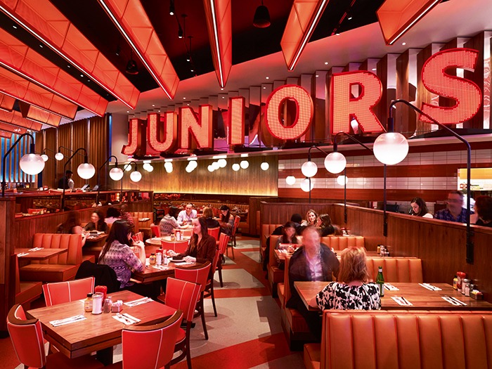
For Juniors at Times Square, we designed glowing custom wedge pendants of red perforated metal inspired by the graphic line pattern of their famous packaging. In addition, we discreetly placed spotlights to highlight the tables and create drama.”
Looking ahead, for Joosten, she sees a future that includes continued advancement of LEDs, such as the integration with other building components, controls customisation, and (hopefully), standardisation.
“Initially, when I joined ICRAVE to build the in-house lighting department, all of our lighting projects were in collaboration with the ICRAVE interior teams,” Joosten says. “Over the years, we have expanded our portfolio by working with other interior and architectural firms. My goal is to continue building these relationships and grow awareness for LICHT as an independent lighting collaborative… After all, in the dynamic world of lighting, you have to keep evolving!”
Nulty opens Bangkok studio
(Thailand) – New lighting studio follows expansion in Middle East, America and Beirut.
Nulty is expanding its presence in Southeast Asia with the launch of a Bangkok lighting design studio.
Headed up by Director Spencer Baxter, a lighting specialised with more than 20 years’ experience, this new location will allow the practice to capitalise on opportunities within the ASEAN community, and fully service the lighting design needs of its hospitality, retail, commercial and residential sectors.
“We couldn’t be more motivated about the launch of Nulty Bangkok,” said Paul Nulty, Founder of Nulty. “Southeast Asia has so much potential for us as a studio, so it’s important for us to be on the ground to maximise opportunities and ensure we deliver the best level of service for our clients.
“We’ve done our homework in the region and are confident that we have the right team in place to widen our network of contacts across Bangkok and beyond.”
Spencer Baxter, Director of Nulty Bangkok, added: “Thailand’s flourishing community of design professionals is just one of the reasons why Bangkok was the logical next step for Nulty. The new base will enable us to establish a dedicated ASEAN team, which will work in close partnership with local developers, architects and designers to bring their projects to life through boundary-pushing lighting design.”
Louis Poulsen appoints UK distributor
(UK) - Danish lighting brand joins forces with Atrium.
This announcement follows the recent appointment of Atrium's Scottish subsidiary Kelvin Lighting as distributor of Louis Poulsen lighting for the specification sector in Scotland.
The development represents a giant leap forward in the evolution of Atrium’s exclusive lighting portfolio, curated solely to offer architects, engineers, designers and contractors the best and most comprehensive range of lighting solutions that meet the needs of any project.
The Louis Poulsen indoor, outdoor, decorative and architectural collections add style and status to Atrium’s portfolio, offering exciting opportunities for specifiers. The range complements and enhances our extensive array of solutions and we eagerly look forward to introducing you to this important and exciting addition.
‘Having already appointed Kelvin Lighting to distribute our brand in Scotland, the logical next step was to appoint parent company Atrium to manage sales into the specification sector in the rest of the UK," says Louis Poulsen’s International Business Development Manager, Sune Arvad Kristensen. "Atrium’s professional and experienced salesforce is already well connected with the architects, designers and specifiers we need to reach and this move can only accelerate our engagement with them. We’re delighted to appoint Atrium and excited by the energy they will bring to our sales efforts."
Ulysse Dormoy, Atrium’s Managing Director, adds: "I have always admired Louis Poulsen and this is a fantastic opportunity for us which enriches our existing exclusive portfolio of brands. Louis Poulsen’s central philosophy of form following function, combined with a singular focus on Design to Shape Light reinforces our own philosophy that Quality of Light ultimately means Quality of Life. We’re very proud to represent such a revered brand in our home market."
www.louispoulsen.com | www.atrium.ltd.uk
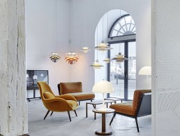
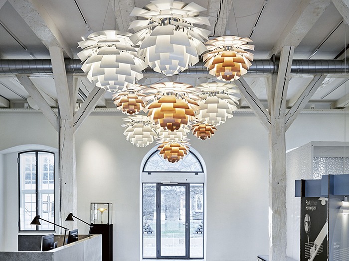
Illuminating the architecture
(Denmark) - Louis Poulsen's Copenhagen headquarters receives considered lighting design.
Anders Straarup Jensen, Lighting Advisor at Louis Poulsen, had the challenging task of bringing together the architecture of the building and the functions of the different rooms.
Every single room and floor are illuminated in different ways, showcasing the variety of Louis Poulsen’s fixtures.
Anders Straarup Jensen, lighting advisor at Louis Poulsen, commented: "As the property is listed, it has required an in-depth understanding and respect for the building to create illumination that brings together and lifts the architecture and the functions of the different rooms. In this case, it’s all about creating illumination that is comfortable and efficient for our employees and visitors."
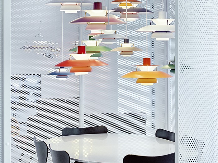
Every single room and floor are illuminated in different ways, but common to them all is the focus on functionality – and then there is a connecting thread in the form of the light fixtures’ colour, which is a subdued black, white and grey.
Research shows that our bodies and minds react naturally to changes in the illumination around us. When we are exposed to higher colour temperatures and brighter light, we feel more awake and become more alert.
However, it’s not good for us to spend our entire working day in an environment with high colour temperatures. Louis Poulsen has therefore installed light fixtures with Kelvin Adjustable, which covers a colour temperature spectrum ranging from 2,700 to 5,700K, making it possible to simulate daylight from morning to evening, while also being able to vary the brightness (lux) during the day.
Products featured include: Above, Flindt Wall, LP Circle Suspended, LP Slim Round Suspended, Munkegaard, NJP Table, Panthella Floor, Panthella MINI , Panthella Table, Patera, PH 3/2 Wall, PH 5, PH 5 Mini, PH Artichoke, VL45 Radiohus Pendant