Very Good & Proper - Pigeon Light
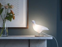
British manufacturer Very Good & Proper is to reissue the iconic Pigeon Light designed by Ed Carpenter to celebrate the 20th anniversary of its creation.
Originally designed in 2000 by Ed Carpenter, the Pigeon light started life as a project, while Carpenter was studying for his MA in Design Products at the Royal College of Art (RCA) in London. Devised as an alternative souvenir for London, the original Pigeon Light was part a reaction to the poor-quality products on offer in most tourist shops and also a celebration of the wildlife of London.
The original design was an exercise in simplicity. Consisting of a vacuum-formed Perspex shell on a wooden perch that attached to a ready-made ‘clothes peg’ foot. The light was fitted with an extra-long power cable that doubled up as a stand when looped and held with the clothes peg foot.
Initially produced by Carpenter in small batch for his RCA graduation show in the summer of 2001, the lamp was then spotted by influential design retailer Thorsten Van Elten and put in production as part of his newly born brand after being exhibited at 100% Design in 2002.
The Pigeon Light caught the public’s imagination and quickly became a best-seller and design icon. It was sold in design and museum shops all over the world, including the renowned Design Museum in London.
Twenty years later, Carpenter – now co-founder of leading British furniture manufacturer Very Good & Proper – has re-visited the design of the Pigeon Light and is reissuing it as part of VG&P’s own new e-commerce site. The designer has worked closely with VG&P’s in-house design team to update and further streamline the Pigeon Light’s design, resulting in a more refined, functional and minimal product, while still retaining the warmth and humour of the original.
The new Pigeon Light can be either free standing or wall-mounted, and the materials have been adapted to today’s needs. The light is made from high-quality and fully recyclable plastic with a wooden European FSC beech base and powder-coated metal weight stand. It comes in both a white and black version.
The first 1,000 Pigeon Lights come in a box featuring a special paper sleeve designed by London based graphic designers Studio Eger, which depicts the pigeon using a half-tone screen – aiming to capture the iconic shape using tone and shading, rather than line.
Chelsom - Edition 27 Collection
What is the concept behind Edition 27 Collection?
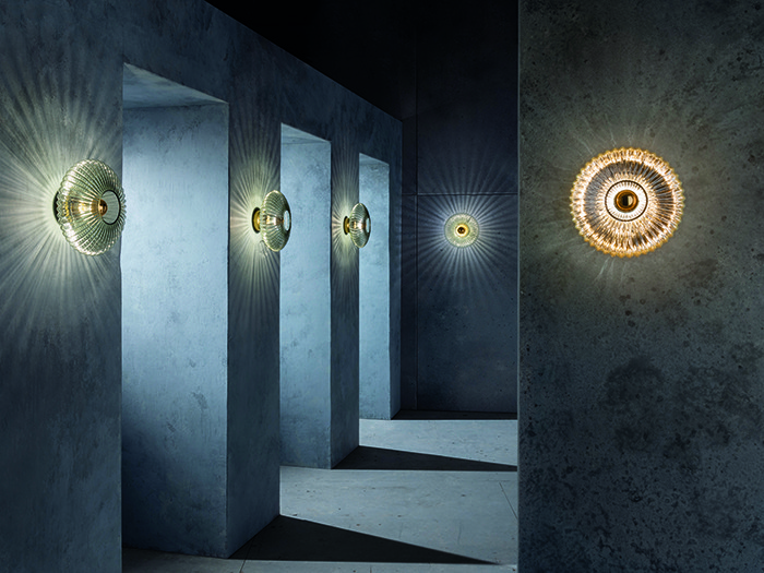
Our main focus - as always - was to create innovative and beautiful lighting designs. Edition 27 shows an array of new wall light designs, this 'Glass Effect' range being one of our favourites. The main concept was to focus on how we could create light effect on the wall and within different types of glass so that the sconces were not just about ambient light but also about the projection, pattern and play of light on surface and the refraction of light through different coloured and shaped glasses. We have used some traditional components in totally different applications to achieve this light effect and one of the key features is that the glass can be fully interchangeable to create totally different results.
How long have you been working on the product for?
The creation of a Chelsom catalogue takes around 18 months and different designs take different amounts of time to perfect within that period. The 'Glass Effect' collection involved a lengthy prototyping period as we had to refine the shape, translucency and colour of all glasses used before we could make our final decisions on the collection.
Can you describe the design process and materials used?
The main focus was to keep things simple. The overall design marries three key components: the brushed brass back plate, a mirror top E27 lamp and then the glass shades. The hero element is the glass itself, which comes from Italy’s Veneto region and in three designs: a flat deeply ribbed elliptical shape available in smoked, mirrored gold and opal; two styles of glass dish, one with built in concentric lines and one that is smooth. They are finished in a Veneto crackle gold leaf to create a brilliantly intense golden light effect which shines like the sun. The final shape is a clear bowl made from cross hatch glass that sparkles as the light refracts through it. The mirror top lamps form the golden centre piece for all designs.
What was the most challenging aspect of producing this product?
As we developed the collection, we soon realised that the different colours and types of glass were going to manipulate the light in different ways. I had hoped that all glass types would blast the light reflections across the wall in the same way as the smoked glass version but it became clear that we could create different types of light effect within the glass itself so we decided to focus on that. The overall design intent evolved as we worked through the manufacturing and prototyping stage, resulting in an ever-moving set of goal posts and endless opportunities. The challenge was narrowing down the options to form the final collection!
What makes 'Glass Effect' different?
We haven't played with light effect as much as we have done in this range before, so this makes the collection truly stand out for us. I feel that because we are using traditional Italian glass in a totally innovative way, this makes the range stand out. The glass would have normally been used in traditional Venetian chandeliers and sconces but this modern application makes for a very different lighting product.
What kind of environment is this product range suitable for?
Given the neat size and the fact that there are an array of glass options to choose from, I feel that this range can be used in all sorts of applications. These are not subtle products by any means and they should be used to create powerful and striking light effects. Because of the pattern and reflection, I think these wall sconces will liven up a corridor superbly as they throw light across the walls. Equally the intense and vibrant colours and light effects will enhance any bar and restaurant interior. I would love to see the lights by the bed in a guestroom scheme.
Why your mental health matters
darc sits down with Nulty’s Kael Gillam and interior designer Kaye Preston to chat about Designers Mind, a new forum aimed at raising awareness of mental health and wellbeing in the design world.
How did Designers Mind come about?
Kaye Preston - pictured right (KP): Designers Mind is a forum and community of creatives who are passionate about raising awareness around mental health and wellbeing for designers in the workplace. The idea was born last October at the Mad World Summit in London. I attended a talk by a journalist who had created a sharing platform for his industry. At the time I was also aware of a forum created for architects but knew of nothing specific for designers. Throughout the day the seeds were planted and very quickly started to grow. I co-chaired a roundtable about leveraging design in our offices to create environments that promote wellbeing. It was in that moment that I realised there was a complete disconnect in our industry. Here, I was raising awareness about using design to help other people’s wellbeing, but there was nothing in place to take care of the people actually doing the designing.
Kael Gillam - pictured left (KG): I met Kaye through our Business Development Manager Sarah Crooks, another fellow American, at a Thanksgiving dinner organised by Nulty. We immediately hit it off and Kaye was bursting with ideas about how to change the design industry for the better. Needless to say, I was ecstatic to join the effort and am delighted that there are now a handful of us supporting this vision.
What do you hope to achieve with it?
KP: Our aim is to help improve the mental health and wellbeing of designers at work by raising awareness of the challenges they face within the industry and the effect they can have. We want to change the mindset of the current working culture that doesn’t really allow the time to incorporate healthy habits into the day. Focusing on prevention and the importance of incorporating sleep, healthy eating, movement, connection with others into our days, can only make us healthier, more productive and more creative in the long run.
How has the discussion on mental health changed over the years?
KP: It’s definitely become more open. Stigmas are being broken and many now feel they can talk about their mental health. Charities are doing incredible work and providing much needed access to resources. There’s also a new level of understanding that prevention methods can be taken through healthier daily habits. Big names like Arianna Huffington talking about the importance of sleep for instance, has been incredibly important for raising awareness and changing mindsets.
KG: Charities are doing an impressive job of trying to raise awareness; Mind really is a household name now. Organisations like CALM and Samaritans have call lines that are helping people on a daily basis. The work they do is literally saving lives by giving vulnerable people someone to reach out to in an anonymous way.
How do you think the lighting industry and wider design community responds to mental health awareness?
KG: I think that the lighting design community is very aware of the impacts of poor mental health, and that we are a pretty open, honest bunch of people who want to implement change in the way we work. However, the research that I did for my talk at [d]arc room last year showed me that a big roadblock for smaller firms trying to implement mental health policies is the belief they have to spend a lot of money to make their workplaces happier and healthier places. I want to debunk that misconception because there is so much that can be done for minimal or no cost.
KP: I can only speak about the interiors industry myself but I have to say that I have always felt supported by all of the firms I have worked with when it comes to my mental health. But there seems to be more policy in place for the moment when someone actually needs help, rather than practicing regular prevention along the way.
Is there any ‘normalised’ behaviour in the design sphere that you think puts more pressure or strain on your mental health?
KP: For me it’s the combination of long hours and technology not allowing us to fully switch off. I acknowledge that it’s a high-pressure, deadline-driven industry, but I also think people can feel under pressure to stay late or look at emails out of hours. We often prioritise work over wellbeing, resulting in us not being able to switch off, set healthy boundaries and say no to heavy workloads. This can all lead to overwork and exhaustion, which puts a strain on our mental health.
What steps are Designers Mind taking to promote better mental health and wellbeing?
KP: We are working on raising awareness by sharing experiences and working on holding talks and events to create a community and recruit supporting partners. We would like to create tools and resources for the industry, in addition to holding workshops to help people create their own wellbeing toolbox and understand the importance of healthy habits and how they are fundamental to mental health and wellbeing.
What has the response been since you started?
KP: The response has been incredibly positive. I’m really grateful to the amazing designers that have joined, been willing to share their stories and help spread the word. The design team at Nulty has been extremely supportive as well. They were some of the first people that I floated the idea past and the team even invited me to speak at their London office where the concept was launched. The forum is still very much in its infancy but with the positive response we’ve received so far, we’re hopeful the momentum will build.
There’s a lot of talk in the lighting industry about the role of light on wellbeing, mostly from a technical perspective. Do you think there needs to be more discussion on the psychological effect that lighting and design can have on health and wellbeing?
KG: I’m by no means an expert on this, but I agree that more research needs to be done into the effects of things like circadian lighting on people’s wellbeing. We had a CPD with Helen Looms last year, and unfortunately it sounds like there’s a massive lack of funding for this kind of research. A lot of the data that the lighting design community relies upon for its wellbeing hypotheses, are the afterthoughts of wider medical studies that aren’t focused on the actual qualities of light, perception and emotion. I would like to see more Master’s students looking into this aspect of lighting design, as it’s clear the industry is shifting towards the emotional, personal side of the perception of a space, as opposed to ticking boxes for lux levels.
KP: Certifications such as WELL and fitwel are addressing the effects of design on overall health and wellbeing. Biophilic design, connecting humans with nature in our environments, has also become more popular – studies show the positive effects of incorporating nature into our interiors on our mental health. Our job as designers is to raise these options with our clients so that we can use these tools when designing a space.
What advice would you give to someone who may be struggling with their mental health and wellbeing?
KP: I would say don’t try and go it alone. It may feel incredibly daunting and even scary at first but reach out. Connect with someone you trust and start the conversation. I know from my own experience that I felt like an incredible burden to my family and friends. But I’ve since learnt that this never was and never is the case. Everyone goes through something. It’s better to be in this together.
KG: Try not to keep it all to yourself. If you’ve never spoken to someone about your mental health before, it can feel stupid and scary and not important because hey, other people have problems too, don’t they? Don’t invalidate your own feelings; own them, accept them and seek guidance on how to work with (not around!) your circumstances to feel healthier. We have a handful of resources on the website and that list will hopefully get longer and longer as time goes on.
What more can studios do to support their staff?
KG: There’s so many things to pick from here it’s hard to boil down! Firstly, I would have to say that stopping the “always on” mentality is a must; some companies have their emails shut off after work hours so there’s no scrolling frenzy at 10pm hoping that someone may have got back to you. Providing support is my other, though quite broad, piece of advice. Offer managers Mental Health First Aid training, offer private healthcare and/or digital counselling options, provide employees with a Mental Health resource guide that shows all of your company’s policies and the resources available to them.
KP: I think focusing on prevention instead of reaction would be really helpful. For example, addressing the long hours culture instead of making time for healthier lifestyles. Whenever I’ve been in the position discussing resource the same thing is always said: “We work longer hours when we have a deadline, but this isn’t meant to be the norm.” Unfortunately, I think it has become the norm and the times in between much less. The London Practice Forum (a community of architectural practices) have signed an agreement to reduce 40+ hour work weeks. Could the design industry follow suit?
How can people get involved with Designers Mind?
KP: The easiest way to get involved and best place to start is at our website. Here they can get in touch, follow us on social media and discuss what they can do. I would also like to add that we really appreciate all of the support.
Karavaan, Netherlands
Studio Modijefsky harnessed the concept of migration and the journey of the caravan, to create a unique destination in the heart of Amsterdam.
In the brightest corner of Amsterdam’s historic Kwakersplein Square, Studio Modijefsky has created Karavaan – an exciting new destination for Amsterdammers. Initially a polder area outside of the old city limits, Kwakersplein became part of the Bellamy neighbourhood after being dammed in the 19th century. Ever since then, people have been migrating towards this spot, just like a caravan.
Studio Modijefsky translated this migration into the concept designs for Karavaan – a venue that combines an all-day hangout, bar, café, cocktail bar, breakfast club and restaurant. “Karavaan is a place where you travel to and unexpectedly have a long stay,” Studio Modikefsky's Esther Stam tells darc. “It is a vacation in your own town.”
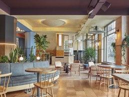
The interior is subtly divided into different landscapes: meadow, swamp, forest, mountain and desert, with each zone characterised by its own colour scheme, materials and design specifics, all unified by a trail that crosses the entire space. As you enter through the main vestibule, a bespoke circular ceiling light defines the lounge area underneath. From here, the space unfolds into different directions indicated by changes in colours, interior finishes and light objects. Looking to the right, a small bar with a toned-down fresh pastel palette is connected to a second entrance, located at the corner of the building.
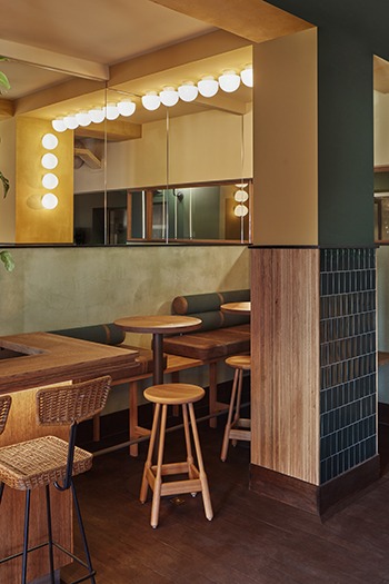
Walking across the herringbone wooden floor, towards the natural oak bar, the white ceramics, staggered yellow tiles and the light wool carpet ceiling, creates the feeling of being in the tall grass of a meadow. This bar changes its function throughout the day, from a morning coffee spot to a window seat for an evening drink. This transition is suggested by a structure of mirrored light panels hanging above the bar, designed in-house by Studio Modijefsky, that can be flipped, changing from ‘Karavaan Caffeine’ to ‘Cocktail Karavaan’.
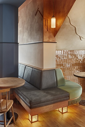
As the meadow bar wraps around the corner, playful bespoke seating leads customers to another level, into one of the dining areas. Here, the colours are more dramatic, conveying a mysterious atmosphere; the glossy ceiling, deep blue column and stucco walls recall the reflections of the water and roughness of the deltas of a swamp. A similar vibe reappears on the opposite side of the venue, overlooking the square, where a dark purple ceiling and a tailor-made curved bench create a cosy corner with the adjacent column, separating the bar from the dining area.
Traversing the different landscapes, the central bar runs along the back of the space, where lines of light, jute fabric and rough plaster intertwine, leading guests towards it. Dark cork panels join with wooden slats, while a reflective zinc bar top intermingles with the dense wood. Glass racks are reflected on the mirror tiles of the back bar, which are crossed by a wavy line of light. The adjacent portion of the ceiling, delineated by four beams, defines the centre of the space through a multitude of Trainspotters’ Mushroom lights, springing up from a mirror.
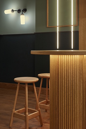
Stepping down from the bar, the floor changes its pattern from herringbone to diagonal. Far from any natural source of light, the use of dark colours and rigid lines make this zone feel like a dim forest. A high bench with a green cylindrical backrest, detailed with leather accents, overlooks the space. Vertical beams of light come through the walls, resembling the rays of sun peeking through dense tree trunks, resulting in an enchanted atmosphere. Opposite these lines of light, light grows out of a planter, with Trainspotters’ white globes adding a playful element between the plants. The feeling of the forest spreads towards the adjacent room and meets a desert, creating an eccentric mix of bright colours, brown wood veneer and green tiles.
Elsewhere, beams of light on one side, and an arc of light on the other, embrace a small wooden bar and playful high seating, creating an intimate corner. Just a few steps from the small bar, warm colours and softer lines create a more gentle vibe – the tiled floor is covered by a soft rug, while the wooden slats of the walls are softened by a velvet golden curtain. Red velvet lounge chairs complete the relaxing ambience.
While the interior is broken up into multiple zones, each offering their own distinct ambience, Stam says that the introduction of different kinds of lighting, both in terms of decorative and architectural pieces, is something that Studio Modjefsky hoped would differentiate the zones.
“Specific types of lights have distinct functions: a light line on the wall creates a landscape and guides people towards a specific point; a family of ceiling lights suggests there is a gathering point underneath. The light doesn’t only contribute in creating a nice atmosphere, but it guides people throughout the space.”
Further to this, the interior designers used light – either bespoke pieces designed by the studio itself, or pendants and wall lights from Trainspotters – to create stand-out focal points throughout. “The bar itself needed to stand out. Above the coffee bar at the entrance we thought of the mirror panels with light integrated in one of the sides to form a composition of lamellas, which can be seen from the street,” Stam explains.
“Deeper down in the dining area, we designed a light string that runs from the window in the façade, all the way along the wall, and ends in the main bar. Here, a light box with textured glass, integrated lights in the back wall and a line of light underneath the counter, capture the attention and invite the client to approach the bar.
“The lounge space has its own light accents, with a row of light spheres placed on the ceiling and column, facing a mirror that is reflecting the lights once more. Also, smaller light accents, such as little cubes underneath a long custom bench, form playful ornaments, giving the place its own character.”
By giving each zone its own unique “light language”, Stam feels that Studio Modijefsky was able to bring a different atmosphere, and as such a broader diversity, to the space. “We don’t use light as a strictly practical element to illuminate the environment, but as a key element to create a warm atmosphere,” she says. “A line of light under the counter, for example, isn’t simply used to indicate where the bar is, but it complements the colour of the material underneath, emphasising some shades that would otherwise be invisible – it gives body to the space.”
Throughout its portfolio of work, Studio Modijefsky looks to tell a story through its designs, by analysing the history of the building and its surroundings, combining this with how the space is today, and the branding of the client. This is what forms the basis for the design concept, and the design language that is specific to each particular project. Here, the interior designers harnessed the concept of migration, of the journey of the caravan, to create a unique destination.
“It’s all part of a complete story,” Stam says. “Like a caravan using landmarks to know the way, we created accents on walls that guide people through the space; sometimes light lines that lead the eye through the space, sometimes light ornaments hanging in a certain direction, and sometimes a special light fixture enriching a specific zone… it gives each space its own character, and transforms Karavaan into a unique location.”
Oceans Restaurant, USA
Oceans Restaurant by Rockwell Group is a timeless and approachable dining experience in the heart of New York’s renowned Union Square.
Oceans restaurant is a local and globally inspired seafood restaurant situated near New York’s Union Square and is the third collaboration between design studio Rockwell Group and Toptable – an award-winning collection of restaurants defined by its exceptional cuisine and striking decors, creating a timeless and approachable dining experience.
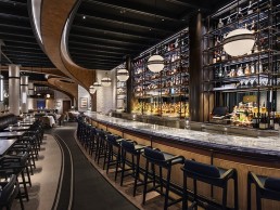
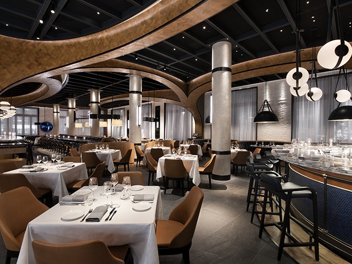
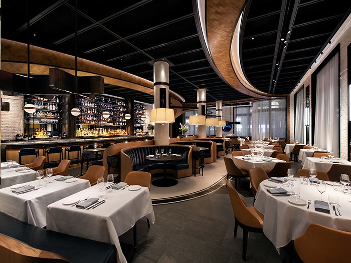
Oceans celebrates an elevated take on a New York bistro with a downtown feel. A spatial strategy telescopes the energy from the bar into successively more intimate dining spaces, including multiple seating groupings, three private dining areas, and a sushi bar – offering a distinctive and flexible restaurant. An undulated wood-rib ceiling, inspired by New York’s historic archways frames each discreet, but open, environment. White oak, whitewashed brick, hammered antique brass, and leather and navy-blue accents dominate the luxurious material palette.
Craig Chowaniec, Senior Associate at Rockwell Group, talks darc through the project: “Oceans is Toptable Group’s first project outside of Canada so we really wanted the design to reflect the client’s incredible ambition, by creating a space that was noticeably unique. They gave us an opportunity to dream up something bold. The way we approached this was to embrace curvature; by curving nearly every component in the restaurant, the space embraces and envelops you in a way that right angles could not. The architecture appears to swoop and move to a rhythm.”
The entrance to the restaurant lies on the corner of Park Avenue South and 19th Street where Rockwell Group carved into the storefront to make an inverted entry and gracious outdoor foyer. A custom, curved glass profile creates this grand entranceway, which features a custom globe pendant with bronze details, creating an undisputed presence on Park Avenue.
“Lighting played an extremely important role in this project,” continues Chowaniec. “As far as restaurants are considered, the space is rather large. We wanted to embrace the grandeur, but also provide a sense of intimacy at each table for the guests; lighting enhances that to an extraordinary degree.
The length of the main dining room in the restaurant is defined by six existing large window bays. Rockwell Group renovated the storefronts with completely custom profiles in solid wood, making them operable onto 19th Street and Park Avenue. An elevated outdoor patio on 19th Street also provides additional seasonal seating, Rockwell Group used the window bays to create a strategy for the atmosphere of the dining room, focusing the majority of the energy around the 30ft long bar and decreasing scale as the restaurant recedes.
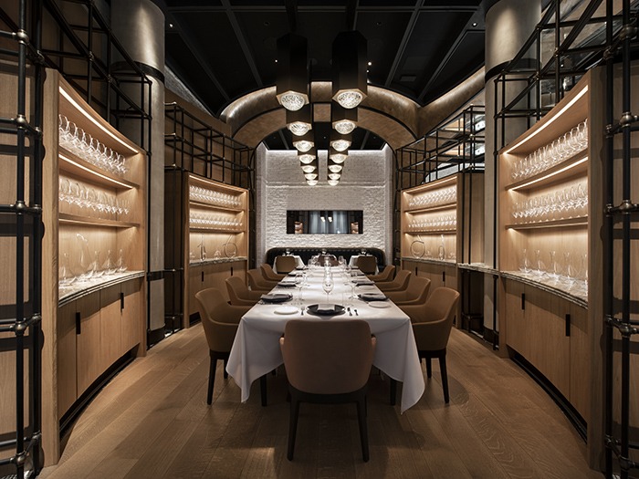
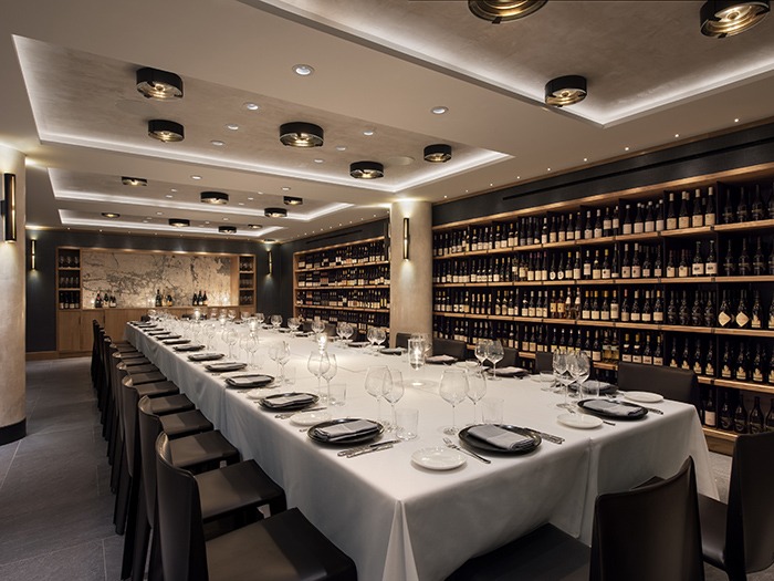
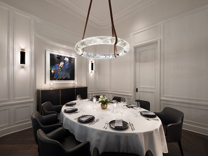
A large exposed kitchen at the back becomes a focus-point for diners, while an adjacent blue title sushi bar and semi-private dining room are grounded by a grand custom hex chandelier. A false wall conceals a secret private dining room featuring white oak millwork and a handmade alabaster pendant hanging over an eight-seat dining table. A feature staircase escorts guests to the shared lower-level private dining room and wine cellar, a celebration of multi-style brick, complemented by a series of wall-length backlit wine cabinets.
“Lighting at Oceans typically ranges from 2700-3000K,” says Chowaniec. “In every space we advocated for a lower colour temperature to create a relaxed, sophisticated and warm, candle-lit style environment. Many of the decorative lighting fixtures were custom designed and then manufactured by the likes of Hammerton, VISO and Juniper.
“The architectural lighting is designed to essentially disappear, which increases the expression of the decorative fixtures. A system of millwork beams in the ceiling hide the architectural lighting so you only notice the custom fixtures beneath. Both architectural and decorative elements share the same warm colour temperature – the rich, soft glow akin to candlelight, feels consistent throughout the space.”
In terms of restrictions on this project, for Chowaniec, the overscale swing fixtures that hang over the round booths in the main dining room are attached to the building’s original columns which were built in 1909. At the turn of the century, cast iron columns were typically fireproofed by terracotta - beneath the plaster finish is a thick layer of terracotta brickwork and we wanted to cantilever the lighting from these columns, so anchoring the pendants without compromising the cast iron and existing fireproofing was definitely a challenge.”
Reflecting on the project, as Tabletop Group viewed the restaurant less as a commercial project and more as if it were a private residence, there is an amazing attention to detail and tailoring throughout… “We were absolutely thrilled with the end result,” says Chowaniec. “Oceans exceeded all of our expectations; we spent many hours refining the conceptual drive behind the space’s curvature, which is palpable when you walk through the space.”
Toplum Restaurant, UAE
In the heart of Dubai, the Toplum Restaurant serves sophisticated Mediterranean fare in an elegant environment.
At Toplum, the latest project by interior designer Vera Dieckmann and her pan-global firm, XO Atelier, the interiors create a stylish environment in which to experience thoughtful cuisine. Located inside the Mirdif City Center, Dubai, the guests are transported into a place of calm and stylish focus.
An inspired series of textures and forms are rendered in a muted palette of warm, buff colours; seemingly disparate textures such as perforated copper coloured metal in an undulating profile, smooth tiles, and wall plaster finishes both smooth and boldly, vertically ribbed, are used to seamless effect. The ribbed walls, undulating profiles and carefully curving lines of the custom furniture all reflect the form of the arch, which repeats throughout the restaurant, and are a unifying presence, even part of the branding itself.
The lighting design scheme developed for Toplum is no less sophisticated. Architectural LED lighting abounds within the space, but always subtle, used carefully here and there to accentuate a form, call out a niche, establish a directionality to a room or give visual weight to furniture. The complexities of architectural LED lighting continue to make it easy and forgiving to integrate into interiors, but what isn’t easy is integrating both architectural and decorative lighting into a single scheme to great effect, and that is precisely what XO Atelier has achieved at Toplum.
Incorporating decorative lighting fixtures from multiple brands – including some designed by the XO Atelier, the interior design studio approached US-based manufacturer SkLO - interested in the Balance pendant, which is itself an arching form.
The Balance pendant is a composition of a single larger 7in lit glass sphere on a short horizontal arm opposite a smaller 4.5in lit glass sphere on a long downward curving arm. Suspended on a rigid brass tube stem, the composition is a visual and literal exercise in balance and proportion. The glass sphere diffusers feature the signature SkLO detail of a small, rippling mouth that shows where the piece is broken hot from the glassblower’s pipe and fire-polished to a smooth finish. This detail is a reminder that all of the glass used in SkLO designs is handblown, made one at a time, and without the use of moulds. Combining subtle, uncontrollable details that call attention to the handmade nature of the glass, with precisely machined hand-finished metalwork is a consistent theme throughout the SkLO collections.
SkLO worked with Dieckmann, to produce an additional custom Balance pendant just for Toplum; a symmetrical version, with two downward curving arms of brass, each with the larger 7in size glass spheres, it is used in a specific location within the scheme, allowing for a moment of transition along the double-row of Balance pendants that stretch gracefully along the length of the Toplum dining room.
“The designs of the SkLO lighting collections are heavily influenced by my work as a jeweller and my background as a metalsmith,” says SkLO Design Partner, Karen Gilbert. “The Balance is an example of this, and I think this is what makes SkLO special, that our designs are the work of a woman, and they do not share the same masculinity of form I see repeated over and over in the lighting design sector. To see my designs used in the work of another talented female designer like Vera, in a project like Toplum, which itself exudes elements of sophisticated femininity, is a great pleasure for me.”
Secto Design ups sustainability efforts
(Finland) - Secto Design invests in packaging technology aimed at substituting plastic.
Secto Design has made a significant investment in start-up company, Paptic Ltd a Finnish producer of unique packaging material made of renewable wood fibres that combines high performance and sustainability; Paptic aims at substituting plastic in packaging with all Paptic-materials environmentally friendly and biodegradable.
“Until recently, Secto Design has purely invested in developing its own production," says Tuula Jusélius, founder and owner of Secto Design. "However Paptic has such a meaningful goal and fits perfectly with our own philosophy, that we had to come onboard.”
Paptic was established as a result of long-term developing process carried out by three Finnish paper technology experts. The main solutions of it have been patented around the world. The outstanding asset compared to other new packaging materials aiming at replacing plastic is the fact that the material Paptic makes doesn’t consume any edibles such as corn, dairy or sugar – but uses wood fibre instead. The packaging produced by Paptic is noticeably more durable and water tolerant than currently existing paper packagings and there are already several high-end brands such as Hunter Luxury and Galerie Lafayette among the brand's client list.
As a manufacturer of sustainable design lights, responsible inventions for a better future are important for Secto Design. “We have taken the sustainability matters into consideration in addition to our products, also in our packaging," continues Jusélius. "But there are still a couple of points where we could do better! With the investment we made we want to support a fellow Finnish company that is addressing the environmental challenges and that we share the values with. Our dream is that in co-operation with Paptic we could eventually remove the remaining trace of plastic still left in our packaging.”
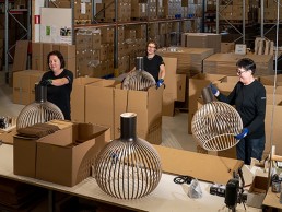
Secto Design is a Finnish company specialized in design lights hand-crafted of top-quality local PEFC certified birch wood. The demanding work is carried out by highly talented local craftsmen in the town of Heinola, Finland.
Vibia launches Sticks
(Spain) - Renowned designer Arik Levy creates an innovative collection connecting light and architecture.
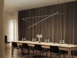
Vibia launches Sticks lighting system designed by Arik Levy in collaboration with Vibia. Fusing technology, space, and architecture, the cutting-edge collection offers a creative toolkit for integrating light elements in an interior.
The namesake sticks rotate on their own axis, offering unlimited freedom in directing a light source precisely where needed. The sticks can be connected from a wall to another wall, the floor to a wall, the wall to a ceiling, or suspended from the ceiling into space. The toolkit features three sticks, minimalist aluminium rods measuring 1.5-metres, 2-metres, and 3-metres, which can be combined in custom arrangements for a maximum length of 6.5-metres. Exuding a daring, industrial sensibility, the glowing rods connect and disrupt planes in space through their unadorned physical form and the focused light they cast.
Sticks presents innovative ways to introduce light, brightening dead zones and transforming linear light into floating sculpture. Pure and graphic, it effortlessly enhances the ambiance of an interior while doubling as an abstract light installation.
Fumie Shibata
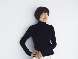
This year, Czech lighting brand Brokis has launched its first outdoor lighting collection in collaboration with Japanese designer Fumie Shibata. Inspired by Japan’s traditional lighting patterns, darc learns more on how she used the style of bonbori - an iconic paper lantern used in local and traditional ceremonies for this collection.
How did you first meet Brokis?
I've always wanted to design lighting fixtures and other products with glass, and my agent suggested the Czech glass brand Brokis. They contacted them on my behalf, and we were able to actually meet and have a tour of the factory. I was fascinated by the innovative technology and beauty of the glass produced.
What is the concept behind the Bonbori range?
In response to Brokis’ desire to design outdoor lighting fixtures and in order to make the best use of the beautiful glass produced by them, we considered a structure where the light in the glass glows dimly. This was inspired by the light from the Japanese ‘snow cave’; a ‘snow cave’ has two meanings: a light made of Japanese paper, and a hole where snow is piled up and dug out. Both are associated with gentle light.
What was the biggest challenge for this project?
As we were designing the fixtures to be used outdoors, I was most concerned about how to combine the beauty of the lamp with waterproofing, but I was able to solve this by working through different ideas with Brokis engineers.
Can you tell us more about the design process?
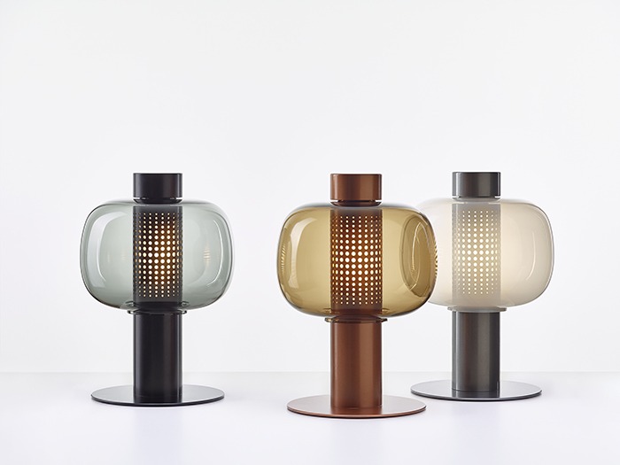
Like other Brokis creations, Bonbori is handblown in the brand’s Czech workshops and took about 18 months to develop from start to finish. The base, made of stainless steel, is available in matte metallic colours, thus bringing a resolutely modern touch to the luminaire. Thanks to a subtle set of openings, laser cut and paired with the lightly tinted opaline glass shade, Bonbori diffuses a peaceful light fit for soft summer evenings.
The design is based on both the symbolic use of one and the interspersing of multiple pieces. There is no front, back, left or right, so you can choose where to put it. We aimed to produce something that would be equally fitting for a residential garden or sit well in the grounds of a large facility such as a hotel.
Bover - Skybell Collection
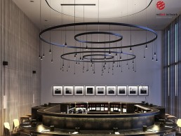
Winner of the 2020 Red Dot Product design Award, Skybell is Bover's first collection to delve into decorative architectural lighting. An extensive and flexible lighting program that allows lighting multiple and diverse spaces.
The elegant and timeless track system of the Skybell Collection provides a decorative accent to the space, while being light structures designed to guide the light to where the space requires.
Decorex 2020 heads online
(UK) - Decorex International confirms move to all virtual event.
The organisers behind the London-based event have made the decision to transition from a live event to an all-virtual format, which will now take place from 3-5 November rather than the original dates in October.
“Although the decision to transition this year’s in-person event was difficult and we will miss seeing everyone in
Olympia, we are excited for a new way to engage and interact with our industry,” says Decorex Event Director, Sam
Fisher. “We know the design community is eager to come together face to face, and our reimagining of Decorex
through a virtual event will offer exceptional content, the ability to source new products, learn, share ideas, and
network.
“We want to thank everyone in the design family for their ongoing support,” continues Fisher. “We look forward to
seeing everyone virtually in November and in person next year in Olympia."
As one of the creative minds behind Designscape 2020, Decorex has also helped to design a creative event focused on
residential, hospitality, and retail set to take place 11-13 August.
More details on Decorex virtual to follow.
Maison & Objet Paris to run digitally
(France) - September 2020 edition will no longer go ahead in usual physical format.
Instead, from 4 - 18 September, Maison & Objet will host a 'Digital Fair' via its online platform, MOM (Maison&Objet and more). At the same time, Paris Design Week is still confirmed to run from 3- 12 September 2020 in Paris, in order to contribute towards re-opening and kick-off the autumn season for decoration, design, and crafts professionals.
"Although there are encouraging signs of the pandemic beginning to decrease, we believe there are still far too many uncertainties regarding the travel conditions for international exhibitors and visitors," comments Philippe Brocart, Managing Director of Maison&Objet. "Furthermore, the lack of clarity regarding the ability to hold large gatherings in early September in France has played a major part in influencing our decision to call off the September edition, despite the fact that 80% of stands had already been reserved by April 2020.
"Our teams have spent the past few weeks shaping out plans that will allow brands to present their new collections and continue engaging with buyers and specifiers online."
The aim of this initiative is to maintain an active relationship between brands/designers and buyers/specifiers with a view to driving year-end orders, as is the case each September. The Digital Fair will feature two complementary strands: Digital Showrooms on the MOM digital platform to enable products to be showcased, and Digital Talks on the Maison&Objet website to deliver content and inspiration.
Each year for the past decade, Maison & Objet has also organised Paris Design Week, a design-led experience that runs alongside the trade fair. Through five different districts, each with their own identity, Paris Design Week extends an open invitation to explore the City of Light through the prism of design. 2020 will be no different, with a host of new finds being celebrated in the French capital's showrooms and featured in its decoration, design, fine crafts and lifestyle stores, accompanied by a plethora of pop-up installations in public places.
This year, Paris Design Week will also be part of France Design Week, a new national initiative spearheaded by the French Agency for the Promotion of Industrial Creation (APCI - Agence pour la promotion de la création industrielle) that will bring coordinated design events to cities across France for everyone to enjoy each year.
In January 2021, Maison&Objet will host an unprecedented edition of its trade fair, attended by all the market players who are keen to further pursue and strengthen their efforts to get the industry back on track. The WORK! and PROJECTS show sectors, two highlights initially scheduled for September, will now be part of the January edition of the fair, as well as the installation from Designer of the Year Franklin Azzi.
"The global lockdown we have experienced is set to accelerate the transformation of workspaces," continues Brocart. "The WORK! show sector will directly reflect those changes, enriched with designs that were elaborated during the crisis period and becoming a veritable hub for reinventing the modern day workspace."
In-keeping with its desire to accompany workspace change, Maison&Objet has recently joined forces with Fabernovel and Morning Coworking to announce the launch of ReSPACE, a think tank to explore post-Covid- 19 workspaces, which will be inaugurated this September.
The next edition of Maison&Objet is scheduled to run from 22 - 26th January 2021.

