Director Appointment at Sadler Brown Architecture
(UK) - Sadler Brown group of companies appoints David Davies to Architectural Director, and to its Board of Directors.
Davies, who has worked at the firm’s head office in Newcastle for the last five years has been promoted from Associate to Director. As an experienced architect with strong management credentials, the elevation to Board status is the natural next step within his fast track career, and reward for his continued success in leading many of the creative and innovative design projects being delivered by the group.
Managing Director of the design group, Tony Harmieson, said: "David has earned his place on our Board of Directors, and we are delighted to recognise his architectural expertise, incredible commitment, and growing influence on the success of our business. His architectural design and management expertise will be vital to our future development and the strategic direction as our group looks to expand our national and international reputation further over the coming years."
Davies added: “I am delighted to be joining the Board of Directors, at a time when we are working on some really fantastic projects for a diverse set of clients. We have a superb team of talented staff, and I’m very much looking forward to developing the practice and our team further; using my experience to ensure our business continues to win stand-out projects, both locally, throughout the UK and on a wider international platform.”
Sadler Brown Architecture originally came together following a series of mergers and acquisitions through its Creative Director, Kevin Brown and Managing Director Tony Harmieson, who joined the company in 2015.
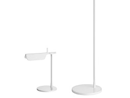
Tab Table and Floor Lamp - Flos
(Italy) Designed by Edward Barber and Jay Osgerby, the Tab lamp is a simple folded form, creating a shade that translates into a desk and floor lamp. The simplicity of the form contrasts with the technical characteristics of the ceramic reflector, which gives a pure and controllable light.
This provides direct light with adjustable head. The body is painted, pressofused aluminium, with a multi-led diffuser in specially designed PMMA to avoid the Multi Shadow effect and dazzle.
Change of direction for Plumen
(UK) – Low-energy lighting brand to sell business and move focus to smart lighting.
Plumen intends to promote the health and environment benefits of smart lighting and the business will be put up for sale in order to finance this next step.
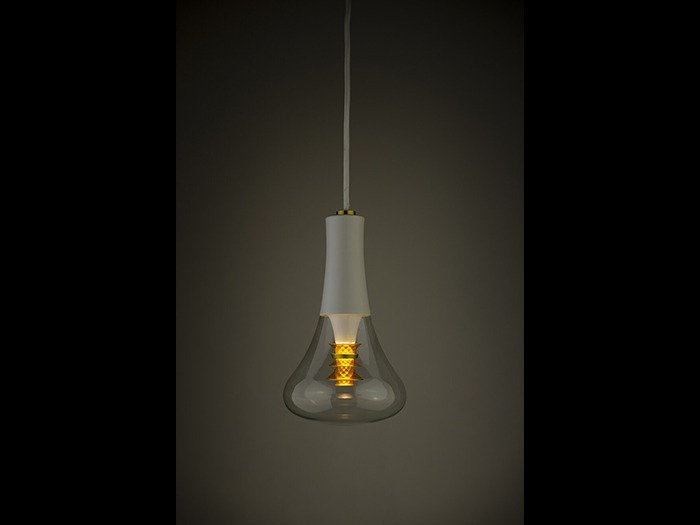
Established to inspire the world to switch to low energy lighting, Plumen created a new category in lighting with its 001 lamp, winning major awards and having since sold the lamp in over 75 countries and invented two new versions – the 001 LED and the 003.
“Climate change is the biggest challenge facing the planet,” says Plumen co-founder Nicolas Roope. “It requires each of us to make small changes as well as big, bold ones. This is an opportunity to do things better, to create a sustainable future.
“The light bulb was the obvious place to start because there is nothing simpler than changing a light bulb. The challenge was that people don’t like change; they didn’t like fluorescent bulbs, but they loved old incandescent. We made it our mission to excite people about low energy light bulbs.”
When Plumen started, LED market share was less than 10%; the landscape has since changed dramatically and by 2020 LED is forecast to have a market share of over 80%.
“The positive environmental impact of the switch to more efficient technology has been even more effective than switching to renewable energy sources, helping bring down energy usage per person in the UK back down to 1984 levels,” continues Roope. “With the world converting to LED – our first mission is now complete.”
By selling the business, Plumen will be able to invest in and play an important role in the next evolution of lamps – connecting them to the internet. Smart lighting is important for two reasons – the impact light has on human well-being and even further energy savings can be made.
“Smart light bulbs have the potential to vastly improve our lives because light is fundamental to how we sleep, how well we work and how we feel throughout each and every day,” adds co-founder Michael-George Hemus. “Our relation to light is biologically rooted in our connection to the sun – until very recently it dictated when we started and ended the day. The advent of electricity changed everything, and our bodies have struggled to adjust. Different types of light, day and night, has led to increased insomnia, stress and illness.
“True smart lighting will be human-centric, adapting to our body clocks automatically, in tune with our circadian rhythms. It will deliver light to help you wake in the morning, focus at work and then prepare for sleep in the evening.
“At the moment, smart light bulbs are just about millions of colours and voice control. Our challenge is to help change this, harness the technology to reduce energy consumption further, and to improve the functioning of society.”
As Plumen looks for new owners, it will transition to a new business model of ‘production to order’ only, meaning customers will only be able to buy directly while stocks last.
Brimet Silva - DigitaLAB
The Portuguese lighting sector is made up of more than 200 companies, employing over 3,000 people. Made up of small and medium sized brands, which some might consider a handicap for internationalisation, the country managed to export over €120m in 2018, doubling its exports compared to the major economic crisis of 2009. Over the next few pages darc provides you with a deeper understanding of lighting designs coming out of the country, while profiling a selection of stunning decorative lighting brands.
Under the umbrella brand of LUZZA, AIPI Portuguese Lighting Association works to promote the greatest brands of the Portuguese lighting industry. Combining the highest standards of European production with innovation, uniqueness and original design, LUZZA aims to support and promote Portuguese brands at an international level. As part of our Portugal design report, LUZZA asked Designer Brimet Silva of creative lab, architectural office and design studio DigitaLAB, to provide an insight into the country’s lighting sector and what makes Portuguese design so special.
How has the design industry in Portugal changed?
Brimet Silva: The design industry is somewhat binary. On the one hand, we have an industry with huge know-how that produces for leading international brands, using highly skilled artisans or the most advanced manufacturing technologies. On the other hand, there is still some hesitation in investing in Portuguese brands, as it remains a risky option and the vast majority of manufacturers and investors fail to realise the importance of design and creativity in society and the economy. This is because design in the national territory is underappreciated, a fact across the entire ecosystem. Lighting is no exception, I would even say that there is a huge way to go. Design in Portugal is taking its first steps and lighting is still a brave new world - there is still a lot to do and the best is yet to come.
What product trends are you seeing come out of Portugal?
There is no design style in particular. In this embryonic phase of lighting design we see a wide range of styles and influences. We may eventually divide the national state of the art into four major groups. The first group develops more technical lighting for contract design, exploiting the latest potential of LEDs, more sophisticated materials and sometimes using Bluetooth technology.
It is a small number, but the amount of international awards these companies have already won is remarkable. In the second group, we can see a clear influence of modernist design; revivals present in the shapes of the products and the materials used.
In the third group, we observe a strong connection with handcrafts and cultural traditions. With very variable scales, companies rely on the expertise of artisans in the work of glass, metals, porcelain and so on, to create unique pieces, sometimes resorting to almost extinct practices and processes.
Finally, there is a new generation of designers who have adopted a more exploratory, experimental and disruptive design. Devoid of slogans, these recent practices explore convergences between different materials, styles and production processes. As a result the pieces gain a more sculptural character, where light is more dream-like.
The overall picture remains very heterogeneous; it would be premature to specify a lighting trend. But it seems clear to me that materials such as cork, porcelain and marble are beginning to gain greater prominence, joining more classic materials such as glass, brass, metals, fabrics and so on.
Does Portuguese culture play a role in design style?
The presence of Portuguese culture in design seems to be unavoidable, but I do not believe it is a concept based on copy and paste. I identify a reinterpretation of the culture present in materials and functionality of design pieces. Identity plays a crucial role in differentiating a country’s design in an increasingly globalised world. It is this individuality that characterises and values us.
How strong is decorative lighting in Portugal?
It has huge potential. For many years, old generations have always acquired timeless pieces that passed from generation to generation. Nowadays, young people have retained this habit, not with the same degree of investment and durability, but in the valorisation of decorative light as an essential element in the comfort of the space. Interior designers have long realised the importance of this paradigm and a consistent lighting design is the beginning of a balanced interior space where light creates environments and promotes emotions.
What’s next for design in Portugal and how do you see lighting playing a role as part of that?
Design in Portugal continues a process of great development and affirmation. It will be a long and complex process, but absolutely necessary. It is vital to value not only ‘Made in Portugal’ but also ‘By Portuguese Designers’. Development only makes sense if it is transversal. Industry, designers, investors, marketers and the media have to work together for a greater appreciation of Portuguese design. There is a spirit of great enthusiasm and optimism. The economic crisis is part of the past and the country is already a world reference in the tourism area. It is vital to use this ‘state of grace’ to promote and communicate best practices of Portuguese design, spreading new brands, designers and concepts. Lighting design is changing and international brands are exploring light in an increasingly experimental way. This great conceptual opening can be the gateway to the new Portuguese design that combines the know-how of its identity with new lighting experiences.
www.digitalab.pt | www.aipi.pt
Gabriel Scott - Luna Series
Helen Ankers discovers a softer side to Canadian design-duo Gabriel Kakon and Scott Richler with their latest lighting launch - Luna.
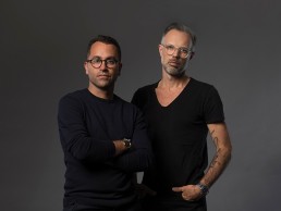
darc’s first encounter with Gabriel Kakon and Scott Richler came during Paris Design Week, September 2016 – we met at the Triode Gallery, where they were presenting their impressive Welles lighting collection. At the time, the Canadian duo’s design studio – Gabriel Scott – had only been around for a couple of years and admittedly I knew little about them. Fast-forward to today and through their New York-based showroom, they are firmly making their mark on the world of interior design and lighting, exhibiting at Euroluce, during Milan Design Week, and most recently expanding their presence outside of North America with a showroom in Mayfair, London.
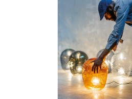
With backgrounds in architecture, fashion and jewellery their lighting pieces are bold and striking in their design, full of geometry and strong architectural lines, making a statement in whatever space they might find themselves. That is, until recently, when the designers launched the Luna Series in Milan, showcasing a more relaxed side to the studio. Exploring a marriage of two lights – tube pieces and blown glass beads – the two work to counterbalance each other and push forward a softer look.
Delving deeper into this shift in design style, Scott Richler tells darc: “From the beginning there has always been an intention to have freedom of creation with our light pieces. So far, we have been known for hard lines, geometry and modularity and while the Luna Series borrows some of those aspects, there’s a lightness to it in terms of the colours produced and a roundness to its appearance, so it’s a culmination of the familiar design language we have established, but softening it up a bit.
“The Luna Series was actually born out of initial designs for two separate products. I had one idea of round blown glass pieces as beads, so there were all these disks and spheres I was working on... and then there was another fixture that was made up of tubes, so there were two separate light fixtures on the drawing board. I was trying to figure out how we were going to thread the beads together and how we were going to get light into them - we ended up combining the two ideas and threading the beads onto the tubes.
“Like all of our lighting pieces there’s still a reference to jewellery and modularity with Luna, but it has what some people might describe as a more feminine look and feel to it. I think you also pick up on the handmade aspect of it thanks to the glass blowing process. When pieces are free blown you are always going to get different tints, shapes and sizes – a lot like artisanal Murano beads would be if you bought them to make necklaces.”
While Richler doesn’t see this ‘softer’ approach to lighting as a change in direction for the studio, he does see further exploration of glass as a predominant feature in future designs. “It is something we’re definitely going to continue with and there are a lot more pieces to come out of the studio that relate to this collection and bring other types of use – direct ceiling applications, wall lights, floor lights and so on; they’re all in the process of being designed. I definitely want to explore glass more as a result of some of the things we’ve done with our glass table tops in the furniture range – ideas we borrowed from Luna – I’ve found it interesting and want to reapply them back into lighting; I think moving forward – for now at least – there will be less hard line glass work in our lighting pieces.”
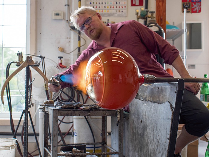
While Gabriel Scott partners with a talented glass blower - who lives and works out in Quebec’s countryside in Canada - to produce the beautiful glass shades for their light pieces, when it comes to the illumination of their pieces, the designers have found it more effective to produce their light sources in-house, particularly for the Luna Series, as Richler explains: “All of our lighting pieces use our own COB (chip on board) light sources and Luna was no different – this was an interesting project in that the COB is located either end of the tube and is almost a donut shape; this gives us the possibility to do more with the light source in the future in terms of colour temperatures, so it’s a more sophisticated COB than we’ve developed before.
“We buy most of our chips from big manufacturers like Cree, but it’s important to develop our own light sources because we’re looking for something really specific and are often dealing with uniquely small spaces. It’s risky to buy something ready made because LED design is so rapidly changing - you might buy a module that in six months time doesn’t exist, so by developing our own COB we can control the next generation. It’s the same with diffusion of light, we have very specific lumen outputs for our fixtures – take the Harlow for example, it uses a very high output that you can’t find on the market and so we’ll make our own diffusers.”
The Luna Series has so far seen interest from all areas of the specification market – from hospitality to residential to commercial and while in the past Gabriel Scott has been specified for the more large-scale signature pieces, what the designers are keen to do with Luna, is produce options for more price sensitive buyers so that the product range can be specified more easily throughout restaurants and hotels etc. “We often get specified for hotels,” says Richler. “But it might be for the lobby or reception area. We want to be able to offer a product range that can feature in corridors or hotel rooms and so I think the modularity of the Luna Series, in particular, lends itself to that option.
“We’ve not shown it yet, but you can add them horizontally or have the pieces stacked and you can mix horizontal and vertical positions. This idea of producing modular fixtures came early on, we wanted to get designers more involved with the products. We were getting commissioned to do these huge fixtures and rather than having to amend an off-the-shelf standard size, which results in an additional ‘custom-made’ expense to the client, it proved better all round to provide fixtures that could grow organically depending on the project.
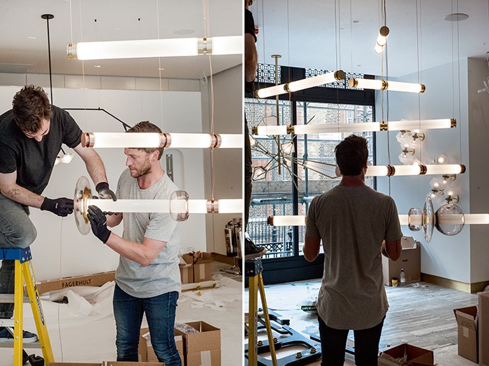
“I do think there has been a natural progression in the lighting industry towards modular lighting pieces, which is a positive I think… it just makes it easier to work on projects of different sizes – the fixture is built into the design.”
Having launched earlier in the year during Milan Design Week, the Luna Series can be seen at Gabriel Scott’s showroom in New York, as well as the recently opened Mayfair space. For Richler, this expansion into the UK will further cement the studio’s relationships with existing clients and allow for closer collaboration within the design community.
“I believe what New York does for the North American market, London does for Europe and some parts of the Middle East,” he says. “New York reaches a very deep pool of architects, designers and clients and it feeds into the North American market - it’s so accessible. From London you can access a lot of the main design and specification companies and it also provides great links to the market in the Middle East and elsewhere in Europe.
“One of the things that’s important to us is to service our markets properly and I believe it’s done better with a more personal presence. We could have chosen Milan or Paris and I certainly wouldn’t dismiss a showroom in either, but London for me, just has that bit extra and felt like a more natural choice. I’m excited to see how this latest move progresses our position in the market and how the Luna Series is going to be received, there’s a lot of creativity to the series and lot you can do with it. I'm looking forward to hearing feedback from designers on what they want to do with Luna and progressing the range from there.”
Enzo Catellani
Catellani & Smith celebrates its 30th anniversary in the lighting industry this year. Known worldwide for its striking decorative light pieces, Helen Ankers spoke with the brand's lead designer and founder Enzo Catellani - delving deeper into his design philosophy, obsession with quality, precision and craftsmanship.
Enzo Catellani is a self-made designer and entrepreneur. While he has no formal training in architecture, industrial design or engineering, the one thing he does have in abundance is a curiosity to explore and a desire to express his creativity.
Having worked with light in some form or another since the late 1970’s, Enzo admits that his lighting studio Catellani & Smith was born almost by chance.
“I was given the opportunity to buy a lighting shop called ‘Aladdin’ in Bergamo, Italy,” he tells darc. “And I soon realised that the fascinating world of light was in fact a hidden ambition of mine. Light became an increasingly important source of inspiration for me and I decided to pursue this, creating lighting objects that express my personal concept of light. This is something I continue to do in my creations today; I put all of myself into my designs, all of my research, attention and feelings. To achieve this, I have to persevere, to experiment, to evolve and keep a keen eye on the latest technologies.”
Success as a designer came suddenly and unexpectedly for Enzo in 1989 when he presented his lighting products at the Ambiente Fair in Frankfurt, Germany. “The pieces immediately drew attention and I came home with orders for around 1400 fixtures; I wasn’t prepared for this – I didn’t even know how to make lamps on a production line… but I did know that this was now my life.”
It was at this moment that Catellani & Smith was established - in a historic building in Villa di Serio, near Bergamo, Italy. Dating back to the 15th Century the building housed the commercial and administrative offices of the business until just last year when they moved nearer to the production facilities, located along the Serio River. Here, design, lighting and nature merge to create a pleasant working environment in-line with the company’s core values. The rooms are filled with light, terraced areas are covered in jasmine, Buddha statues feature in the large garden and wooden furniture and parquet flooring adorns the internal manufacturing space.
Catellani & Smith is based on a working concept that reflects Enzo’s approach to design; a large part of his production is made up of pieces that require a great amount of craftsmanship, yet technology also plays a key role, as he explains: “My personal approach to design is halfway between craftsmanship and art. I am always experimenting with new materials, which in turn keeps me abreast of the latest technologies. Catellani & Smith originated as a craft industry and most of the production is based on skilled artisanal care. It is the hand of the craftsman that builds each piece, their manual work that creates the little differences and imperfections that makes each lamp unique.
“The basic rule I have instilled in my collaborators, is that they have to put their heart and soul into everything they are doing, just as I do. I believe that this process can be felt in our lamps. I believe people still appreciate my work 30 years on because of this. Perhaps this is also the reason they possess a kind of timelessness to them. Turciu, for example, belongs to our first collection Oggetti Senza Tempo (timeless objects) and it is still one of our best sellers.
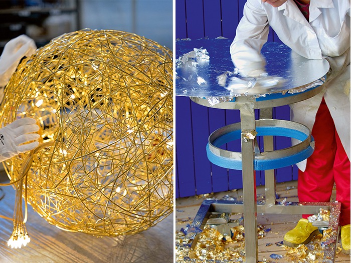
“I like to give people the opportunity to live with light in different ways, in accordance with their mood and the ambience where they live or work. A light source should never be direct or blinding, it must be warm, pleasant and evoke emotion. In nature, light affects everybody’s own life – light gives life. Just consider the importance of natural light in human behaviour and health, how it can influence animals and plants, how the lighting environment can produce different effects on every living being.
“The invention of the light bulb was the greatest of all time – indeed, it allowed us to bring light into our homes that we would usually only get from the sun,” continues Enzo. “Ever since its invention, we have been able to ‘dominate’ light, to regulate and even ‘shape’ it. The interaction between users is fundamental in my concept of lighting design, as well as the emotional response it should elicit. People who buy one of my lighting designs are engaged to establish a relationship with light. The lamp, while lighting up the room, should become an object that raises an emotional response.
“When I start working on a light I always consider the most suitable material that can be applied in order to reach the lighting effect I want, then I test and evaluate the best possible outcomes and functions. I need to feel and see how the materials ‘play’ with light, how they interact with it… as such, in the initial stages there is no design, just an idea that must take shape and become a lighting object able to give expression to a concept of light. Only after having achieved that, do I move on to the traditional design phase, feasibility, technical characteristics and so on.
Enzo has always avoided artificial effects in his work, preferring to use natural materials that change with time or age naturally, as he further explains: “The iron we use is coated with a thin layer of beeswax so that it changes colour and even gains spots of rust over time. Aluminium and brass compose many of our structures and also age slowly with time… Through the interaction of light with different materials – gold, silver, or copper finished surfaces, irregular or flat – you can achieve particular lighting effects, almost giving a shape to light. Most of the light objects I create both interact with light and the user, who can shape them in accordance with their taste or lighting needs in a room.”
Catellani & Smith is world renowned for its Fil de Fer light fixture. One of Enzo’s favourite designs, over the years, it has become a symbol of Italian creativity. Exhibited at Shanghai Expo in 2010 as an example of the best ‘Made in Italy’, the piece is installed at the V&A museum in London, at the Triennale in Milan, as well as other, countless installations. Still one of the brand’s best sellers thanks to its distinctive design, Enzo explains the origins of the fixture to darc: “I was asked by an architect to design a huge chandelier for the Museo della Cartografia di Stato – Fontana di Trevi in Rome. The original briefing was to create a lamp in large dimensions, with lots of light bulbs that could be ethereal at the same time. It should symbolise the universe and I immediately thought of using a lightweight and flexible material – such as iron wire (Filo di Ferro in Italian) – that could also become the lamp structure and be capable of holding a lot of light sources. The iron wire was flexible and malleable and allowed me to create an enormous sphere of tangled wire.
“The light for the museum was another thing completely, but this prototype remained and it was more than easy to produce it in many different sizes and shapes – in aluminium wire or, more recently, in an anodised gold finish.”
“A lighting object must be able to produce unexpected effects, something poetic, to emphasise light in all its cues. It must be a confirmation of form and function, an object able to give character to a room and have a two-fold purpose.”
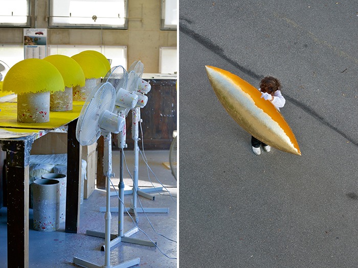
For Enzo, in terms of technological advances in lighting, there has been both positives and negatives along the way, specifically around the arrival of LEDs. “There was an initial period of confusion and maybe creativity was sacrificed to technology when LED first arrived on the scene,” he says. “LED lighting was interpreted as the complete opposite to decorative lighting but I believe they started a revolution in lighting and I had the foresight to use the technical light source for decorative, emotional lights – adapting them to design. LEDs allowed me to create more essential forms and linear designs, which are possible thanks to the miniaturisation of light sources and related cables. Technology is becoming more and more important, but it must not be used at the expense of creativity.”
Thanks to these advances in lighting technology, for Enzo the gap between decorative and architectural lighting is now becoming smaller, since decorative lights can provide the same functionality as architectural lighting in many cases thanks to the latest generation of LEDs.
“Decorative lights today are able to fully illuminate a room to a high level,” he says. “While a relaxing, meditative light is certainly preferred for interiors – both for residential or hospitality projects. Today, people take great care when choosing the lighting for their home, they look for the perfect decorative light to give character to a room, change an ambience or even define and divide different areas in their home, without the need of walls or furniture.
“I think lighting design is continuing to look for new expressions of light, for new designs to be produced in limited editions. People today are more attracted by custom-made items and tailor-made solutions rather than mass produced items. At Catellani & Smith we will continue to combine craftsmanship and technology at the service of creativity. I’m not looking to transform the company into an industry or relocating the production to other countries. Our products are the expression of ‘Made in Italy’ and of a tradition in craftsmanship. This year we started a collaboration with a young designer Giulia Archimede, who shares my own passions for light and has been able to investigate the interaction between shade and light, giving a shape to her emotions through the creation of her Alchemie lamp.
“Looking ahead, we are looking for new ‘Smiths’, people who can design new products in tune with my vision. Young or old… as long as they are enlightened and enlightening.”
Newnham College, UK
Design studio Nulty designs lighting scheme for the Newnham College modern extension incorporating a light-filled homage to notable former students and research fellows.
Newnham is one of the 31 colleges of the University of Cambridge in the UK. Established in 1871, as a women’s college at a time when women were not allowed to attend the University, its co-founders included Dame Millicent Garrett Fawcett, the famous campaigner for women’s suffrage and as such, today, remains a space that brings together outstanding women from around the world for study and research. With a mixture of beautiful historic and contemporary buildings, set in stunning gardens, Newnham is located by the University’s Sidgwick site and University Library.
Having recently introduced a new modern extension, lighting design studio Nulty was asked to design the lighting for the space, which incorporates a light-filled homage to some of the college’s most notable former students and research fellows, including: Prof Dorothy Garrod, Anne Jemima Clough, Anne Jemima Clough, Rosalind Franklin, Eleanor Sidgwick, Philippa Fawcett and Basil Champneys to name a few.
Working in close collaboration with Walters & Cohen Architects and Ab Rogers Design, Nulty was tasked in creating an inviting warmth to the new wing, as well as addressing the practical needs of the students and faculty.
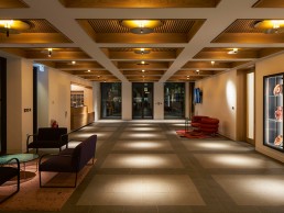
Inside the entrance, Nulty Bespoke produced 36 beautiful surface-mounted ceiling pendants, with the capability of producing two layers of light. Each pendant consists of two circular plates with a gap in between. The lower plate holds a series of small LED lights, which project light onto the larger brass disk close to the ceiling, producing a soft ambient glow of reflected light, highlighting the sensual texture of the ceiling’s timber coffers.
Nulty Bespoke cleverly utilised some of these pendants further by incorporating a pop out, adjustable spotlight within the lower disk. When popped out and angled, these allow highly targeted beams of light to illuminate art on the walls when required. Alternatively, the spotlights can stay partly hidden and create a pool of light on the floor directly below the pendant. Some of these pendants are also fitted with concealed emergency lighting features, ensuring the necessary function doesn’t impact on the aesthetics of the space.
In the café and social area, Haberdashery design studio was commissioned to develop a lighting sculpture inspired by the fascinating written and photographic history of Newnham College and the prints of Japanese artist Hokusai. Designed to represent 270 pages of paper flying through the air, the ‘pages’ made of brass and powder-coated steel are etched with historical documents and letters written by women associated with the college. Small LED lights are positioned on some of the ‘pages’ and carefully targeted spotlights positioned on nearby walls allow light to be reflected from the piece.
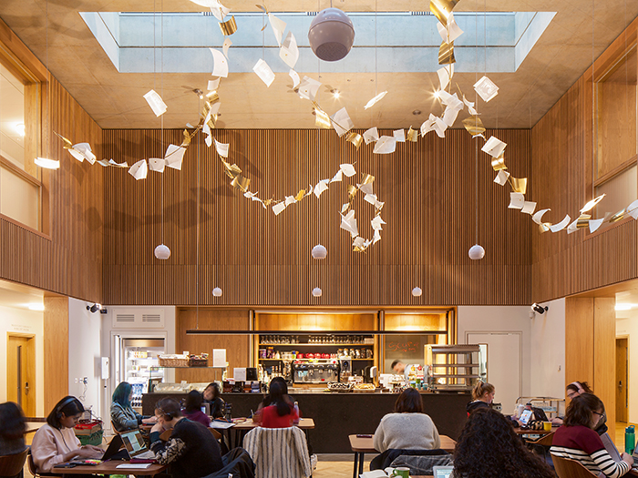
Associate Lighting Designer at Nulty, Anna Sandgren comments: “We were determined to reflect the history of the college in the main lighting installation and tell the inspiring stories of these pioneering women. Due to the double-height configuration of the space, it is possible to be close enough to read many of the pages when looking from a first-floor opening.”
Haberdashery’s Ben Rigby adds: “As a brand-new architectural space, we were very aware that our sculptural interventions needed to absolutely complement the architect’s design language while also maintaining the harmony of the architectural lighting, without making the room feel crowded or over-complicated.
“We always take care to ensure our work integrates with the light qualities of the surrounding architectural lighting but also ensure it makes the most of the natural light available. This gave the sculpture several identities depending on what time of day you see it, or the position you view it from – light reflects off the curved ‘paper sheets’ and passes through the perforated surface produced by the photoetching process, allowing distinct light and shadow to evolve through the day.
“The pages were carefully positioned along curved ‘arcs’ that guide the viewer’s eye through the space, hence the sculpture name Arc of History; overall a feeling of lightness was preserved, allowing for a relaxing café environment below – inspiring free thought and imagination.”
“The decorative lighting elements add playfulness and warmth to the space,” continues Sandgren. “Creating an environment that inspires students and teachers alike. The space is brought to life and the mood changes throughout the day. All of the bespoke elements were tailored for the audience. Every light element was developed with the use of the space in mind; linking academia with design throughout.”
www.waltersandcohen.com | www.abrogers.com | www.nultylighting.co.uk | www.haberdashery.com
Lucky Cat, UK
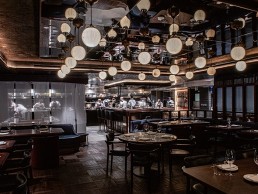
The Lucky Cat is a new authentic Asian Eating House in the heart of London from Gordon Ramsay Restaurants. The category-defining interior design was completed by Afroditikrassa Studio, that transported diners back to urban drinking dens from 1940s Tokyo.
Situated on the original site of Maze, one of the Ramsay’s previously well-loved restaurants that resided there for fourteen years, Lucky Cat brings a whole new vibe and atmosphere to the developing food and beverage scene in central London.
The authentic Asian Eating House took on a restaurant-come-evening lounge design inspired by drinking dens of the 1930s and 40s in Tokyo and the Far East. Afroditikrassa design studio was approached by the restaurant group based on its rich past of category-defining hospitality design, with Dishoom, Heston Blumenthal and Itsu amongst its portfolio.
“In-keeping with the authenticity of the concept, the restaurant’s name takes inspiration from Asian culture where the ‘lucky cat’ is a talisman that is believed to attract good luck and fortune,” studio founding Director Afroditi Krassa.
Collaborating closely with Ramsay and his team, the studio worked hard to hone down the desired concept’s aesthetics, introducing a bold and creative flair with strong attention to detail that ensured diners would travel on an experiential journey from their first point of entry.
The team also paired up with Connected Lighting, which helped turn the creative brief into a tangible scheme. “Our main challenge was ensuring the space considered and welcomed both existing and new audiences,” explained Krassa. “With Mayfair’s fine dining scene experiencing a clear shift from its often-imposing interiors, the space aims to create the perfect balance of luxury, comfort as well as long-term innovation in concept and design.
“We wanted to find lighting pieces that perfectly encapsulated both the Asian Art Deco movement and the urban touch of the Japanese Kissa dens, which informed the creative direction. It was important that the lighting felt moody and atmospheric throughout, without masking the many open chefs’ tables and large kitchen within the space.”
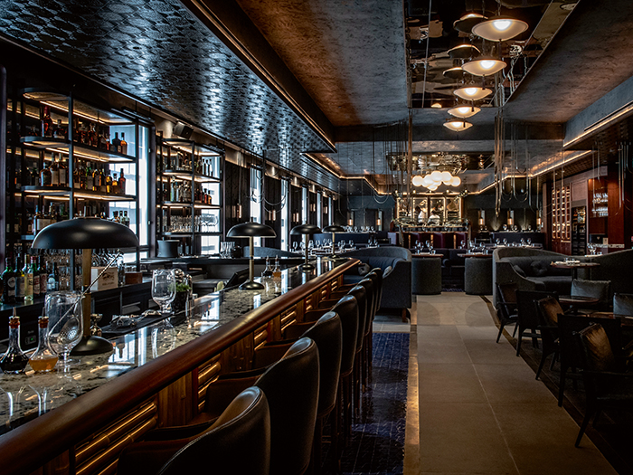
The restaurant is a large open room divided into multiple varied-functioning areas, including a bar, restaurant and multiple chef’s tables and private dining rooms. The decorative lighting played a key role in mimicking the atmosphere of the Japanese Kissa’s that exude a dark and moody ambience. The chef’s tables have much warmer lighting radiating out that also draws attention to the skill and precision of the chef’s at work.
A selection of fittings were used from Bath-based company, Felix Lighting, as its pieces add to the continuity of the theme with its painted metals, industrial details and Art Deco influences. “Their fittings were incredibly complementary to the creative direction that we had created,” explained Krassa.
“We used the Art Deco pendant, reeded bone china globe pendants, glass bar top lights and handmade blackened steel and brass table top lamps. Alongside these sit anthracite and weathered brass School Pendants from Original BTC lighting and bronze long bulb cage wall lights from Edison Light Globes.”
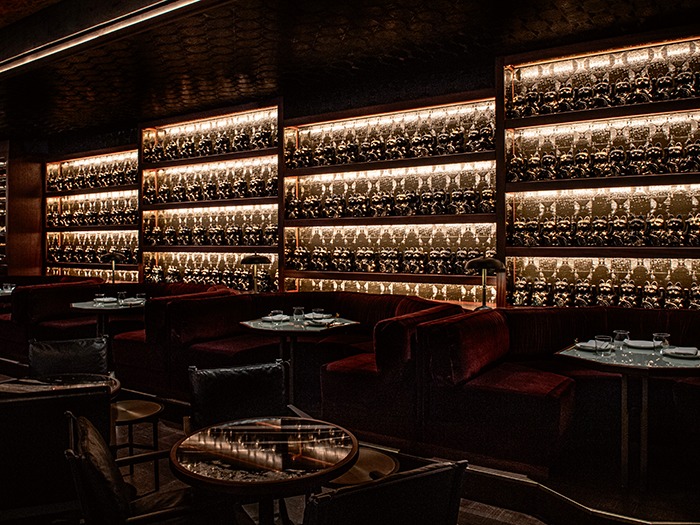
During the project, some structural elements did cause issues, including low ceiling levels and numerous mechanical and electrical items, such as low hanging sprinkler points, which the team had to work around.
“The architectural lighting was used to create a perfect backdrop for our carefully chosen decorative pieces. It guided diners through the space and created warm and atmospheric pockets of intrigue,” continues Krassa.
“It was very beneficial working with a lighting consultant [Connected Lighting] who helped with the technical side of the project, ensuring we achieved the desired feel of the space.”
The overall impression of the design remained true to the team’s initial creative direction. “The lighting really helps to encapsulate the vibrant, urban atmosphere of Tokyo in the 1940s and we aimed to achieve and highlight the many smokey hues we have throughout the restaurant,” reflected Krassa.
“Diners are taken on an experiential journey from the moment they arrive, and the final impression is really for the guests to judge, whether it works and communicates the intended atmosphere and feel.”
Loong Swim Club, China
The Loong Swim Club is a fantasy inspired space for children and parents to enjoy. Designed by X+Living, the leisure centre plays on all the senses, creating a magical space.
A brand new, fantastical leisure space in Suzhou, China. Completed in May this year, it is a parent-child sports training facility that integrates both swimming and sports education with entertainment and leisure.
The large, subtle horseshoe-shaped building is divided into five main functional areas with some secondary functional spaces - all of which are centred around the behavioural habits of its audience.
In order to break-up the spacious floorplan, chief designer, Li Xiang of X+Living, devised a streamlined flow through the space, taking into account the users’ habits and potential behaviours of the differing target groups, so all age ranges can benefit fully from the club.
“Since we had no previous experience with projects related to swimming pools, we spent a lot of time in the beginning, researching consumer behaviours,” explained Xiang.
“We also spent time designing appropriate functional distribution, movement lines and choice of materials according to the different ages, gender and needs. The design ideas provided by the client were to make a beautiful swimming pool. Using our experience from previous parent-child projects, we created some new functional areas for them, which they had never thought of and were really fond of taking the chance with.”
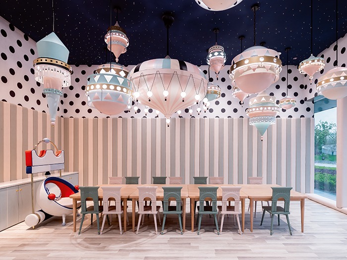
The first point of entry for visitors is the reception area. This room sets the tone for the rest of the space and establishes the design narrative that the parents and children will venture on.
A big whale is wrapped around a column in the entrance, which appears to be jumping out of the ocean-like floor. The reception desk is shaped like a ship with small lace arcs outlining the bottom in a simplified wave that pushes the ship and the narrative into the next room. Paying close attention to these design details helped the team to emphasise the design expression of X+Living’s concept.
Water played a key role in inspiring the interior design for the space, particularly in the colours and textures used for furnishings and finishes. Continuing on the journey further into the leisure club, the parents and children find themselves in the reading room. The round-shaped decorative lighting elements in this space are reminiscent of sprays of water glinting in the sunshine across the ceiling. Alongside the reading room is the restaurant. Several fragmented eggshell-like shapes are arranged in the space, all coloured in fairy-tale tones and shapes and reflected in mirrors across the ceiling.
“The main function of the decorative lighting was to satisfy the aesthetics of the space. Another factor for consideration was the humanisation of the space, with a particular focus on the decorative lighting fixtures used above the baby bathtubs. We also took into account the idea of attracting childrens’ eyes to something above whilst ensuring the angle of light avoids hitting their eyes directly,” described Xiang.
The fixtures used throughout this project were bespoke designed and made in X+Living’s own factory. This allowed the team full control to create the desired effects in each room. It was important the fixtures created a soft distribution of light across each room, avoiding any dark angles or shadows. The pendants and fixtures add an ornamentally richer layer to each room’s design concept, as well as provided functional lighting for the user.
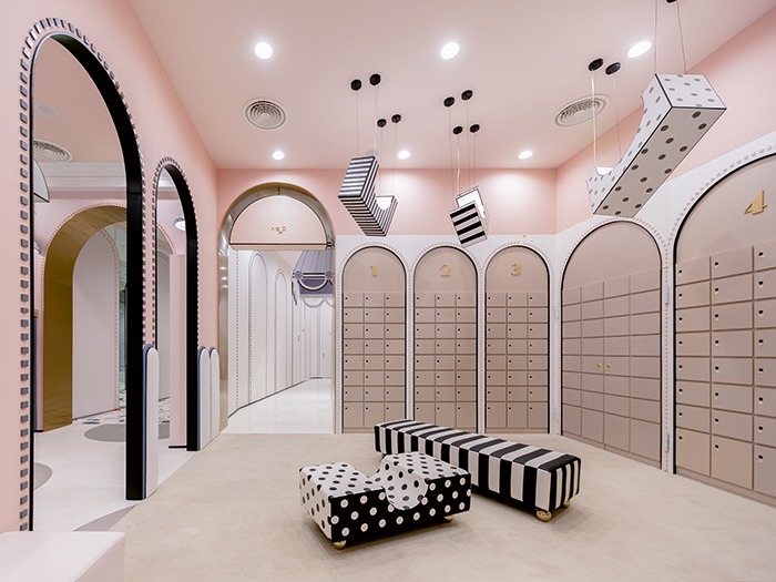
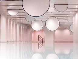
Progressing through the next stage in the narrative, visitors enter the pinnacle point of the building – the swimming pool. First glimpses of the pool are seen through the parenting observation window in a dedicated seating area. Pastel pink and blue walls mixed with the blue hue of the water create a beautiful backdrop to the simplistic, yet striking lighting features across the ceiling. The giant water droplet-like lamps appear like condensation, adding to the overall dramatic effect.
“The entire parent-child swimming pool uses gentle colours, and does not distinguish between different genders. The thin black lines add a bit of an avant-garde fashion to the overall space. In order to create an encompassing dreamy experience, design without accent lighting is used, which motivates people to explore every corner in the space,” explained the design team.
The final room at the end of the corridor is the bathing area, which is the most functional space. A huge chandelier is an eye-catching focal point in the room that also demonstrates the essence of the designer's style.
“The design thinking of the overall space is closely centred around the water element. Water is extremely light and soft and has the infinite tolerance for life. To keep such a softness embedded in the heart of this project, we combined the design elements in the space to be as natural as flowing water.”
SBID throws spotlight on issue of non-payment
(UK) - Society of British and International Design set to tackle a persistent taboo in interior design – the issue of non-payment – during Meet the Buyer event.
This all-too-common industry injustice is a challenge SBID will address head on through a panel discussion featuring an expert line-up, who will outline the issues and examine what’s being done to protect professionals. Designers, specifiers and manufacturers are invited to take part in the discussion.
Getting paid by a client at the end of a project can be a thorny issue for interior designers and is still one of the biggest challenges for many designers. With construction and interior design among the least regulated professions, many professionals in these industries remain at the mercy of clients when it comes to payment.
When a client chances non-payment, which often occurs where the sums are substantial, the costs and delays incurred by the professional for court proceedings often outweigh the sum in question. In these cases, the designer or contractor is more willing to settle for a lower sum than the due amount.
Speaking on the panel will be interior designer Joanna Frances, who recently won a case against a client for non-payment; Head of Intellectual Property Office Mediation Service Stephen Probert; and SBID CEO Dr Vanessa Brady, OBE who has also had her own experiences of non-payment.
The seminar will take place at 10.30am on 24 October as part of the SBID Meet The Buyer event, which brings together some of the best interior designers to meet face-to-face with leading design-led product manufacturers from around the world.
Drape Circle 28 - SkLO
SkLO has officially added the Drape Circle 28 chandelier design to the SkLO - LIT lighting collection. Produced as a bespoke fixture design for clients and showrooms over the last two years, it is now a production design ready-to-order.
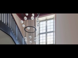
Originally developed as a custom project design, part of a collaboration with acclaimed Danish designer, Nadia Olive Schnack, on one of her residential projects in Copenhagen, the Drape Circle 28 is a larger version of the Drape Circle 18 chandelier. The 28 adds another larger ring to the eighteen platforms, and ten additional lit spheres. The number in the product name indicates the number of lit spheres.
Like the Drape Circle 18, the new Drape Circle 28 chandelier offers many custom possibilities by its very nature. By working directly with the SkLO Design team, designers can explore the different possibilities of lengths and proportion which are possible – by adjusting the relationships between the locations of the rings and lit spheres, this chandelier can have many different personalities. Combine that with the options already part of the DRAPE collection – five glass colors, two metal hardware finishes, and four available fabric electrical cord colors – and the possibilities are clear.
The Drape Circle 28 references the classic cascading chandelier language and form, yet it is an entirely modern reinterpretation of the typology. Each lit sphere measures approximately 11cm in diameter, and features a signature SkLO detail of being broken hot from the glassblowing pipe and fire polished, leaving a small rippling mouth in the glass. Individually handblown, no two spheres are exactly alike. The individual spheres are hung on fabric-wrapped electrical cords.
Brand Van Egmond opens in US
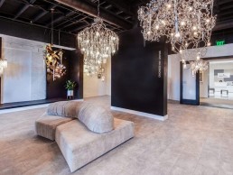
(USA) Belgian lighting brand opens new showroom at San Francisco Design Center.
The San Francisco Design Center itself lays in the heart of the Bay Area’s design and innovation area and is surrounded by pioneering technology firms, world-class museums and ground-breaking design and architecture companies. The new designated Brand Van Egmond showroom, due to open on 19th September, will be a well-placed location to connect and inspire, in particular for architects and interior designers.
Brand Van Egmond has been responsible for several unique lighting installations throughout the US. The atelier’s first major installation was for the Green Room for the Academy Awards Ceremony in Los Angeles.
Dennis van Egmond, Head of Sales and Marketing, comments, “The growing interest in more sculptural lighting in the US fits our atelier like no other. The opening of a dedicated showroom is a logical first step, to further support the growing appreciation of a more artisan approach towards lighting.”
The mono-brand boutique is designed under the vision of Brand van Egmond’s founder William Brand, who has worked through the years as an architect, designer and artist. The space features a minimalistic black and white interior that intersects with the city’s innovative atmosphere and its history, with a selection of new and established collections on display.
Brand adds, “Our dedicated showroom allows for even better support of the US market. We strive to learn from our American clients as well, in fact, some of the most creative and beautiful projects from our atelier have been done hand in hand with fellow creatives from the US.”

