Raw-Edges creates installation for WonderGlass HQ
(UK) - WonderGlass to open new headquarters in Fitzrovia design district.
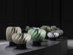
Featuring a gallery showcasing classic and new collections, as well as samples showcasing the capabilities of itsWonderLab artisans, to celebrate WonderGlass invited design duo Raw-Edges to curate the first installation, featuring the iconic work Horah.
The collection, displayed in the space as a selection from the limited edition series, reflects on the theme of light in dialogue with one of the essential aspects of contemporary living: sociability. Inspired by Horah, the Israeli dance, London-based design duo Raw-Edges explores an ongoing theme of repetition with a lighting installation that is imbued with an essential quality in the dance: conviviality.
Each lamp features curving glass 'leaves' attached to a pivoting motor, the glass sections expertly composed using glass casting techniques. Light is concealed at the centre, creating a gradient of illumination.
Also featured in the space will be glass compositions and unique prototypes showcasing the skills of their WonderLab workshops in the Venetian region.
Designed by architect, Massimo De Conti, the space is inspired by the galleries of Lower Manhattan mixed with the buzz of London’s Fitzrovia, where the new showroom and gallery is located, as well as reflecting the essence of the WonderGlass DNA.
Founders Maurizio and Christian Mussati said: “Since launching in 2013, WonderGlass has been looking forward to creating a space where the company can showcase its collections and experiment with new possibilities. The gallery envelopes our DNA as artisans to provide tailormade solutions with the transparent material of handblown glass, cast glass and all its bespoke variations.”
The headquarters will open during this year's London Design Festival.
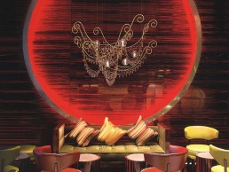
Yellow Goat Design - Rococo
Like a poem of Arabian nights, this piece sings of mystery and romance. Curl up under this bejeweled fixture, decked in brass, glass crystals, and LED bi-pins to ponder it's ornate, overlapping simplicity shrouded in luxury and shine. The theatrical Rococo leaves you dazzled by its rolling, scrolling curves.
Timothy Oulton opens in Chelsea
(UK) - Timothy Oulton launches worldwide flagship store in London’s iconic Bluebird Garage.
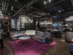
Furniture and lighting company Timothy Oulton has opened the doors to its worldwide flagship store in London, a manifesto expression of everything it stands for: heritage, innovation, creativity and hospitality. All brought together under one roof in the historic Bluebird Garage on the storied King’s Road in Chelsea.
Originally a celebrated Art Deco motor garage, Bluebird enjoyed connections with legendary innovator, racing driver and record breaker Sir Malcolm Campbell. It has since born witness to much of London’s rich legacy of innovation, modern culture and design.
This pioneering spirit, fearlessness, and dedication to relevance are the very same values that have always inspired Timothy Oulton’s collections, and now become a central part of its future presence in London and worldwide.
The new 670m2 (7,200sqft) gallery will feature the largest retail display of Timothy Oulton collections anywhere in the world. The Victorian era collides with a 1960s anti-establishment streak in a portfolio of different ‘worlds’ including the glamorous Age of Elegance, urban slick Metro, eclectic Beat Generation, laid-back Loft Living, and tranquil Coastal Drift.
Alongside certain limited editions exclusive to Bluebird, all the brand’s established icons will be on show: the daring Westminster Jack’dN Brok’n sofa, the effortlessly sophisticated Shabby modular sofa, the iconic Aviator Tomcat chair, the timeless Saddle chair in Buck’n Brok’n, the floor-standing Rex mirror, and the Odeon chandelier.
The speakeasy-inspired Hudson and Bio Hazard bar cabinetry collections bear witness to a philosophy that beautiful interiors support the creation of hosted experiences. And a separate space creates a showcase for Timothy Oulton’s Noble Souls, a modular sofa collection handmade with natural vegetable-dyed linens using ancient dyeing techniques, and promising to create a realm of sensorial, social and cultural reconnection in any home.
The space is also replete with distinctive hallmarks of the Timothy Oulton philosophy, with a bold nod to every major influence of Tim Oulton’s approach to design. A selection of antiques from Rare by Oulton, procured and curated by Tim, speaks of his early days and ongoing involvement in the antiques trade, and includes part of one of the world’s largest collections of customised Louis Vuitton trunks. A giant fish tank housing a Yellow Submarine, plays on Tim’s endless fascinations.
A wall draped with 20 hand-finished leather hides, offered in the collection, is in keeping with Tim’s passion for authentic materials and traditional craftsmanship. There’s Apollo, a custom designed ‘spaceship’, showcased at this year’s Milan Design Week, referencing Timothy Oulton Studio and its capability in delivering customised experience-led hospitality projects, which include the recently completed 1880 members’ club in Singapore and award-winning boutique hotel Glazebrook House, nestled in the Devon countryside.
The seasoned Timothy Oulton team at Bluebird is ready to offer an array of services, and is headed up by Ms Alessandra Raia, who has worked with Tim for many years, starting at the store in Harrods, and has trained with him in his workshops. Ms Raia is an expert in every aspect of the Timothy Oulton experience, and she is supported by Ms Nikita Noviello, who is dedicated to supporting the needs of interior design clients.
Timothy Oulton said: “It’s a special place, and we want to bring something very special to Bluebird, and to Chelsea. Inviting people into our home has always been at the core of our ethos, so we’re passionate that the gallery at Bluebird shows our home at its absolute best, and is not only a great furniture destination but it’s also a place to host and connect with people.”
LDF collaboration for Tala and DDMP
(UK) - Tala teams up with Distributed Design Market Platform for London Design Festival.
DDMP and Tala will work with up to ten emerging designers, makers or enthusiasts as part of the Distributed Design Challenge 2018, to create lighting fixtures that can be manufactured anywhere in the world, using accessible digital manufacturing techniques.
The Distributed Design Challenge 2018 is a progressive initiative that aims to celebrate and support the rise of distributed design, through an exhilarating five days of experimentation, prototyping and production.
This competition is the first phase in a four year EU funded project. The four best designs will be promoted by the Distributed Design EU platform, and awarded a one month residency at Machines Room, London’s first Fab Lab, in order to finalise their design.
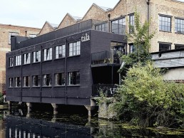
Using Tala’s sustainable, LED lamps as inspiration, the makers will go from design concept to exhibition within one week, and the results will be displayed at Tala’s new global headquarters located at 25b Vyner Street, during London Design Festival.
As a refurbishment project, Tala Studios is inherently sustainable. With a refined and minimalist material and colour palette - including exposed brick walls, large crittall-style windows, reclaimed pinewood floors and original steel columns - that pay homage to the building’s industrial heritage, the space is synonymous with Tala’s founding promise of ‘Conservation Through Beauty’.
The fit-out has been led by Tala’s in-house design team whose brief was to design a multi-functional space with collaboration and wellness at its core. The layout is divided between the varying styles of the departments, with a focus on nexus points between teams and flexible layouts for events and workshops.
With an office, showroom, break-out spaces, balcony terrace, design studio and engineering lab, the design intent was to create both an enriching environment for Tala employees and a destination showroom for the design community. A key design feature of the space is the state-of-the-art engineering lab which allows Tala to carry out research
and testing in-house for the first time.
Four Seasons Hotel, France
Jeremy Maxwell Wintrebert collaborated with interior architect Pierre Yves Rochon to bring a sense of fairytale and wonderment to the new Four Seasons Megève.
The Four Seasons Hotel Megève in the heart of the French Alps lies directly on the Mont d’Arbois ski slopes. This modern chalet builds on the legacy of the Rothschild family who set out to create an unrivalled resort experience nearly a century ago. Distinct French character, pure Alpine tradition and an intimate and inviting setting in both summer and winter define this mountain retreat. Guests can play at one of the world’s finest Alpine golf courses, relax in the region’s largest spa and dine at two Michelin star restaurant Le 1920.
Craftsman and glass blower, Jeremy Maxwell Wintrebert was asked by Madame de Rothschild herself alongside the hotel’s interior architect and decorator Pierre Yves Rochon, to take part in the hotel project. Having proposed pieces of his collection for different areas of the hotel, Wintrebert then worked to adapt them to suit the spaces accordingly, as well as realising an entire site-specific installation in the form of Crying Willow.
“I imagined the hotel guests having a fairytale-like experience and I found inspiration in the natural location and surroundings of the hotel, which is high up on a mountain, surrounded by very dramatic and incredible mountain ranges. The mountains and sky are like canvases for the ever-changing light that reflects off them. The array of colours sometimes change minute by minute and can go from dark grey to gold or from bright oranges to dark purples to everything in between.”
Every single piece of the project – from the lighting fixtures to the glass used – is entirely handmade, which Wintrebert explains is always an immense challenge in itself. “I am lucky to work with incredibly skilled people such as the team at Mydriaz Paris, who make the brass and my team with whom I blow these incredible pieces in my studio in Paris. I was very fortunate that the clients were so open and trusting of my work and gave me complete freedom… although, that itself can turn into a challenge.
“As a glass blower I always imagine the work as a sculpture first. Sometimes the work simply stays a sculpture, like Crying Willow, which doesn’t have a light source inside but which plays with the light that comes from different spotlights. Either way, the lights are all decorative so I stayed with 2700K for almost all the lights. The exception was with the Clouds pendants, which needed to be slightly warmer and for which we developed a unique temperature. Since all our LEDs are custom made, we can really research and produce very bespoke light effects. For projects like a hotel, it’s almost always going to be warm, cosy lighting. Almost all the lights are dimmable and sometimes on a program that adapts to different times of the day.”
While the selection process might have been smooth and straightforward, as with most lighting projects, the actual installation did highlight some structural issues. For example, the Clouds pendants had to be hung on a sloped ceiling, which affected the hanging mechanism and actual installation. Then, the Crying Willow sculpture in the wine cellar, which is made of thousands of handmade glass threads and is almost three meters, needed to be assembled and hung inside a circular room made of glass and a metal structure with very odd proportions and underground with very difficult accessibility.
But, the most difficult issues with the placement and structural constraints, according to Wintrebert were with the Solstice wall lights around the pool. “Each light weighs over 70kg and needed to be fixed through a thin marble wall, which was textured and not flat. I collaborated with Mydriaz Paris who designed the brass so they could be hung safely but handled easily for maintenance, while enduring a humid environment.”
Looking back on the final design, for Wintrebert, the project reinforces his sculptural approach to lighting as a craftsman. “I believe it adds a very sensitive quality to the experience of the space and celebrates the handmade quality that is so rare in lighting, which often has a very industrial feel to it because it has been designed on a computer then made separately with very precise specifications.
“I love that on the scale of a project like this, the sculptural handmade quality is celebrated and very noticeable. I believe that the guest doesn’t notice the lights at first but experiences the expressive, creative work where emotion prevails over function and therefore becomes an actor in a part of the fairytale.
“I have never before had the opportunity to propose so many different lights for one project and have them all work together,” concludes Wintrebert. “I believe the stand out feature is the 30 Clouds installation over the bar and 1920 restaurant. I was very lucky to also collaborate with chef Julien Gatillon to create the tableware collection for his restaurant, which is directly inspired from his cuisine and the hanging 30 Clouds above.”
Øivind Alexander Slaatto
Øivind Alexander Slaatto, is a Danish designer and founder of the SLAATTO Design studio in Copenhagen, Denmark. Having worked with Louis Poulsen and Le Klint on products Patera and Swirl respectively, Oivind takes part in this week’s ‘Quick Fire’
What did you want to be when you grew up?
Duck, inventor, pilot, musician, designer
What is the one product you wish you’d designed?
The wheel
What inspires you?
Everything and everyone.
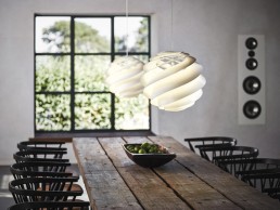
Swirl for Le Klint
If you didn’t work in design what would you do?
I would propably be a musician, artist or inventor somehow. Or whatever – it doesn’t really matter what I do as long as I go happy to bed in the end of the day and look forward to the new day in the morning
What would your dream project be?
An airship (including everything on board) an aircraft that flies without fossil fuels, a better world or something I don’t even know about yet.
What’s your favourite Instagram account?
I have deleted all my social media accounts including Instagram which I recommend everyone else to do who would like to have more time for real life and time for getting good ideas.
Patera for Louis Poulsen
What was the last thing you googled?
Oh – I haven’t deleted Google yet, but would love to do so. Last Googling is something as boring as a powdercoating company for a project.
Which of your designs are you most proud of?
I’m proud of all my designs – even those nobody knows about.
What or who is the next big thing in lighting?
I hope people learn to appreciate darkness more as something we shouldn’t be afraid of but actually need – and thereby request good darkness as we today request good lighting. Light is essential for life and so is darkness – and everything in between!
Lighting isn’t just decoration but has a huge impact on our life and wellbeing – the biological impact of light is something which we need to be more aware of and can’t continue to ignore. The Danish design culture has a long tradition for good light and is a good starting point for this jurney as new technologies enable sollutions we couldn’t ever dream of before.
Vans Headquarters, USA
Rapt Studio’s Vans Headquarters design represents the evolution of a West Coast skateboarding company to a global youth culture brand.
From the original Van Doren tread to the iconic racing stripe, the Vans brand is synonymous with individual expression and undeniable style, something US-based Rapt Studio kept at the forefront of its design,when working on the new headquarters - bringing the underground to the mainstage.
The Vans Costa Mesa headquarters represents the brand's evolution from a West Coast skateboarding company to a global youth culture brand. Rapt Studio has enjoyed a long and successful working relationship with Vans, having designed its previous headquarters and assisted with its growth and expansion strategies.
“When we were asked to re-engage, we had never really been gone for long,” Chief Creative Officer of Rapt Studio, David Galullo explains. “The project lasted approximately two years from acquisition to completion.”
The brand had grown at an incredible pace and the executive team asked Rapt to study Vans’ evolving work process and to workshop, coordinate and manage a shift to a more collaborative open work environment. The hope was to streamline communication among the various stakeholders and offer an array of different spaces to support the reinvigorated collaborative processes. The space was also designed to incorporate and exploit Vans' four brand pillars: music, street culture, action sports and art, and it of course had to be skate-able throughout. It also needed to enable collaboration along with the growth and flexibility that was inherent to the planning.
“The brand needed to be ever present in the space,” says Galullo. “But we also wanted to design the headquarters in a way that would allow for the future brand to take hold; the artists of today and tomorrow; the new products and the classics, basically an ever changing gallery of the visual expression of this iconic brand.
“As with any design, we work to make the space greater than the sum of its part…that is to say that each perfect ingredient comes together to make a perfect recipe. When it came to lighting we knew that it needed to be simple and invisible in places and in other areas it needed to work a bit harder. We looked to classic brands that had endured the test of time as Vans had itself. We chose coloured cord exposed lamp pendants tied in interesting ways from Tech lighting. We created drama with a repetition of black industrial pendants from Barnlight. We had a large, custom light installation made for the library space to signal the quiet, escapist nature of the space and each desk received a custom colour desk light from Anglepoise."
Merging the classic with the contemporary is a theme that runs throughout the design, the headquarters is organised around a central courtyard that connects interior offices to outdoor spaces while a custom Vans, classic red staircase becomes the literal and figurative symbol of connection between the varied groups housed within. The staircase connects the first-floor café with the second-floor coffee area and the third-floor outdoor terrace barbeque.
The style of the workspace supports a range of active work styles, fostering a culture of collaboration and innovation. Concrete floors allow employees to skate from desks to meeting rooms. In homage to the brand's deep roots in music, there is a jam room available to staff, complete with instruments. Each of the conference rooms are wired for sound with Bluetooth, while the shared celebration of art is apparent throughout with the incredible commitment to artistic expression – murals, classic skateboard art and graffiti style murals decorate the walls and elevate the experience.
Fostering a sense of community, the more public circulation that rings the courtyard on all floors is outfitted with meeting spaces, booth seating (a favourite from the beginning) and places where staff can hang out and just get a different perspective. This configuration allows an employee or visitor to move through the building without traipsing through someone’s work environment. Employees are afforded plenty of individual space to layout new products, fabric samples or prototypes. These individual working neighbourhoods also give way to more shared spaces – dedicated work rooms that can retain a project team’s memory on its walls, various spaces for group meetings as well as rooms where one-on-one conversations can happen freely and within the work environment.
The use of decorative lighting is consistent, in areas that require delineation, lighting is utilised as architecture, as a canopy - a way of indicating a more intimate gathering space and plays an important role in defining each space, the main pantry is entirely defined by a dropped pendant plain that helps the eye travel throughout the space. “We chose clean, simple linear lighting for the workspace and more decorative and interesting lighting for the conference rooms,” Galullo says.
“I think of lighting as that beautiful piece of jewellery you build around. It is always the shiny object in the room that will capture everyone’s attention, and when done right it makes everything seen against it look better. We created a space that was built on a mature vibe but still true to its youthful and energetic southern California roots - a space for creatives.”
SKP Store, China
Torquil McIntosh of London-based architecture and design practice Syabrite was given the keys to the city of Xi’an for the creation of a new 250,000sqm, 20-storey, luxury landmark, SKP store in China’s former capital Xi’an.
Home to more than one thousand high-end global brands, such as Hermes, Gucci, Dior and Chanel, SKP features multi-storey event spaces, boutique cinemas, restaurants and cafes as well as an airy garden terrace designed in collaboration with structural engineers Arup. Under the ‘Rendezvous’ umbrella, visitors find a wine bar, restaurant, art gallery and several niche boutiques. In both scale and scope SKP Xi’an’s super luxe environment is as much about creating an immersive and experiential space as it as about creating something beautiful.
The project took just under three years to complete from start to finish, with its location proving a challenge to the Sybarite team. Close to both Xi’an’s ancient City Wall’s South Gate and the region's Parliament building in China’s oldest city, the façade had to be sensitive to the surroundings and in no way ostentatious. It needed to be architecturally simple and sit back, humbly, within its environment.
To achieve this, the team took inspiration from the Forbidden City and Ming Dynasty architecture. In contrast to the exterior fortress walls; it is when you are up close to the skin of SKP Xi’an that you appreciate the intricate bas-relief honeycombed façade of brushed bronzed brass.
At the heart of every SKP project lies ‘the SKP curve’. “We always want visitors to know exactly where they are without having to explicitly remind them,” says Syabrite's Torquil McIntosh. “We created the curve as part of the brand identity and made it a recurring motif throughout our design. From the lift buttons to the concessions, via the vents built into the pavements outside the building, we made the curve a subliminal branding cue which artfully reminds visitors that they are experiencing SKP.”
The sum of SKP’s individual parts is a truly extraordinary store, which not only offers an unrivalled 21st century shopping experience but does so despite the scale of the building, managing to successfully create an atmosphere of both luxury and inclusivity.
Lighting has been used to create zones with different atmospheres - the bar and seating areas include softer, atmospheric overhead lighting in contrast to the more directional lighting in the bookstore where the lighting picks out the book covers. Syabrite also designed large-scale pendant lights to act as zone-illuminators.
Most of the architectural lighting across SKP Xi’an is timeless, adjustable recessed downlighting where the colour temperature correlates to the category it is lighting. When it comes to bespoke lighting, it is used in feature locations to enhance the desired mood of the space. Decorative lighting is used sparingly and for the right reasons but plays a key part in Rendezvous, a fine dining restaurant within SKP Xi’an. The two Rendezvous floors are linked by a grand staircase designed to feel welcoming, incorporating intimate areas within it to read, as well as delicate planting to create an area of calm. A dramatic cluster of lights designed by Syabrite creates a sculptural installation within the centre of the staircase.
“We believe strongly that less is more with lighting – it is equally important to know where not to put the lights as it is to know where to install lighting,” McIntosh notes. In Beijing Kitchen, Syabrite enhanced the restaurant's intimate feel with large, upholstered, teal-coloured acoustic discs which hang above each of the tables, absorbing sound and breaking up the space. Designed by the Syabrite team, bespoke lighting hangs from the disks throughout the centre of the restaurant and creates pools of diffused or directional light, depending on the time of day and the required atmosphere.
Each of the seven screens at the SKP Cinema – two double-height halls, two VIP halls, a kid’s hall, a theatre hall and a Love hall – has a signature geometrical stacking effect across the ceiling and walls similar to that of an armadillo shell. This design highlight connects the ceiling and the walls, with the curvaceous offset also allowing a gap for air-conditioning and subtly diffused lighting. Aside from the multi-hued Kid’s hall, each screen has its own single colour identity, such as red for the Love hall, with seats matching the walls. Syabrite looked to have the lowest light levels possible – just enough light to highlight seating and steps.
The large light in front of the Louis Vuitton store is very heavy, despite its lightweight, ethereal appearance. Structural calculations were required to ensure the ceiling above would support the weight. “Every space had to be drawn, modelled, lit and technically – that is structurally and mechanically – managed," says McIntosh. "But with changing site conditions, the designs also had to be explained, translated and adjusted almost daily. As architects, it was our role to co-ordinate everything so that the right information reached the right person at the right time, in order to deliver the project successfully - both on time and on budget.”
Lighting, combined with the use of tactile materials throughout the 250,000sqm store, has created a luxurious and sensuous environment. The large-scale chandeliers add drama in public spaces, while carefully designed overhead lighting creates the right atmosphere depending on the time of day.
“SKP Xi’an is so much more than just a department store,” McIntosh says. “Despite the potentially overwhelming scale, it manages to be very intimate – which, in turn, makes it very easy to shop. Ultimately, the store offers something hugely experiential for its customers – and I think that makes it very powerful.”
RYSE Hotel, South Korea
RYSE hotel is a vibrant new hotel in the creative heart of Hongdae, Seoul. Part of the Autograph Collection, the hotel aims to act as a cultural force and lifestyle hub. The design is inspired by the beauty of the Korean landscape and the alternative, youthful character of the neighbourhood in which the hotel is situated.
London-based architecture and interior design studio Michaelis Boyd was commissioned to create a bold vision for the entire hotel, which sits within a building designed by SCAA, and has delivered a distinctive design concept for the hotel interiors with artistic elements woven throughout the public spaces, amenities and guest rooms.
Michaelis Boyd worked with local interior design firm Integ. and UK-based lighting designers Inverse Lighting on the project and as the design developed, the space became more colourful and more materials were added. As such, lighting became a very important player in the space – bringing warmth and light to the various colours and textures. Inverse Lighting was responsible for ensuring the architectural lighting worked efficiently with the prominent decorative lighting elements and interior design.
Inverse Lighting’s Onur Sunguroglu told darc: “We were invited by Integ. to work on this project based on our existing relationship. Our involvement was limited to the public areas and as the decorative lighting elements were one of the key features of the design, we made sure that the architectural lighting didn’t compete but complemented it where there was a shortage of ambient and accent lighting.”
Michaelis Boyd wanted to create a dynamic first impression for the hotel guests and so the design team created a striking feature at the centre of the triple-height entrance space - a lift, core-clad in monolithic concrete slabs of different textures, that contrasts with the perfectly cut and polished marble lobby area. A pink resin floor reflects the energy and spirit of the neighbourhood while a large statement artwork looms from an elliptical hole in the ceiling. The floor also acts as a reflecting pool as daylight passes through the space. Simple yet bold decorative lighting elements complement the interior design throughout the lobby, which is defined by this mix of rough and raw materials combined with luxurious detailing.
The check-in and print lounge have been designed to suggest a grand curated gallery in red and gold colour ways with art pieces reflecting the history of Hongdae. A long brass mesh curtain has been woven vertically through the space to form individual zones and a sense of transparency, this is brought to life with the use of architectural lighting elements. The space is split down the middle by the elliptical void looking down to the entrance lobby, while a sculptural concrete staircase circles around the perimeter leading up to the fourth floor.
Moving up to the guest rooms, they feature a natural colour palette making use of green and blue tones. The main concept for the rooms was to break down the typical corridor and bathroom box at the entrance to a hotel room. Michaelis Boyd achieved this by designing a permeable wall that is expressed in different ways across different room types. The lighting in the guest room hallways was a key consideration as part of this. In this area, strip lighting was embedded into the architectural finish rather than decorative pieces that could have led to a ‘thematic’ result.
In the bedroom and lounge areas of the suites, the decorative lighting elements are kept simple and classic, with task lighting featuring prominently in the head boards and floor lights used for reading areas. Over the dining table, elegant globe pendants draw the eye and in the bathroom, inbuilt mirror lighting adds a modern, clean look to the design.
The final design impression at RYSE hotel, is one that creates a one-of-a-kind experience in Seoul created by a passionate team and enhanced by visionary collaborators from every corner of the globe.
Jardines de Nivaria, Tenerife
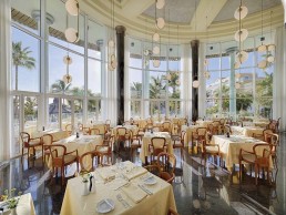
Stone Designs Studio worked with ImpulsARQ on the refurbishment of Jardines de Nivaria to bring a fresh, modern approach, while staying true to the DNA of the Adrian Hoteles brand.
Jardines de Nivaria is a five-star hotel located in Costa Adeje, Tenerife. Featuring modern design and facilities, Adrian Hoteles aims to provide their guests with everything they need for an unforgettable experience. As part of a major refurbishment, Stone Designs Studio was tasked with remodelling the Jardines de Nivaria, alongside ImpulsARQ studio. The focus was to upgrade the suites, two restaurants, spa and common areas while adhering to the style that represents the DNA of the Adrian Hoteles brand.
A project outside of Stone Design’s usual design work, the refurbishment began with the remodelling of the suites, which involved creating a series of elements that serve to unify the rest of the hotel. “Lighting played a main role in unifying the different elements of the project,” Stone Designs’ Isabel Galindo tells darc. “We had a very close relationship with the client and communication was fluid at all times, which helped to keep the true essence of the project from start to finish.”
The decorative lighting in the suites included a C_Ball suspension lamp designed by Stone Designs in collaboration with Spanish manufacturer B.lux. It consisted of a 15cm glass sphere and is framed in a metal structure to light the nightstands.
“It was very important to us that the lighting fitted the space and the style of the hotel,” continues Galindo. “The purpose was to create something that represented the feeling we were looking for. We chose pieces that weren’t going to be the centre of attention but played an important role in the overall design. When we began work on the project, we found many vertical and horizontal spaces, different ceiling heights, and we had to cover skylights… we wanted ambient lighting that didn’t limit us for the layout of the tables.
“Lighting was really important in this project – we used it to compose all of the different spaces, all of which speak the same language thanks to the design.”
For the common areas, Stone Designs, opted for multiple suspension lamps comprising vertical and horizontal structures with a larger 30cm diameter glass light sphere. The idea was for these multiple lamps to make use of the existing points of light, while at the same time adapting to the layout of the space to illuminate it throughout.
“La Cupula restaurant is the most important element within the complex. It was the most challenging too,” says Galindo. “Located on the Canary Islands where they have one of the most important astronomical observatories in Europe, it was impossible not to be inspired by the stars and the firmament that shelter the Teide. This is why the ceiling represents the explosion of a supernova, which at night is retro illuminated, generating a spectacular effect in the space. Tom Dixon’s lamps fall over the tables as if they were lava balls, adding a big dose of drama.
“The constellations were also the inspiration behind the C_Ball collection created specially for this project. Located in the suites and the Solandra buffet area, we knew we needed something special to fit the big and beautiful space. We realised that when you look at the sky at night and you see the stars, you see spherical lightening dots - this became our inspiration.”
For Stone Designs, the architectural and decorative lighting elements perfectly co-exist, mixing classic and contemporary, timeless and elegance.
“We were really happy with the end result,” says Galindo. “We weren’t sure what it was going to be like, given that this was such a different project for us. We really enjoyed the challenge and every step of the design.
“We had to work around different architectural challenges that the client wanted to keep – some of which we weren’t convinced of in the beginning. But in the end, these elements helped to keep the spirit of the hotel and made us work around them for the final result.”
Gran Hotel Inglés, Spain
Gran Hotel Inglés has been a landmark since it was built in 1853. The first hotel to have a restaurant, and on the first street to receive electric lights in Madrid, it became a cultural icon as well. Politicians, artists, writers, and intellectuals made it their gathering place. After years of neglect and disrepair, the derelict hotel has been renovated and redesigned for today’s sophisticated traveller by Rockwell Group’s studio in Madrid.
Bringing back the glamour, elegance, and innovation of Gran Hotel Inglés and drawing inspiration from the hotel’s 165-year-old history, the design concept celebrates the hotel’s past as a gathering place for the avant-garde and intellectuals, weaving original imagery and salvaged historic items into the design of the public spaces, gym, spa, meeting rooms, and guestrooms. The hotel is located in the cultural and historical centre of Madrid, within walking distance to the Puerta del Sol and various monuments and tourist attractions.
The Rockwell Group design team, headed up by Eva Longoria and Elisa Rodriguez, introduced elegance and sophistication to the lobby, celebrating its high ceilings with circular chandeliers, inspired by a classic English manor. Some of the hotel’s original chandeliers and columns have been restored and a central lobby bar is surrounded by a cocktail lounge with clusters of area rugs. A range of seating provides gathering spots for hotel guests and visitors, complemented by mirrors, rich, gem-toned upholstery, and metal details that nod to the hotel’s heritage. A library with floor-to-ceiling bookshelves and a fireplace is a return to the hotel’s intellectual past.
“From the very beginning we wanted to retain the building’s history and infuse it with a contemporary, yet timeless design and unique set of offerings,” Eva Longoria tells darc. “The project was a really rewarding collaboration and our clients at Hidden Away Hotels were great to work with.”
As mentioned, Gran Hotel Inglés is located on the first street to receive electric lights in Madrid – something the Rockwell Group duo were keen to celebrate through modern and classic lighting throughout the property as they explained: “The concept is inspired by the history of lighting and its evolution. We considered its quality in each space to enhance the mood and atmosphere. Our overall goal was to create an inviting feel through a sense of warmth.”
One key consideration during the project was the lobby. The space transitions from day to night, so the designers carefully looked at the ambience at various times, from breakfast to afternoon lounging and reading to evening cocktails.
“The decorative lighting elements combine contemporary influences with nods to the Art Deco style,” Longoria says. “Most of the fixtures were custom designed to suit the look we were seeking. In the lobby, we wanted to restore the hotel’s original splendor as a meeting point for intellectuals. A custom bronze and oval chandelier adds an element of theatricality above the central bar; its grandeur draws guests into the space to convene, have a drink, mingle with locals, or work.
“Restored original pendants hang above the entry and reception desk, while two custom traditional chandeliers comprised of a brass frame with handblown glass, add a sense of sophistication and elegance above the lounge seating. The lobby’s library features embedded LED strips in the custom bookcases to highlight the hotel’s history as a place of respite for writers and intellectuals.”
The restaurant is inspired by the dining room and open kitchen of a grand British country estate, with a mix of classic structures, such as oak columns painted blue, and a mix of modern and classic lighting. A custom bronze and tempered glass fixture hangs from a mirrored ceiling, adding to the sense of intimacy and casting a warm diffused light on guests. Booth seating is reminiscent of a sophisticated and intimate members’ only club.
Moving through the hotel, the hallways leading to the guestrooms feature small framed photographs and are dedicated to the building's illustrious past guests, from bullfighters and writers to politicians. Inspired by the first electric light bulbs, a row of filament lamps crown the top of the elevator, while custom antique brass room number sconces with fluted glass, line the hallways.
“In the guest rooms, we developed an understated, residential elegance that honours the building’s heritage. Most of the decorative lighting is again, custom designed, including the brass wall sconces and bedside table lamps. A custom brass ceiling lamp hangs above the table area, while vintage-inspired reading lamps from Marset also reference the past.”
The designers juxtapositioned classic decorative fixtures with modern architectural lighting, for example, alongside the restored historic chandeliers in the lobby they added recessed architectural lighting throughout. Shade pocket lighting highlights the lobby’s distressed mirrors with faded historic images of long-ago guests and famous hotel visitors. Existing iron columns are lit from the ceiling, emphasising the late 19th century detailing.
“We wanted to create a home away from home – a place where guests will feel as if they are stepping into a friend’s residence,” says Longoria. “Every single detail, from the notion of the space to the level of the service, has been designed to deliver an individualised and memorable experience.
“Lighting is very much a part of that… it shapes the hotel’s public spaces and guest rooms and it has a dramatic impact on the atmosphere and perception of space. Every space has its own unique needs and requires various lighting solutions. This was especially important in the public spaces where dimmers control the lobby’s atmosphere during the day and add a sense of intimacy at night.”
While Rockwell Group has worked on numerous hotel renovations, this particular project was the first in the Madrid office’s home city. “It was really exciting to work inside the 165-year-old landmark and we poured over the rich history of the hotel’s location and the history of the hotel itself to weave allusions to the past into our design concepts and details.”
Hans' Bar & Grill, UK
Goddard Littlefair creates striking interior and lighting features at the new Hans' Bar & Grill restaurant, taking inspiration from Sir Hans Sloane's love of natural history, adventure and discovery.
Hans’ Bar & Grill is a new neighbourhood restaurant in Chelsea London’s Pavilion Rd. Featuring striking, contemporary interiors, created by leading interior designers Goddard Littlefair, the new venue offers an exciting extended café-bar space and restaurant.
Making use of a newly-covered former courtyard space, within the 11 Cagodan Gardens hotel, the new restaurant and bar is set to appeal to a wide range of day-to-night guests.
Named in honour of Cadogan family ascendant Sir Hans Sloane, one-time physician to the royal family, as well as a celebrated natural historian, the new 106-cover restaurant encompasses 18 covers within the café-bar, 46 covers in the courtyard area forming part of the main restaurant, plus a further 42 covers in the dining area of the main hotel building.
A further private dining space, ‘The Curio’, inspired by Sloane’s love of adventure and discovery, can seat 16 guests and is located directly opposite the internal restaurant entrance.
The first café-bar space is located within a converted former news garage on Pavilion Road, where it sits alongside other converted garages either side, to form a new suite of upmarket, independent boutique retailers, from barbers to cheesemongers to specialist purveyors of wine and bread. Architectural works on this, as well as the courtyard refurbishment, were carried out by ReardonSmith Architects.
The bright and airy café-bar space has a clean and contemporary feel with a monochrome colourway, along with interesting, textured finishes, such as white slatted timber wall cladding and an original, exposed yellow-stock brick wall to the left, plus white tiling behind the bar, where vertically stack-bonded Solus ceramic tiles create a great handcrafter feel.
The bespoke feature bar front is in split-faced stone, with a natural, honed grey basalt bar top, providing a clean contrast. The ceiling in this space is exposed and painted light grey, with architectural lighting on tracks and features lighting consisting of five industrial-feel brass wall lights from Istanbul-based Topos Workshop along the left-side brick wall. Alongside this, there are seven Nordlux Strap pendants over the bar, which hang from leather straps.
As you move through to the first courtyard section of the restaurant, it is filled with natural light thanks to two large-scale feature rooflights, from which green and black blown-glass Amp pendants by Holloways of Ludlow hang, interspersed with bespoke spun-brass bowls full of natural planting. This subtle nature theme extends into the main restaurant area where small pots feature throughout on the waiter stations and along the back bar.
The restaurant has a contemporary classic feel and makes use of bespoke, shallow brushed brass chandeliers, which were custom made for the project by Northern Lights. Adding glamour to the space, one is situated in the wine room and the other in the rear restaurant section that follows and completes the scheme.
The rear section is also the indoor restaurant entrance for guests coming from the hotel side. A Gubi Multi-Lite pendant in brushed brass hangs over a six-seater booth here, complemented by art inspired by Sir Hans Sloane and including a series of tropical birds, flowers and feathers, painted by artist Rebecca Jewell and curated by art consultants Artiq.
Outside the main restaurant directly opposite, is the 16-cover Curio lounge space, which can be used for breakfast overspill or for a further 10 covers.
For Lucy Robinson, F&B Associate at Goddard Littlefair, the design process on this project was a relatively straightforward one as the client had realistic ambitions in terms of the space becoming a workable project. “The brief was to create a classically contemporary café bar and restaurant that had complementary but contrasting interiors to the hotel interior,” Robinson tells darc. “It needed to suit the Chelsea market and sit well on the newly-refurbished Pavillion Road.
“We used decorative lighting in the scheme to add personality and warmth to both the café-bar and restaurant spaces throughout the day. At night, the lighting scene has been set to turn off the majority of architectural lighting so that the decorative fittings really come into their own and provide the glow, sparkle and comfort in the spaces.
“In the restaurant, blown glass fittings in the former courtyard space work well with the indoor-outdoor feel and hanging plants, while bespoke brass rings were used to suit the lower ceiling heights and add to the timeless feel of the panelled rooms. In addition, we used decorative lighting in black and brown for the café-bar to complement the space’s graphic feel.
“The lighting is crucial in achieving a day-to-night transformation for the space, allowing the client maximum operational flexibility, as well as helping to demarcate zones and respond to the different character and feel of the three sections of the space – from the exposed brick and white tiling of the café-bar to the well-lit former courtyard space and the more intimate, lower-ceilinged rear space and wine room.”
Goddard Littlefair’s Co-founder and Director Jo Littlefair, adds: “We’re very excited about the opening of our first London restaurant project. As a design studio, we’ve built an extensive portfolio of residential developments in London and an extensive portfolio of hospitality projects outside the capital, so it’s great now, to have a completed restaurant project in the same city we work, eat and play in – and also, to have been able to do it for such a prestigious client and in such a great location.”

