Cantabrian Maritime Museum
Architectural studio Zooco has transformed the hospitality venues inside the Cantabrian Maritime Museum, creating an elegantly simple destination that celebrates the building’s original architecture.
The Cantabrian Maritime Museum, Spain, was conceived as part of an architectural complex together with the Oceanographic Center, designed by Vicente Roig Forner and Ángel Hernández Morales and built between 1975 and 1978.
The original building consists of two square bodies connected by a canopy, with a concrete structure. The interior is distributed over three floors around a central courtyard covered by a vault of paraboloid membranes. In 2003, a renovation and extension was carried out, which included the extension of the west façade and the roof of the terrace with a pyramidal aluminium structure, thus altering the initial conception of the building.
Madrid-based architectural studio Zooco was brought on board initially to rectify issues of dampness in the roof and façade of the building. This later developed into the team designing and creating a new space of the museum on the second floor, which houses its restaurant and terrace.
When describing their involvement in the project, Miguel Crespo Picot and Javier Guzmán Benito, two of the three founders of Zooco, explained how fortunate they were that the client granted them complete freedom when it came to shaping the design of the restaurant.
“Throughout the duration of the project, the integrity of the design remained unaltered, preserving its originality and functionality without undergoing any changes.”
The geometric properties of the space helped define the approach to the restaurant’s interiors. The square morphology of the restaurant’s volume is the result of four additional triangles that regularise and complete the concrete paraboloids of the original building.
“The original building had a terrace on the third floor, where the concrete structure was completely outside and functioned as the roof of the museum’s central patio. In 2003 the building was renovated and within this intervention, the paraboloids were covered with a new roof and the space between them, and the perimeter of the building was closed with glass, generating a covered space where there was previously a terrace. From the outside, the original cover can no longer be seen, and from the inside it is covered by paint or coating,” explain the two founders.
“Our intervention focused on recovering the original essence of this significant construction element. To do this, the coating and paint were removed, and the inclined green glass was replaced with vertical transparent glass. In this way, the paraboloids appear in their pure state and a perimeter terrace is recovered along the entire space.
“The geometry of the existing structure conditions the space, because its height in its lower part is impractical, so a large bench was arranged around the entire contour that allowed us to take advantage of that space and organise the distribution of the rest of the floor plan.
“We wanted the concrete paraboloids to be the absolute protagonists of the space. To do this, we looked for a floor finish that was as neutral as possible, that adapted to the existing conditions and did not compete with the main element of the project.
“To enhance the original structure, we decided to use a wooden roof that framed the perimeter of the paraboloids. The wooden slats bring warmth and friendliness to the space, while allowing us to solve all the technical needs for air conditioning, heating, and lighting, leaving them hidden. In this way we ensured that all these elements did not interfere with the dialogue of concrete and wood, which were presented as continuous and clean elements.
“This geometry became a recovered element, a vestige of the past, and the protagonist of the restaurant’s interior. Treated as an artistic element, the triangular wooden false ceilings frame it.
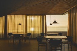
The museum’s location also played a key role in the design strategy for Zooco. “We could say that it influences 100%,” says Guzmán Benito. “We are at the Cantabrian Maritime Museum, a museum dedicated to the sea, which is practically on top of the water. When we are inside, the feeling is the same as when we are inside a boat, there is only water around, and that is why we used clean glass from floor to ceiling, generating a perimeter terrace as if you were on a boat.”
“The use of wood and steel for all the furniture is reminiscent of the materials used in ship building,” continues Crespo Picot. “The wood is arranged in small boards just as it is used in the hulls of boats and the furniture has slight curvatures that are reminiscent of the aerodynamic shapes of boats. Likewise, the lamps are inspired by the masts for ship sails.
“The dialogue between the concrete container in grey tones, on the one hand, and the glass envelope that allows a total visual connection with the outside, generates great spatial harmony. Everything is completed and harmonised with all the oak wood furniture and stainless steel accessories.”
The role of decorative lighting was integral to achieving the minimalist aesthetic the team were working towards for the dining area. Along with fixtures from Arkoslight, Menu and Gubi, Zooco also created a custom piece called the MMC Lamp.
“The concept behind the design of the MMC lamps stemmed from a specific necessity – the quest for a lighting solution that seamlessly emerged from the table surface, eliminating the need to suspend it from paraboloids,” explains Crespo Picot. “This innovative approach aimed to preserve the integrity of the concrete structure, ensuring a harmonious blend of functionality and aesthetics. In addressing this challenge, the lamps were meticulously crafted to not only fulfil their illuminating purpose but also to become an integral part of the architectural composition.”
Discussing the various considerations for lighting placement, Guzmán Benito says: “First, in this luminous spectrum are the suspended fixtures, gracefully poised from the ceilings adorned with wooden slats. Second, the MMC Lamps that emerge from the table, and thirdly the recessed spotlights, which are strategically placed to illuminate pairs of tables, creating intimate pockets of radiance.
“[Decorative lighting is] as important as any main element of the design. The luminaires, in their varied forms, become not merely sources of light but protagonists in the narrative of design, illuminating not just spaces but also the nuanced interplay between permanence and flexibility, aesthetics and functionality.”
When asked how this project differed to others in Zooco’s portfolio, Guzmán Benito explains that the task of rehabilitating the existing concrete structure was a point of difference for them. “This challenge added layers of complexity to the process, requiring a meticulous approach to preserve and strengthen the structural integrity while undergoing rehabilitation.
“Zooco designs everything. Our philosophy consists of approaching any type of assignment, regardless of its scale, budget, and programme, with the same attitude and creative ambition. Applying the same process searching the most appropriate and valuable solution, both from an artistic and functional point of view.”


