Ekho Studio on collaborating with Arup
Ekho Studio collaborated with Arup to create a new, dynamic London-based office for Alexion, which was recently acquired by AstraZeneca.
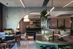
Pharmaceutical company Alexion, recently acquired by AstraZeneca, has a newly completed 7,000sqft workspace located within AstraZeneca’s existing offices at St Pancras Square, London, UK.
During trade show LiGHT 24 in November last year, [d]arc media’s managing editor Helen Ankers hosted an exclusive Q&A with Sarah Dodsworth, Founding Partner at Ekho Studio, who worked on the project. Dodsworth discussed the project’s journey along with her studio’s collaboration with design and engineering firm, Arup.
Ekho was brought on as lead consultant/lead designer on behalf of the client for RIBA Stages 1 to ascertain and fix the project brief and vision. Following on, it was brought into Arup’s team as the “specialist design services” to join its multi-disciplinary team covering mechanical, electrical, acoustics, environmental and general design management.
“It was of paramount importance to the client that the design solutions were as coordinated as possible, so this model of team structure was adopted,” explains Dodsworth.
The brief for the new design was to enable greater collaboration to drive an innovation agenda, as well as ensuring the new space harmonised with AstraZeneca’s existing offices. These include the 21,000sqft, award-winning commercial head office for AstraZeneca UK, located on the building’s 8th and 9th floors and designed by Ekho Studio in 2021/22, becoming the agency’s first completed project.
Over the next few pages you will find an edited recount of the discussion that took place at LiGHT 24, followed by Dodsworth’s reflections on the completed project, shared exclusively with darc.
Helen Ankers: How did Ekho get involved in the project and what was the initial brief?
Sarah Dodsworth: We’ve been working with this client for a number of years, and this project is an evolution from a scheme that we delivered in 2022 in the same building, which was a relocation of their commercial marketing team from a huge building on the outskirts of Luton into Central London. You can probably imagine, without focusing too much on it, was a huge cultural shift for all manner of reasons – the ways of working, the approach to collaboration with partners being in central London, etc.
This project is on the sixth floor of their new London HQ building, and as mentioned it’s an evolution of where we were with the other scheme. What differs with this design is that it combines workplace for a team that call it home, every day. With a reception concierge, but also significantly, a big conference meeting tech suite. What it offers is a touchdown for the senior execs – who are part of this global company – who travel all over the world, a place to drop in when they land into the UK before moving on again. So, it provides a space with the ability to arrive at any time of the day into an environment that’s appropriate for that, which feels beyond a typical office.
It has the business lounge facilities, the hospitality lay down, catering facilities, and top-notch tech spaces to hold conferences, etc. All of this is combined with what you would call a workplace, with desks, quiet pods, that kind of thing.
Ankers: What struck me when I initially saw the images was how much it felt like a hotel.
Dodsworth: Given the nature of their business, it was important the design wasn’t about frivolity and making things look nice for the sake of it, the absolute fundamentals of it were productivity, ensuring this is a place where wellbeing thrives, and ensuring it’s a functional workplace. And then what ensued around the aesthetics and the look and feel followed. There was no one in that business that would’ve taken us seriously if would’ve honed straight in on textures, colours – which we love doing by the way – but we had to ensure we gained their trust, and they understood what we were doing. For example, the investment into AV and these meeting spaces is so reliant on the lighting: the scene setting, the control element, the glare, the uniformity of light. We had to ensure that we nailed all of that before we started explaining how we can still make this really soft, warm, welcoming. It’s a much softer approach to what an office feels like. Given this is a space where people land in at any given time of the day, it’s not just a nine-to-five workspace, the layering of the lighting, the warmth, but the ability to manipulate and control those spaces from a daytime into an evening use was really important.
Ankers: What challenges did you come across and what were the key focuses?
Dodsworth: I’d say we had opportunities and challenges with this one. I’m sure anyone else involved in interiors, architecture and lighting knows what I mean when I say when you inherit a Cat A spec building – an office building – and there’s already ceilings and lighting in place, the challenges around justifying why we want to remove what’s there, which is new, which is an unsustainable approach, but it’s actually really unconducive for us to be able to create this layered, softer, more nuanced scheme. In some ways it presented an opportunity for us here because this was a previous fit out of a previous occupier that just needed stripping out.
What we were able to do within the office space significantly is define and design something quite tailored and unique that then made the lighting design intrinsic to that rather than, for example, a grid, with a format, with a uniform of light that then no matter how many lovely pendants, layers, and integrated LED fixtures you input, can get lost and not often read because the standard of light is already quite overwhelming.
So, that was an opportunity that we took, there was flexibility. But, conversely to that around the challenges, in the workplace it is all about uniformity of lighting. As much as I’d love to do a little bit more around the contrast between light and shadows, we’re working with engineers and lighting designers, which require uniformity of light in these boardroom spaces and workplaces to ensure that it’s a productive environment. We don’t want people complaining of fatigue or headaches, and the lighting is very much working with that. There’s a beautiful curved blue bespoke bulkhead in the ceiling of the large meeting space, and that caused us real challenges to get the right approach of uniform lighting without a huge proliferation of fittings that just ruined the whole installation’s curved nature. That got the engineers and the technical side ticked but also allowed us to bring in the softer elements as well.
Often, when something looks simple I think you can appreciate that it was hard to achieve to get elements looking beautiful and considered and curated.
Ankers: How was the client to work with – welcoming of new ideas or rigid with the brief?
Dodsworth: I think that is the benefit of working with a client before, isn’t it? You’ve bought some trust, and we delivered quite a groundbreaking scheme for them a few years ago, which was a game changer for them. I think we had the opportunity there because the marketing team were a slight subsidiary of the global team, and they wanted to purposefully mix things up and do things differently. They wanted spaces that felt more hospitality focussed.
So, when we latterly do these spaces, which are very much for a corporate audience, we’ve at least got some great benchmarks, we’ve already brought them on that journey. Needless to say, there are the standards that are written within the corporate literature around the CIBSE guidance and the lux levels being 500, etc. So, we very much have to work collaboratively with the entire design team to ensure that we’re illustrating that this works functionally, fundamentally, but equally we’re not just there to nod along and tick the boxes, but to push the agenda as well and explain how the workplace has changed, as we all know, believe us there’s another way. We can get these spaces to be functional but also make them beautiful so that people genuinely want to come to work as well.
It’s about dialogue and it’s about throwing yourself into those technical workshops as well as it is then relaying that back to the client where some of the technicalities are lost but ensuring them that you’re ticking every box as it were.
Ankers: You mentioned working collaboratively with other designers on the project; do you have a lighting design team, or did you work with another studio on any lighting design for this project?
Dodsworth: At Ekho Studio, we’re all interior designers. We are massively passionate about lighting design because if you haven’t got good lighting, no matter what we do, you will only achieve so much. Even though we like to think we’re fairly well-educated, we would always collaborate. On some projects it’s a given that the design team doesn’t just have an electrical consultant, it involves lighting specialism. It isn’t always a given, so we are massive advocates – I sometimes think I should be on commission with the number of times I try to get feature lighting consultancy in on a project! As much as we have the vision and we know what we want to achieve, we fundamentally could not do that solo; we very much work as a team and rely on coming together to discuss how we achieve things and how we can do it across all the different parameters that we need to do.
Ankers: Where do you think an interior designer’s job ends and a lighting designer’s starts?
Dodsworth: I can only speak from our experiences. Our studio sees a project through to completion following the RIBA stages all the way through to RIBA six. So, to me it doesn’t end, but obviously you have different involvements at different stages depending on how technical the stage is. You’re selling the dream, interpreting the brief at RIBA one and two, and then bringing in lighting design hopefully never later than RIBA stage three; now we need the help. We’ve sold the concept and everyone’s on board, but we really need [the lighting designers] to help us work this out.
Ankers: What were the standout features for you in terms of the lighting?
Dodsworth: They probably look very simple but I am incredibly proud of the timber rafts that we created for the office space, because when you walk in, the tone is just set. Generally, we are used to a more gridded version of ceilings, unless you have some cool warehouse or ex-industrial building. This is an a-typical office building. The fact that we could get the client on board to invest, because it is quite a bespoke, tailored solution, we wanted the natural materials and tones to create the whole story of sustainability around the choice of materiality and that connection to nature. But I think what’s really important to how we approach the lighting within the workspace, and again, this comes back to this layered lighting, was that it wasn’t just strips of LEDs throughout. Yes, we had to ensure for the uniformity, but there’s lots of downlights that provide softer pooling of light in conjunction with something more functional. And then where we’ve got some of the suspended pendants within the collaboration zones, for me it’s really important to ensure that lighting’s not just coming down, it’s actually indirect as well.
I can’t help but feel that sometimes when you go to Scandinavia particularly, they’re really good at getting the light to be indirect as well as direct and bounce off the surfaces, which creates for a softer environment. I am a migraine sufferer and too much of bright lighting really triggers me. So, I think it’s just about how people feel comfortable in the space, but then ensuring that it is productive throughout all these hours of operation.
I’m also really proud of the bespoke curved blue ceiling installation that we developed, which comes off some of the original concepts around form that we wanted to do. Curves have this sort of subliminal, relaxing and softening feel to them. How do we take a very corporate client and create a sophisticated and calm space that can’t be too homely, because that would have been frowned upon – it’s sophisticated and grown up and professional. That particular ceiling was a real challenge. So, we formed this bespoke bulkhead, and the blue colour, which has a mottled texture, is formed from a natural clay product. This gives a real striking effect within the space and allows the light to bounce off something with some aggregate and texture to it. Set within that is acoustic panelling, which had to be bespoke formed to fit in our shapes and finished with beautiful handblown glass pendants dropping down. Lots of design workshops went into this feature, and it was very much about bringing everybody on board collaboratively.
Overall, there are loads of lovely details throughout, lots of nice pendants, table lamps and integrated LEDs, which are all fabulous, but were a little more straightforward to deliver. It’s always the things that are a challenge that particularly stand out in your head.”
Reflecting on the project as a whole, Dodsworth elaborates to darc the working relationship Ekho Studio had with Arup. “This was our first time working with Arup. We learned an appreciation of the technical aspect of a fitting, so much more than what it looks like. For example, the output of a light per unit being a determining factor, which influences quantity and spacing, not least linked to the energy efficiencies too.
“The client team’s priority was always function over form and to generate spaces for high productivity. Our challenge as a project team was to find solutions that meant we delivered on functionality with a considered design approach.
“The architectural lighting elements were intrinsic to ensuring spaces are appropriately lit to suit the usage of each environment, while the decorative elements created warmth and softness, which resulted in a layered approach. This gave the scheme it’s unique edge and aesthetic and also meant that the work settings are very adaptable.”