Kricket TVC, UK
Kricket TVC at White City is the third venue to join the London-based restaurant family. While using existing Soho and Brixton venues as inspiration, design studio Run For The Hills creates a more sophisticated yet industrial dinner setting with this latest project.
London-based design consultancy Run For The Hills has revealed the interior of the new Kricket TVC restaurant, which launched 24 September at the recently renovated Television Centre in White City. Headed up by founders chef Will Bowlby and Rik Campbell, the 100-cover restaurant is the third Kricket restaurant designed by Run For The Hills.
Kricket was founded in 2015 when the duo first began serving out of a 20-seater shipping container in Brixton. Known for its modern, seasonal twists on Indian dishes, Kricket’s latest project showcases Bowlby’s flair with Indian spices, learned from his years in Mumbai kitchens and his passion for quality, locally sourced ingredients. Run For The Hills has a long history with the brand having worked on Kricket’s creative identity, website, and designing the interior of its first two London restaurants in Soho and Brixton. The design studio’s graphics team also designed the Kricket cookbook earlier this year, which coincided with the launch of the Brixton venue.
Anna Burles, Creative Director of Run For The Hills, comments: “The brief was to take the spirit of Kricket Soho but make it a little more understated and to notch up the sophistication, while retaining some of the industrial vibe of Kricket Brixton. Ultimately, we had to make the big Television Centre open-plan modern space still feel like a quintessential Kricket, warm and welcoming with soul and character.
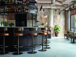
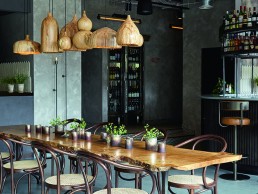
“For the look and feel of the new space, we’ve styled Kricket TVC with an atmospheric and highly textured palette, ranging from urban nudes and cracked terracottas through smoke-gold-veined marbles, burnt chocolate joinery and black marbled cork walls, with a mint-crisp crackle-glazed bar top, weathered polished plaster, aged walls and lightly distressed micro-cement floor. The antique brass metallics of Soho have been replaced with rich and dark oil rubbed bronze, raw iron and refined gunmetal steel metalwork. The new design also features a range of bespoke specialist finishes and layering of decorative grilles, custom metalwork and bespoke lighting. The overall scheme is fresh and earthy by day, designed to turn barfly-moody later on, for late night drinks and food.”
One of the main challenges for Run For The Hills on this project, was designing something original and characterful within a large, square and very modern landlord designed glazed box. “It makes you work really hard to come up with ways of zoning the space cleverly so that it doesn’t feel too open or empty at quieter times,” says Burles.
“Using decorative materials and lighting to create distinct sub-areas within the restaurant with their own personality. We also had to conform to landlord perameters with what we could do to the windows, signange and exterior landscaping, but I think we still managed to create a really Kricket-feeling terrace and shop front, that stands out from the neighbours.”
The project itself took a full year from start to finish and as you would expect, when a project manifests over such an amount of time, it naturally morphs and changes slightly, not least for budget reasons more often than not. However, for Burles, the spirit and essence of the design concept were retained – even when they had to rethink things to make them simpler or more cost-effective.
“The finished piece looks remarkably like the 3D visualisations we designed months ago, which shows how closely we stayed to our original concept, look and feel,” she tells darc. In terms of mood, the venue feels fresh and earthy during the day and warmed by candle-glow lighting at night. Given its much larger size, the light and airy open plan layout, the new venue doesn’t have the compact and cosy moodiness of Soho. However, the lighting design has been carefully detailed with targeted lighting adding softness and warmth, while zoning different areas within the space.

Much of the decorative light fittings have been designed by Run For The Hills, working with talented workshops around the UK. A cluster of various-sized bespoke, hand-turned, spalted beech wood cupola pendants by Tamasine Osher sit above the communal table, while there is a suite of different-sized, super-long javelin wall lights in black iron that have been woven into a curated mix of sourced lights, including vintage-style surgical holophane pendants, DDR strip lights originally used in Soho, and waterfall crystal chandeliers, which inject a shot of glamour.
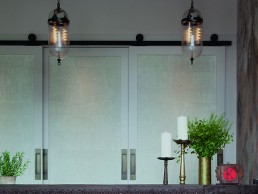
Hanging above the reception desk are two stunning Aston lantern pendants with Skinny Rib glazing from Fritz Fryer, a wall-mounted version takes centre stage on the main wait station. Vintage Indian clock boxes, as seen at the other restaurant locations, have been customised and turned into light boxes, nestled amongst glassware and bottles on the gantry and back bar.
“We concepted and sourced all of the decorative lights within the space,” continues Burles. The brief was to create a mid-level, warm light ambience with pools of light and pockets of detailed lighting picking out beautiful design details, vintage pieces and key pieces of furniture. A key part of the brief was to make the tables feel intimate for diners through lighting and of course, to make the food look amazing! Decorative lights also had to add to the overall style of the space, with hints of industrial fixtures marrying with decorative glass, colonial-style fixtures and more organic pieces for a really layered look. All of the decorative lamps were allowed to ‘breathe’ away from architectural spot lighting so that the two weren’t trying to compete.
“As it’s a new-build space, lighting tracks and decorative pendant placement and wall lights had to work around all of the other ‘busy’ activity on the ceiling from H-VAC extraction, H&S cabling, loudspeaker systems, and sprinkler systems to name just a few. But you always manage to work it out somehow… some of our wall lights had to be moved to make way for slightly over-zealous regulatory control panel systems in very visible locations, but so be it… you just have to take a deep breath and know that the overall impact will be good.”

The overall decorative palette of the restaurant creates the perfect backdrop for pops of Kricket’s brand orange-red, which zings out from sections of upholstery. A fiery glimpse of the brand colour can also be caught when the reception wardrobe doors open. Due to the size of the space, some of the walls have been treated in acoustic materials, including a black-ink marbled cork. Alongside this, Run For The Hill’s team of sign-writers have hand-painted custom graphics and lettering throughout the venue to guide customers around the space.
Concluding on the use of lighting throughout, Burles tells darc: “Lighting is everything, not just something nice to have. It can be the make or break that transforms an excellent design into an utterly jaw-dropping design. Great lighting makes everything feel and work so much better. Spaces are zoned as much by the shadows and darkness as they are the lights picking beautiful design details out.
“Diners and drinkers enjoy their evening so much more when the lighting adds to the experience. Good lighting is flattering for guests and staff, it can make the food look amazing on the table and counter. It can highlight a design detail, which costs a decent amount of budget, and the lighting attention can make that part of the design work even harder. Bad lighting can ruin a design and dilute its impact, so we are great believers in the power of lighting.
“We are delighted with the results at Kricket TVC and feel the finished interior design is incredibly close to our original concept. The whole team worked really hard to make sure the design was brought to life really carefully and with loving attention to detail.”
“This is our third project working with Run For The Hills and they have given it the same level of passion as their first,” adds Rik Campbell, Kricket Co-Founder. “It’s also our biggest site yet, so has been more complex and challenging but we have pulled it off together and still managed to really enjoy the process. They just get us and our ambitions and when you add that to the creativity of their design ideas, and their eagle-eye for a good finish, it makes them a really great design partner.”


