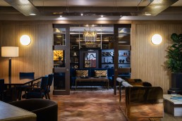
Matrix Office
Alex Dauley tells darc about her workspace scheme for Matrix Studio. Combining luxurious colours and furnishings, she has created a stunning and professional environment.
After two years of pandemic-induced remote work, the return to the workplace has left companies and their employees stuck at a crossroads. On one hand there is a positive attitude to the familiarity of routine and the welcome escape from home confinement, bringing back a natural rhythm to life. On the other hand, the comfort of our own abode is sorely missed when forced to work the nine to five in the same bland environment complete with squeaky swivel chairs and sterile lighting.
Matrix Studios, an office, studio, and co-working space, nestled in West London, is one of many companies changing their perspective of post-pandemic workspaces. Embracing the idea of being a “home away from home” Matrix has invested in its interior landscape to make employees and clients enjoy working in the space. Interior Designer Alex Dauley of Dauley Design was tasked with the ambitious endeavour to transform the space. Dauley, already having a longstanding relationship with the client, brought a wealth of expertise to the project with her knowledge of the company and working with many commercial projects since the pandemic.
“The office is used by two music industry companies, 2 Tone Entertainment and Stellar Songs. They are publishers and artist management. Their brand is very strong and the image they needed to project to their clients and artists informed the design direction. It needed to feel opulent, sophisticated, and professional yet relaxed,” says Dauley.
Previously the office was a stereotypical white box with little character, thankfully the client was open for a complete transformation, leaving Dauley with a blank canvas. Her design emerged from her observations of how the team worked and through thorough research of the client’s brief.
In response to the clients wishes to have a SoHo House inspired look, the design process unfolded with a nuanced approach aiming to establish sophisticated feel to it’s hospitality. Using a layered approach to textures and tone, Dauley designed a neutral backdrop using stone and wood, which were juxtaposed against bronze mirror, brass accents, and reflective surfaces. Each element was meticulously created not only for its visual appeal but also its practicality in conjuring the kind of productivity for a music company. The overarching aesthetic sought to strike a balance between opulence and fostering an atmosphere that will nurture creativity. Take for example, the chairs, upholstered in a vibrant blue velvet, injecting energy while blue can simultaneously bring peace and calmness.
Dauley explains: “This space was about creating a vibe, a space that allowed for creativity and entertainment, alongside the day to day running of the business. It had to function on several levels. Technically we had to soundproof the entire office so music could be played without causing too much disturbance. The space needed hot desks, a group meeting area, break out spaces, a private meeting room, bar, and stage for client performances. We fitted a lot into a small space.”
Alongside textured materials and warm metallics, the look is complete with ambient light such as Andrew Martin floor lamps positioned in the corners of the room, while Andrew Martin’s tubular chandelier takes centre stage from the ceiling. The wall lights are vintage and bought from Crystal Palace Antiques, washing the walls with a warm glow.
Dauley adds: “I wanted the space to feel like you were at home. The lighting was residential lighting placed into a corporate space. It needed to be softer and more tactile to create that ambience.”
According to Dauley, decorative lighting is one of the crucial components when achieving a dynamic look in workspace environments to add both comfort and luxury. She says: “The lighting played a huge role, again to help it move away from feeling too corporate. Layered ambient lighting, lamps, vintage wall lights and statement pieces added to the relaxed aesthetic and the mood could change depending on the lighting used.”
The shift in workspace design since the pandemic has been notable to Dauley, with most of her commercial projects requesting to move away from corporate looks and instead prioritising comfort. The reason for this is crystal clear to Dauley as she explains from her experience: “I think companies want to entice people back into the office environment and have realised the importance and benefit of creating a space people want to spend time in and that promotes wellbeing and happiness.”


