Red Herring, USA
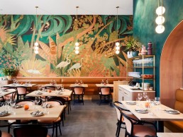
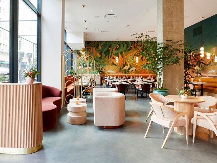
Situated in a new mixed-use development on a bustling street in Downtown Los Angeles, Red Herring restaurant and bar is timeless, energised, and bathed in a California attitude. Downtown Los Angeles is rich with history, which heavily inspired the new scheme for Red Herring; using a splendor of colour, Art Deco geometry, soft curves, and splashes of flora and fauna whimsy along with a custom focal point mural by Mike Willcox, this space has quickly become a design destination.
Building on an already well established working relationship, designer Marissa Zajack was brought on board the project by restaurant owners David Woodall and Alexis Martin-Woodall. David is a prominent chef in LA and Alexis is the President of Ryan Murphy Television, and both have admired the design style of Zajack and worked with her in the past on branding projects.
“The design project was a complete build-out and took a full year,” explains Zajack. “I wanted the restaurant to feel as though it was grounded in the environment around us. Downtown LA is filled with historical buildings that came to life in the early 1900s; Red Herring is Art Deco meets California cool. There are many textures and geometry mixed with a large fauna and flora mural, and soft curves and arches. There is also custom lighting throughout that plays off the architecture and design elements.”
Working on a restricted budget, Zajack explains that the main challenge of this particular design was making the most of the money she had to work with. “It made me think more inventively and look to sources and artists that were lesser known to achieve an individual and bold statement,” she says. “I really loved the idea of using up-and-coming innovative artists. For the most part, it all worked out, but of course there were challenges and headaches.”
For example: “The three globe pendants in the dining room, although lovely, were a bit of an undertaking when it came to getting light sources in and out. If I had to do it again, I probably would have gone with a more experienced designer. This is where working with emerging designers can sometimes get tricky. I spent many hours getting these ready for service,” says Zajack.
Describing the lighting working as another “detail and sculptural element within the space,” Zajack wanted to incorporate custom lighting aspects into the scheme, for example the lighting sculpture hung above the bar. “I’m a fan of Light Cookie’s Dora Koukidou and had an idea for a light sculpture. I thought she would be the perfect designer to bring the idea to life; she did and more. It is a mixed metal sculpture with illuminated globes – it’s simply stunning and works so well within the aesthetic,” explains Zajack.
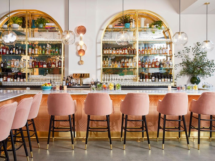
Using decorative lighting as an “extension of the story” Zajack used multiple decorative brands to complete her look for the restaurant including three globe pendants by Adir Yakobi and Mid-Century multi-light chandeliers by France and Son in the dining room; pendants from CB2 and the light sculpture from Light Cookie in the bar; and the I Do sconce by Light Cookie in the restroom. Architectural lighting was used in recessed areas and served a purpose for these spaces that the decorative lighting could not.
Looking back on the Red Herring restaurant, Zajack was very pleased with the impact the decorative lighting had on the space and its use in creating an overall atmosphere.
“The standout feature was how much of a statement the lighting in the space makes,” says Zajack. “Honestly, that’s a lot of what people talk about in terms of design. It’s such a big part of the design story and really brings everything together. It adds shine in all the right places and it’s a detail that brings everything to life and sets the mood.”
