Scandic Hotels, Norway
Designers Light Bureau and Koncept worked closely on two of Scandic’s latest hotels – combining Nordic style with beautiful details inspired by each venue’s surroundings.
Scandic is the largest hotel operator in the Nordics, with a network of around 280 hotels across six countries. Two of its most recent projects, Scandic Falkoner, which opened in in 2019 and Scandic Kødbyen – opened in 2018, feature interiors and lighting from the teams at Koncept and Light Bureau (formerly ÅF Lighting).
Following a two-year renovation, one of Copenhagen’s most iconic hotel and event venues reopened in the summer of 2019 under the name Scandic Falkoner. Following a two-year renovation, the hotel, located in the Frederiksberg theatre district, now has twice the accommodation capacity with 334 rooms appointed in classic Nordic style with beautiful details inspired by the entertainment world.
Centrally located, the hotel offers proximity to shopping, cafés, restaurants and green spaces. It also features a new restaurant and bar targeting city dwellers and visitors alike. Environmentally certified, the hotel also includes two event spaces – the largest with space for 3,000 people; twelve newly renovated and flexible meeting rooms; restaurants with seating for 350, a cocktail bar, café and gym.
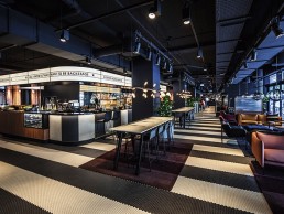
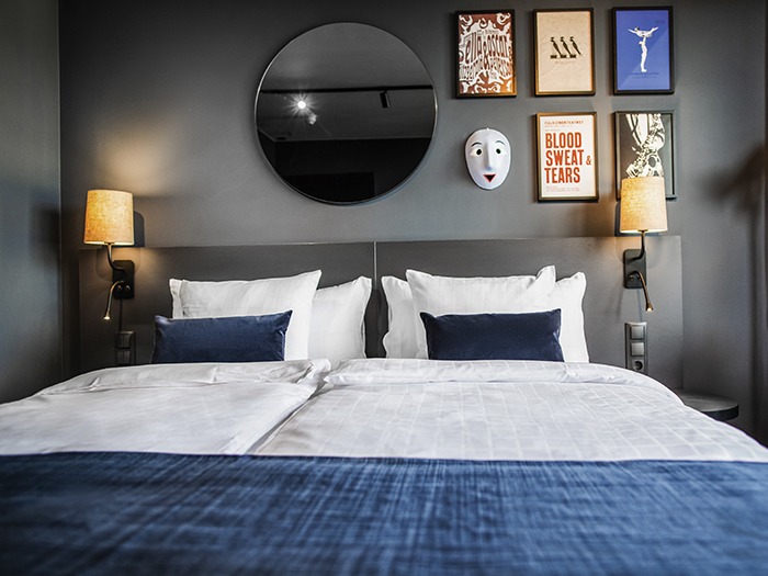
Kødbyen is located in one of Copenhagen’s most creative and culinary districts and certainly suits its environment. With its low-rise buildings and distinctive look, the hotel blends into the rustic background of Kødbyen. Designed to embrace everything and everyone, it features a café, restaurant and bar, meeting and conference room, with the guest rooms featuring a cool Nordic décor, designed to make guests feel at home.
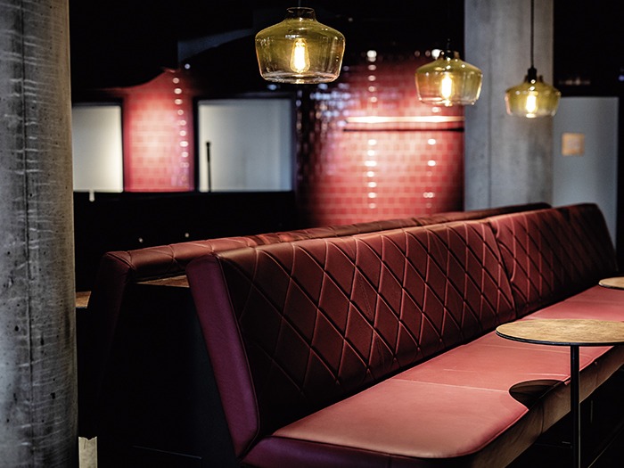
While located in the same city, both hotels have their own identity, something which informed the design brief in both spaces. At Kødbyen the initial lighting brief called for something warm and dramatic, with the general atmosphere creating a flirtatious salute to the traditional meat packing district where the hotel is located. Materials used throughout are warm, rustic and rough, using concrete as a continuous unifying element. Glossy tiles and brass mesh details were other elements that allude to the districts and previous butcher history. The materials were used as part of the lighting scheme, with the brass mesh lit to create a warm peripheral glitter, as were the tiles, while the concrete walls served as a soft backdrop. In the restaurant the key decorative features include back-lit meat panels, as well as a bespoke water container fixture – like the type you find in pastures.
When it came to choosing the light fixtures at Kødbyen, pricing was key due to the sheer volume of fixtures being used throughout the venue. The decorative elements are used to give tone while architectural light completes the composition. Thanks to careful consideration, the designers were able to leave room for decorative fixtures and use them in an intelligent way.
With Falkoner, the project started life as a simple refurbishment – the designers were asked to update fixtures in a small part of the venue, with products of the same dimensions as previous products used. However, it soon grew and, in the end, included lighting design and controls of the public areas, the two conference floors and hotel room corridors and taking three years to complete.
The main challenge for the designers at Light Bureau, was working with the ‘dark and intimate’ backstage interiors created by interior architects Koncept, while at the same time dealing with generous skylights and a wall-to-ceiling glass façade. The contrast in light intensity was a challenge, as was finding a physical place for mounting the general lighting in the atriums without obstructing the daylight.
The main lighting considerations at Falkoner were that it should be intimate and inviting – the designers worked consciously, using reflections and transparencies throughout, prioritising highlighting features such as tables or posters, to create attractive eye-catchers in an otherwise subdued setting. This created contrasts to the soft backdrop where they made use of the different materials in order to create soft sheer light levels to frame the décor.
In order to create a warm and intimate experience for the hotel guests and concert goers, the designers needed to limit any source of glare, and for this reason, they made frequent use of honeycomb louvres and well shielded fixtures. They also worked with golden reflectors in the main restaurant area to enforce the warmth from the light. Perspectives were created by establishing different light layers and for this purpose integrated lighting was also used – for example, at the backlit bar in the atrium restaurant.
One of the key general decorative fixtures was a custom-made horizontal suspension piece with visible LED filament lamps. As the general interiors were intimate and dark, finding a decorative lamp of decent size – but with a low light output that was flicker free during dimming – was difficult; the dimming curve of the fixtures was also difficult to predict. In the end, the total dimming span used was only between 63-61% light output; in reality this meant a considerable variation of light output but difficult to manage – this constraint was something the designers encountered in many places during the project as the LED lamps were used as a general decorative element.
Creating warm, glowing points in the restaurant, while lighting the sheer curtains next to them from track lights, the result is balanced and creates a general glowing sensation and the feeling that all of the light is coming from the filament lamps. This method is implemented throughout the entire restaurant and lobby area.
The remaining decorative lighting elements chosen by Koncept create highlights and focus points in the design, while the architectural lights are hidden and support the decoration. In the restaurant, the combination of the two create colour contrast between the glass lanterns suspended on arches over the tables and the otherwise warm velvety interiors.
Reflecting on the project, for the designers, Falkoner went through a great transformation – from a vast, cold and mineral universe to an intimate setting with many different rooms for guests to encounter.
