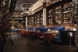
The Cut & Craft, UK
Using influences from the Titanic, The Cut & Craft in Leeds, UK, has been given a new lease of life by Studio Two and Mistry Lighting.
A historically enriched location found in the heart of Leeds city centre in the UK, The Cut & Craft opened in October 2022. The Grade II listed building, formerly known as Collinson’s Café, was famously frequented by Wallace Hartley, the Band Master of the Titanic. Using this unique affiliation, Cut & Craft’s interiors take inspiration from the elegance of the Titanic, incorporating oceanic colours, textures, and metallic qualities.
Completing the interiors for the new venue was Studio Two, a Yorkshire-based interior design practice. darc spoke with Zoe Wheatley, Director at Studio Two, about the design concept for the new hospitality space. “Having previously worked with the owners of The Cut & Craft on multiple sites for their Italian restaurant brand, we were appointed as the designers on their most recent acquisition in the iconic grade II listed building, Victoria Quarter Leeds. The Cut & Craft have brought their signature flat iron steak and craft beer experience to the city centre, allowing them to make their mark on Leeds’s casual premium dining scene,” she explains.
“The brief was to create a beautiful restaurant that caters to an all-day offering, whilst ensuring the space can transition into a lively venue in the evening. The client was also determined to celebrate the history of the site and use what information we had on the building to turn it into visual stories. With that, we were able to create an underlying design concept around The Titanic, curated from a story of a musician, Wallace Hartley, that was invited to play as Band Master on the ship and was linked back to the site’s previous Collinson’s Café as part of their entertainment team.
“The project was on site for a duration of 16 weeks, however, the planning and designing of the scheme was two years in the making.”
Studio Two brought Mistry Lighting on board to ensure a beautiful lighting scheme was embedded in the design. Krishna Mistry, Founder of Mistry Lighting, explains to darc her involvement in the project: “The building is listed and there were many architectural features that Studio Two wanted to illuminate as part of their interior vision for the restaurant. This included a large feature dome that spans across the bar where they needed a specialist lighting designer involved to bring their vision to life.
Due to the historic nature of the building, the teams faced some challenges throughout, as Mistry explains: “The main challenge we found was the building was grade II listed, which gave us limitations on where we were able to mount lighting. For example, we wanted to illuminate the ornate arches, but we couldn’t recess lighting within the floor. We worked with Studio Two to create a discreet box at the base of the arches to recess the uplights within. Where possible we integrated within joinery items to allow us to illuminate existing and new features of the restaurant.”
Wheatley adds: “Certain challenges arose around the M&E side of the project, as with a lot of listed buildings the traditional concrete construction resulted in a dynamic and creative lighting design, which was undertaken by Mistry Lighting, packed full of joinery illumination, beautiful back-lit features, and perfectly hidden marker lights. The end result of the design scheme is impactful, atmospheric and completely on brief.
“The brief didn’t change over time however the space planning altered slightly as we hit certain challenges with the building. We spent a lot of time before the construction phase designing and working with our client to ensure the brief was fully captured.”
Mistry adds: “We always kept Studio Two’s overarching vision in mind when designing the lighting. It was always a key element to this design and as previously mentioned, as it is a listed building, we couldn’t illuminate every detail we wanted but we prioritised the key elements to ensure the original vision was achieved.”
Using the Titanic as a foundation for the design’s inspirations, Studio Two featured “oceanic hues, glistening water-like metallics, crafted timbers and an abeyance of inviting texture”. These details were key when it came to the team designing bespoke decorative lighting fixtures with Northern Lights to “embellish the scheme with scale and impact”.
Architectural lighting fixtures from Lucent, LightGraphix, LEDFlex, and Anolis were used to create a backdrop for the decorative fittings that took centre stage. “The key decorative features were the large bespoke pendants as you enter the main restaurant. This was in the original visual from Studio Two, who appointed Northern Lights to manufacture the bespoke pendants as well as the decorative pendants across the restaurant. They were all designed by Studio Two to ensure the decorative lighting complemented the interiors perfectly,” explains Mistry. “The lighting played a huge role to celebrate the architectural features of this historical building and creates drama and impact. It draws attention to certain areas of the space and highlights richly detailed elements,” she continues.
“The grand ceilings lend themselves to the suspension of large bespoke pendants, inviting you through the space. The lighting showcases the building’s exceptional beauty and allows it to come alive at night.
“We used layers of light to create the right balance between architectural and decorative lighting allowing us to change the mood of the restaurant from day to night.”
These layers of lighting that Mistry references were an essential part of the design scheme to allow the space to be flexible between times of day and usage. Wheatley elaborates: “The ground floor restaurant and bar, as well as the reception space heavily features hidden joinery lighting, specifically designed to create mood and atmosphere from day to evening. The spaces are then embellished with opal glass bespoke fittings with touches of brass to add a subtle glow to the landscape.
“The first floor is home to the champagne bar, which is positioned under the historic glass dome and is focused mainly on table lighting to allow the colour-changing dome lights to take centre stage.
“The architectural fittings are mainly used to celebrate and highlight the historic features of the building and ensure the space cleverly transitions from day to night. The decorative fittings then furnish the scheme with a selection of materials that complement the overall design.”
The colour-changing dome lighting mentioned by Wheatley was achieved using Arcsource 4MCA spotlights from Anolis. “We could not position any fittings on the historic glass dome at the first-floor level, which is why we and Mistry Lighting opted for colour-changing DMX lighting to add drama and impact for guests dining under the dome.
“Bespoke table lighting was designed to add a secondary glow to every table on the first floor.”
Mistry adds: “It’s not often I have the opportunity to work with a listed building and especially one with so many original features. With other projects you can place lighting wherever you need it but, on this occasion, we had restrictions that made us explore different opportunities to light the space.
“The standout feature has to be the main dome, which is stunning! We lit the dome using a combination of beam angles from the perimeter of the base of the dome to allow it to glow softly.”
Speaking on what the lighting brings to the space, Wheatley explains that without it, their design wouldn’t have been brought to life as it was. “For us, without a carefully curated lighting scheme, our efforts for the overall design concept wouldn’t come to life. Meticulously specified lighting not only adds layers and depth beyond loose and fixed furniture, but it also helps a space transition from day to night ensuring the story of the space is being told. In restaurant design, the space is more than just furniture and new joinery; it’s essential that the visual stories come to life and impact guests as a whole experience.”
Typically, there are always some elements that have to be compromised or removed altogether along the project journey. For Studio Two, this involved the external signage. Due to landlord restrictions, the team were unable to illuminate the external signage, which was included in the original plan. For Mistry, she too wanted to include some external lighting. “I’d like to have explored ways to illuminate the existing stained-glass windows from the outside in the evenings. It is such a beautiful feature that is effective during the day but at night, you don’t get to appreciate it in its full glory being lit from within.”
Overall though, the project has been deemed a massive success for both parties involved in its design. “Working on a unit in the Victoria Quarter was a big moment for Studio Two. Being a local site to us, we have always admired the history and beauty of this building so to be able to bring our vision to this space was iconic. The project was also our first time working with Mistry Lighting, which was a huge success as we were able to see each other’s visions from the outset,” says Wheatley. “Working with Mistry Lighting was a huge success and we have plans to work with them on future projects. We found using a lighting designer really elevated the scheme and brought our visions to life.”


