Tivoli, UK
London-based Run For The Hills has designed the interior of Tivoli cinema’s first location, launched in December in Bath, UK. An exciting new breed of boutique cinema, Tivoli is a fantastic screening venue that is also a high-end social and dining destination in its own right.
The design studio’s branding team worked first with the cinema to conceptualise a signature brand and visual identity, before Run For The Hills’ interior design team dived into the styling of this first location.
Tivoli has four, 50-seat screening studios and a twelve-seat Directors Lounge, offering an exclusive cinematic and dining experience in a premium environment. The first location in Bath boasts state-of-the-art technology, stylish interiors and an impressive food and beverage offering, with the venue also designed to host parties, events and private screenings.
Creative Director, Anna Burles, of Run For The Hills explains how the project came about: “We were approached by Empire to create their new brand after they had seen our work for Kricket Soho and loved the original and quirky design. The brief was to build a brand from ground up, combining interiors and graphics seamlessly to offer a premium cinema experience and destination in its own right – in a boutique, out-of-London setting. This is our first foray into cinema design and we’ve absolutely loved it.
“Tivoli is a bold, charismatic new concept, with the overall look and feel laid-back luxe – super stylish but very welcoming and ultra comfortable. Our client had a real vision, and as it’s a new venture for both them and ourselves we really had to learn about each other as much as possible to result in a design outcome that worked best functionally and operationally, but that was also full of character, beautiful and premium.”
Tivoli has an earthy and warm palette, paying homage to the natural world, but with an urban, Art Deco twist. The core colour palette features rich golds, green, ochre and dusky blue tones in slouchy linens, brassy velvets and deeply textured weaves. In terms of materials, chalky and marbled stones and tactile finishes are paired with a strong mix of patinated metals including bronze, antique brass and blackened steel.
Visitors are invited in to the cinema through an oversized, dark door leading to a concierge-style lobby. The moody entrance is dressed with beautiful light fittings and softly illuminated decorative signage. A sweeping mesh and brass framed staircase takes you up to the open-plan beating heart of Tivoli, on the light-filled first floor.
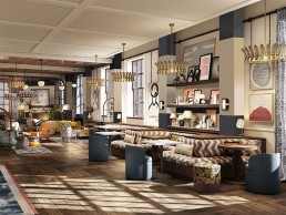
Burles tells darc more: “We wanted to create a journey with the lighting, so upon entering the building the lobby space is very moody and dark, exuding a premium feel. Walking up the stairs, guests are hit with natural light, as we have placed mirrors up the staircase to reflect the large windows that run the full length of the first floor where the bar, lounge and dining areas live.”
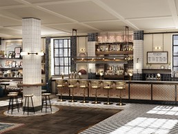
The hospitality space is designed to create natural zones between the bar, café-lounge area and more formal dining areas. The first thing that greets people is a beautiful hero bar, with glamorous bar stools in a mix of antique brass, blackened steel and dark tropical patterned velvet. Bar-top lamps create an intimate glow for guests enjoying cocktails, while an orange/red Tivoli neon sign, designed by the Run For The Hills graphics team, takes centre stage above the bar, adding a vibrant shot of glamour. Floor-to-ceiling pillars are dotted throughout the space and the columns close to the bar are wrapped by circular drinks tables and upholstered bar stools. Custom-designed black iron and opalescent tube light fixtures wrap around the top of the columns. Beyond the bar is a beautiful, inviting and relaxed café-bar and lounge area.
As Tivoli is an all-day venue, Run For The Hills styled the space with a morning-through-night feel, as Burles explains: “While having lots of natural light in the daytime, in the dusky evening hours the lighting drops very low and warm, with pools of light zoning cosy tables and corner nooks. The lighting in these areas easily translates from day to night, which was a key element in the brief.”
The designers custom designed many of the decorative lights to create an original Tivoli style, with modern features paying homage to decorative old-world chandeliers, juxtaposed with industrial-chic, fixtures, shapes and finishes. The interiors and graphics teams also worked closely to merge lighting and creative signage throughout the space.
Commenting on the different lighting elements and the specific choices made, Burles says: “Our decorative lighting scheme is a healthy mix of beautiful ‘off the shelf’ pieces and fully bespoke Run For The Hills designed larger pieces, all intended to balance each other both stylistically and materialistically. We’ve mixed metals over modern chandeliers, nodded to the natural world with leaf and petal designs, and contrasted these with urban black steel and tube lamps to create pockets of space that balance old and new design ideas. Rather than using wall lights in the studio rooms we’ve played with lighting ‘scallop’ effects over drapes, for a more contemporary and unique-to-Tivoli look.
“We partnered with Northern Lights to manufacture our bespoke lights, which can be seen throughout. Northern Lights provide a great range of finishes, which meant we could mix metals through the space and still ensure they worked together. Mullan Lighting has provided wonderful wall lights, and we sourced oversized textured table lamps from Cowshed Interiors and Shades from Pooky Lights. Overall, lights were specifically chosen for their texture and shape, something that is reflected in the furniture throughout.”
“The lighting at Tivoli elevates the design and ties in key spaces that otherwise are quite far and could be disconnected from each other. We’ve designed lighting formed of leaves that can be seen on fabrics, and specified simple lamp shades that show off the shape of table and floor lamp bases rather than being the key feature themselves – allowing us to use extremely decorative and textured bases that again tie into the shapes on fabrics, shapes of tables and finishes on the walls and floors.
“We worked closely with the architectural lighting consultant Elektra Lighting to ensure all lamps would be of the same temperature and there was fluidity of lighting throughout the space. Many of our bespoke joinery pieces have integrated illumination that helps to highlight key features and add distinctive layers of light. Most architectural lighting is hidden or integrated, allowing the decorative lighting to take centre stage.”
At the far end of the space is a more formal restaurant area, the entrance framed by curved urban-deco crittal screens that divide the space without closing it off completely. Behind the screens are full height drapes, allowing for more intimate private dining and events, giving maximum flexibility for either private or public use.
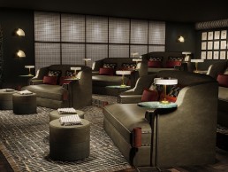
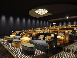
Moving through to the four screening studios – glamorous boutique-sized cinema auditoria that use a palette of midnight blue and gold – decorative trims and border details frame bold painted walls and create a powerful backdrop to the relaxing atmosphere. Fabrics and soft furnishings feature block colours, bold geometric patterns and pastels with pops of bright colours and contrasting piping and trims. The velvet-clad, sink-into, two-man and single sofas are paired with decorative cushions for extra comfort. Each sofa has a handy shelf on the back for personal effects and is matched with a table for in-screen drinks and dining. Inky-blue fabric-draped walls are lit with soft washes of light and low-level bespoke table lamps add to the gentle ambiance.
A decorative blackened steel archway, with globe feature lighting, leads from the auditoria to beautifully light and airy statement bathrooms. The design team created an unusual pivoting window mirror to make the most of the statement windows within the space. The bathrooms are filled with highlight basins, bronze fretwork mirrors and terrazzo flooring. Everything is monochrome with just a hint of colour on the floors.
The venue is finished with layers of accessories to add soul and underline the subtext of the Tivoli story. Shelves are decorated with quirky artworks and decorative objects that are subtly filmic and designed to get people talking. Framed and unframed fine art and prints are woven into the canvas of the overall design, nestled amongst props and objects decorating walls and fireplace mantels, softly lit by picture lighting.
“The final lighting scheme at Tivoli works beautifully, and is an outcome of the close collaboration with Elektra – us leading the conceptual design, for overall mood and aesthetics and designing the bespoke decorative fittings and Elektra detailing the technical aspects, ensuring they all worked beautifully together on the mood controls system.
“We continuously developed and evolved the design for the space, it really reflects our original concept, and the ideas of the whole team behind it. We’re really excited by it as it’s our first branch into boutique cinema design. The space itself is especially beautiful, with an abundance of natural light, which is not typical of a film space.”
